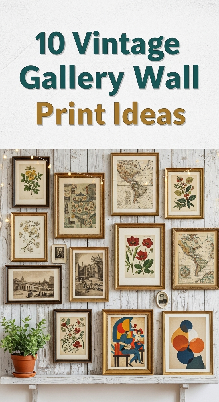
My vintage gallery wall started by accident. I bought a dusty botanical etching at a Munich flea market for 6 euros, meant to frame it for the kitchen — and somehow, a year later, the entire hallway was covered in frames. What I’ve learned since then: a gallery wall works when the prints feel collected over time rather than bought all at once, and the frames matter just as much as the art. Here are the ten print styles that have worked best in my own flat, each with the real details of what I tried, what flopped, and what I’d do differently.

1. Botanical Illustration Prints

This was my gateway print, and honestly still my favourite. I hung three A4 botanical etchings above my desk — a fern, a thistle, and some impossibly detailed mushroom I couldn’t name even now. I mixed black-and-white engravings with one coloured lithograph, and I learned the hard way to keep them in matching dark wood frames; the one I put in a white frame stuck out like a stranger at a family dinner until I swapped it. What I love about botanical prints is how forgiving they are: they look good in a tight symmetrical grid, but they also survive my more chaotic free-form arrangements. Mine live in the reading corner now, and they’ve become the backdrop for every phone call I make — friends always ask about the mushroom. I spent about 25 euros total on the three prints (reproductions from a flea market seller in the Glockenbachviertel), and the frames came from IKEA’s ribba line. Start here if you’re nervous; botanicals are nearly impossible to hang badly.
2. Antique Map Prints

Maps are the prints that make guests linger in the hallway — everyone stops to find their hometown. I framed a 1930s Bavaria map and a smaller city plan of Munich in antique-gold frames, and they hang opposite the front door where the morning light hits them. The detail on real antique maps is something no reproduction quite captures: the tiny hand-lettering, the way rivers meander across the paper. I grouped mine by region, two Bavarian maps together, and added a small brass compass on the shelf below just for the mood. One practical note: dark maps need breathing room, so I left generous wall space around them instead of cramming them between other prints. The frames were the expensive part at 18 euros each from a secondhand shop, while the map prints themselves cost under 10 euros. They give my otherwise modern hallway a layer of history that feels earned rather than decorated.
3. Retro Advertisement and Poster Prints

This is the fun one. I have a 1920s Art Deco travel poster hanging in the kitchen, and every time I look at it while making coffee I feel slightly more glamorous than someone reheating yesterday’s soup. Retro ads bring bold colour and big typography that cuts through the softer vintage prints, so I use them as anchors in a mixed wall — one bright poster can carry a whole arrangement. I tried grouping three smaller ad prints in a row first, and it looked flat; what actually worked was one large poster (A3, in a simple black frame) surrounded by smaller, quieter prints. My kitchen poster is a high-quality reproduction I ordered for 12 euros, and honestly nobody can tell. The trick with these is restraint: one or two retro posters per wall is characterful, but five starts to look like a diner. Keep the frames simple so the artwork does the talking.
4. Black-and-White Photography Prints

Black-and-white photos are the backbone of my hallway wall — they tie everything together because the monochrome palette never clashes. I printed some street scenes from a 1950s Munich archive (freely available online at print-on-demand prices) and mixed in one old family photo of my grandmother at roughly twenty, which guests always gravitate toward. I arranged them in a staggered cluster rather than a perfect grid, which felt more lived-in. The frames are all simple black, bought in a multipack, and the uniformity is what lets the photos vary in size and subject without looking messy. One thing I learned: matte paper beats glossy for these — the glossy ones caught the hallway light and threw glare across the corridor. Black-and-white also has this way of making a room feel more grown-up, which my flat needed after years of colourful student posters.
5. Vintage Typography and Quote Prints

I was sceptical about word-art on walls — it can tip into motivational-poster territory fast — but a single typographic print above my desk changed my mind. Mine is a page from an old book, a beautiful old German Fraktur heading, framed in distressed wood, and it reads more like art than a slogan. That’s the line I’d suggest walking: choose prints where the lettering itself is the beauty — old book pages, vintage shop signs, calligraphy — rather than a quote slapped onto modern clip art. I keep just two text-based prints in the whole flat, both in my workspace, and they genuinely make the desk feel more intentional. The second is a small letterpress-style quote in a gold frame that a friend gave me. Keep the frames plain so the typography stays the focus, and vary the orientation: mine are one portrait, one landscape, which keeps the arrangement from feeling like a textbook page.
6. Travel Postcards and Souvenir Prints

This is the most personal corner of my wall, and visitors love it because every piece has a story. I framed a handful of vintage postcards I picked up at flea markets — a 1960s Italian coastline, an old Berlin street scene — alongside a few from my own travels. The small sizes (most are A6-ish) meant I could cluster them tightly in a row of small matching frames, which looks charming rather than chaotic when everything shares the same frame style. I added a tiny brass key and a miniature suitcase figurine on the shelf beneath, which sounds kitschy but somehow completes it. Cost was almost nothing: the postcards were 1–3 euros each, and I cut the frames from cheap clip frames. These little prints punch far above their price because they carry real memories — mine sit in the hallway where I see them every time I come home.
7. Victorian Portrait Prints

Victorian portraits are the boldest move on this list, and I’ll admit I hesitated — a stern-faced stranger staring down from my dining room felt like a commitment. But a pair of antique-style portrait reproductions in ornate gold frames ended up giving the room exactly the drama it was missing. I hung them symmetrically, museum-style, at eye level on the wall behind the dining table, and they make the whole space feel more considered. The frames matter enormously here: cheap thin frames ruin the effect, so I splurged on proper ornate ones at a Munich antique shop (about 30 euros each) while the prints themselves were inexpensive reproductions. The portraits I chose are a woman and a man, roughly the same era, which reads like a deliberate pair rather than two random strangers. Not for every room, but in a formal space they are pure character.
8. Botanical and Zoological Prints

Think of these as the museum gift-shop wall — old scientific illustrations of birds, insects, and plants, the kind with Latin captions and painstaking cross-hatching. I built a small cluster of four above my bookshelf: two birds, one beetle study, and a botanical plate, all in matching wooden frames with little handwritten-style labels I printed myself. The mix of flora and fauna keeps it interesting, and the aged-paper tones harmonise so well that the wall practically arranges itself. These prints have an educational charm that guests always comment on, and they suit a study or library corner perfectly. I found mine as a set of four reproduction prints online for under 20 euros, and honestly the detail in each one rewards a closer look — the beetle’s wing segments alone are worth the wall space. Hang them where people stand close enough to see the fine lines.
9. Mid-Century Modern Art Prints

My living room wall needed colour, and mid-century prints delivered it without breaking the vintage mood. I chose three abstract prints from the 50s and 60s — bold mustard, teal, and rust shapes — and framed them in sleek thin wooden frames that keep the look light. Unlike the heavier Victorian pieces, these sit beautifully in a modern flat, and they bridge the gap between my antique maps and the contemporary furniture I couldn’t afford to replace. I arranged them in a loose row with varied sizes, the largest in the middle, which gives the wall a rhythm without feeling rigid. These were the cheapest prints of the bunch at about 5 euros each as downloadable files I printed at a local copy shop on matte paper — and the framing cost more than the art, which is often how it goes. If your vintage wall feels too dusty and brown, one or two of these will wake it up.
10. Eclectic Vintage Mix Gallery Wall

This is my bedroom wall, and it’s the one I live with most — a deliberate mix of everything: a map, a botanical print, two photos, a postcard, a typographic piece. The secret to keeping a mixed wall from looking like a jumble is one unifying element, and for me it’s the frames: nearly all dark wood, nearly all the same depth, which lets the artwork vary wildly inside them. I also kept the colour palette of the prints muted — lots of sepia, sage, and dusty tones — so nothing screams. I laid the whole arrangement on the bedroom floor first and shuffled pieces for an embarrassingly long time before committing; start with the biggest piece slightly off-centre and build outward. It took me an afternoon and roughly zero euros beyond what I’d already spent, since every print was a leftover from another room. It feels like me in a way no single-theme wall could.
Conclusion
My hallway wall is still growing — I add a print every few months when something finds me at a market or in a shop, and that’s the whole point. A vintage gallery wall is never really finished, which is what makes it feel alive rather than staged. Pick the prints that make you stop and look twice, hang them at heights you can actually see, and let the collection build slowly. The wall will tell your story better than any perfectly planned arrangement ever could.