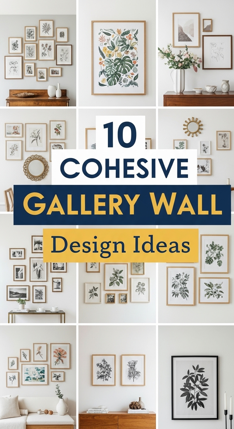
My first gallery wall was a disaster, and I am saying that with love for it. I hammered seventeen nails into the hallway wall in one afternoon, hung everything I owned that was remotely flat, and stood back to admire a collection that looked like a flea market had exploded. Two years later, the wall above my sofa is the one spot in my Munich flat that visitors always photograph, and the difference came down to one word: cohesion. Not rules, not expensive frames — just one thread pulling everything together, and I figured that out mostly by making every mistake in the book first.
1. Monochrome Masterpiece Wall
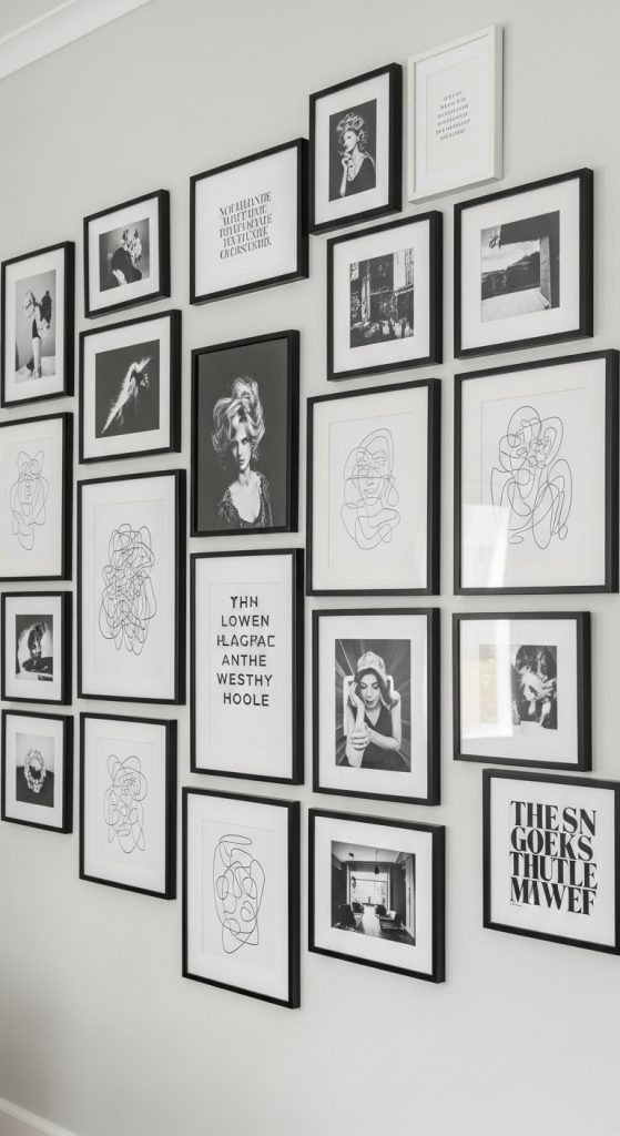
I started with black and white because it was the cheapest lesson I could learn — no agonizing over color, just shapes and contrast. My hallway runs long and narrow, so I picked a symmetrical grid of six prints: two of my own black-and-white street photos from Berlin, a line drawing I bought at a flea market for 3 euros, and three typography prints I downloaded and printed at a copy shop. I used plain black frames from IKEA, all 30×40 cm, spaced exactly 7 cm apart, and honestly the hardest part was the measuring, not the choosing. If your room feels busy, this approach calms it down — monochrome gives you structure for free, and it suits living rooms, bedrooms, or a home office that needs to feel sharp.
2. Neutral Tone Gallery Wall
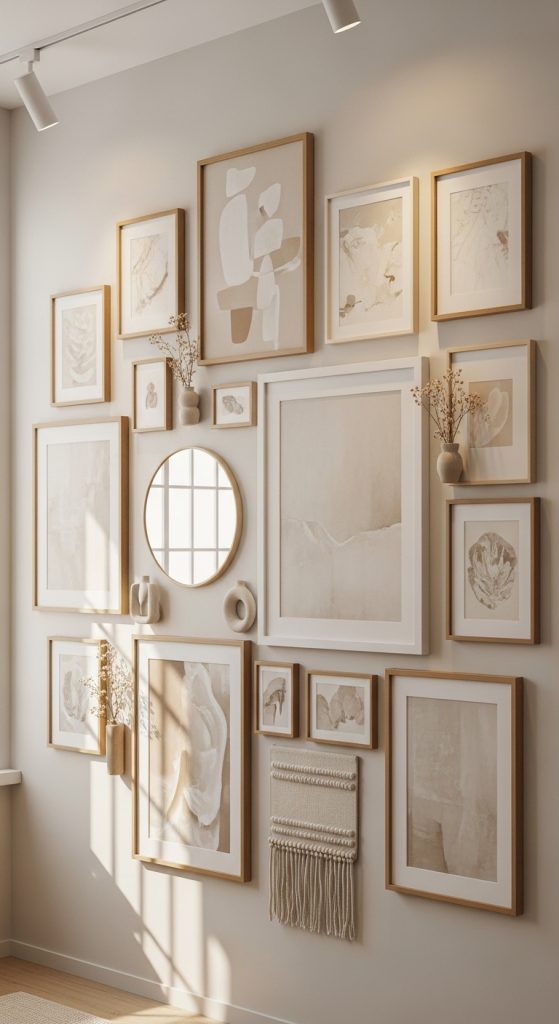
My bedroom wall was the opposite problem: the room itself is pale — cream walls, linen curtains — and anything colorful felt like shouting. So I went full neutral: beige, taupe, soft gray, nothing brighter than a cloudy morning. I mixed muted prints with a small dried bouquet tucked into one corner frame and a tiny wooden sculpture I picked up in Austria. The frames are white and light oak, mixed sizes from 21×30 up to 50×70, arranged in a loose cluster over the bed. My rule was simple: if a piece had any color that wasn’t beige-adjacent, it went back in the drawer. This is the wall for anyone whose home leans calm and minimal — the cohesion comes from restraint, and the room feels like exhaling.
3. Vintage-Inspired Gallery Wall
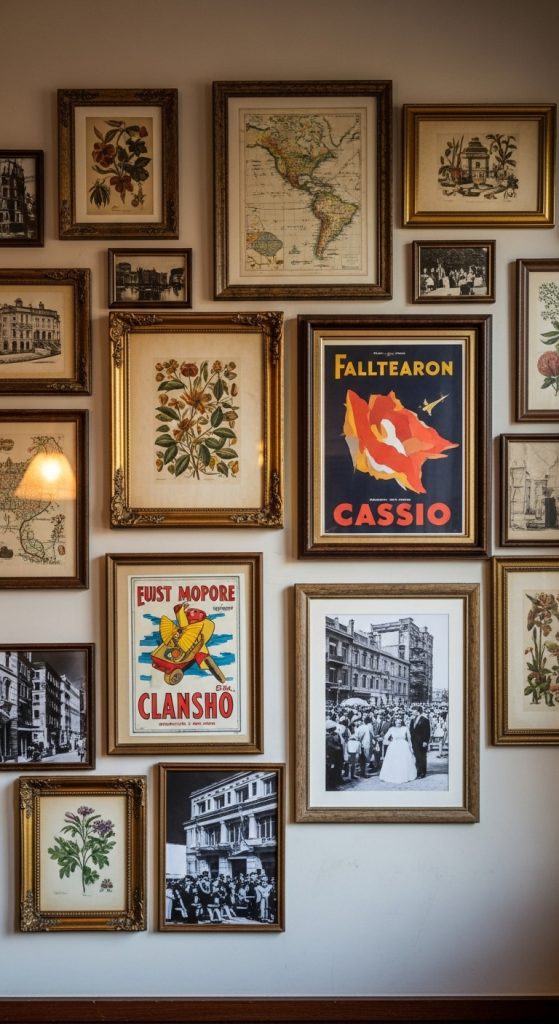
This one grew out of my grandmother’s attic boxes — I inherited a stack of old sepia photos and a 1920s map of Munich, and suddenly I had a theme handed to me. I built the wall around them with botanical prints, an old tram ticket I framed, and a vintage camera ad I found at a Flohmarkt. The key move was the frames: distressed wood and a couple of gold-toned ones, all warm, so even newer prints looked like they belonged to the same era. It’s an organic cluster over my reading chair, nine pieces in different sizes, and I added two small vintage keys hung from tiny hooks as three-dimensional accents — they cost me 2 euros each and get more comments than anything framed. A vintage wall forgives a lot of messiness because the theme itself is the glue.
4. Color-Themed Gallery Wall
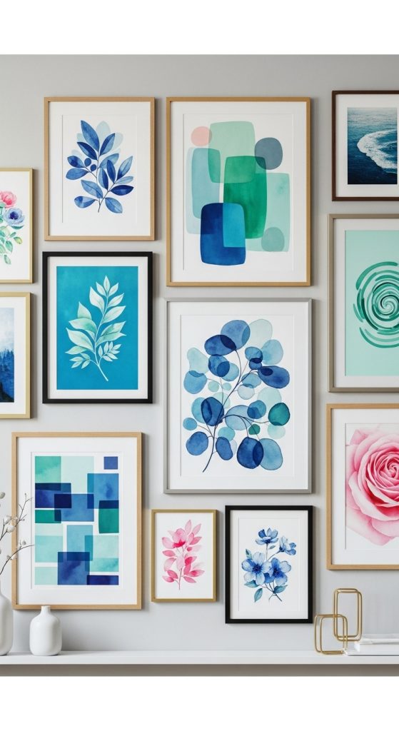
When I wanted the living room to feel brighter without repainting, I picked one color and let it run the whole wall. Mine is a dusty blue — a friend calls it “Bavarian sky at dusk” — and I pulled it from a cushion I already owned. Every piece has to contain that blue somewhere, even just a sliver: a seascape photograph, an abstract with blue strokes, a blue-and-white porcelain plate on a plate hanger, a typography print in navy. The frames are mixed — white and natural wood — which I get away with because the color does all the unifying work. I arranged them largest to smallest, flowing left to right like a sentence. If you’ve got a color you keep coming back to, this is the easiest cohesive wall you’ll ever build, and it brings real energy into kitchens and creative spaces.
5. Minimalist Grid Layout
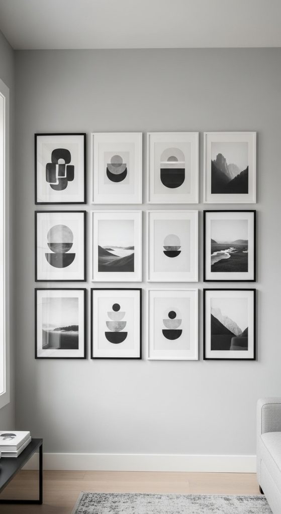
My home office got the grid, because that room needed to look serious and I needed to stop fiddling with it. Nine frames, all identical black 40×40 cm, hung in a perfect three-by-three with 5 cm gaps — I measured with a laser level and I’m not ashamed to admit it. Inside the frames are monochrome botanical prints I ordered as a matching set. I cut paper templates for all nine frames, taped them to the wall, lived with the ghost rectangles for two days, and only then drilled. The result is the most photographed corner of my work calls, and it’s the wall that requires zero decision-making afterward — nothing gets swapped, nothing gets added, it just sits there being orderly. If symmetry soothes you the way it soothes me, accept the measuring time as part of the project and hang it properly once.
6. Eclectic Yet Cohesive Wall
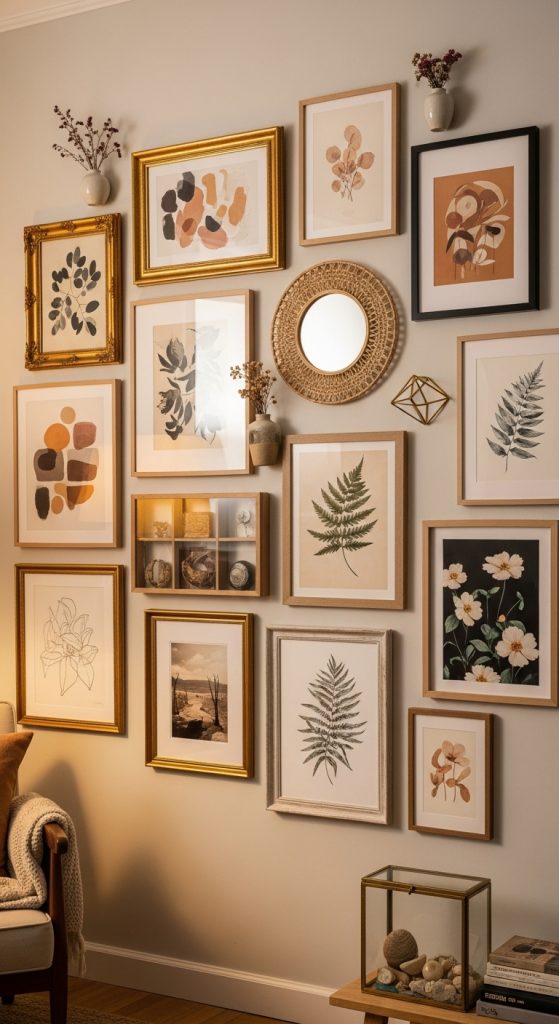
This is the wall over my sofa, the one I rebuilt after the great seventeen-nail disaster, and it’s deliberately a mix — photography, a small mirror, one woven piece, two postcards from trips, a sketch my friend drew of my cat — held together by a single rule: warm tones only. Golds, ochres, terracotta, warm wood. The frames are wildly different — chunky wood next to thin metal — but because the palette is consistent, the eye reads it as intentional instead of chaotic. I laid the whole thing on the living room floor first and shuffled it around for a week, ending with an organic cluster and generous negative space in the middle — that empty space is doing half the work. This is my favorite wall in the flat, precisely because nothing matches and everything agrees.
7. Nature and Botanical Gallery Wall
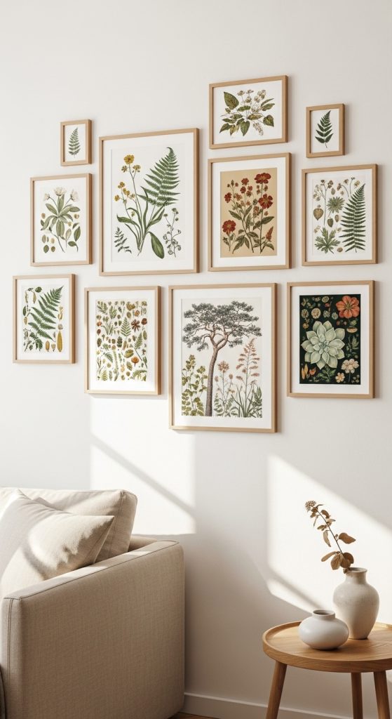
I hung this one in my bedroom, right where I see it first thing in the morning, because I wanted the day to start somewhere green. It’s all plants and landscapes: pressed fern fronds I framed myself (between two sheets of glass, a 10-euro frame, and it looks like a museum piece), a watercolor of alpine meadows I bought from a student artist in Schwabing, three of my own forest photographs, and a small landscape oil from a flea market. The frames are natural oak and white, all matte — shiny frames and nature prints argue with each other, I learned that the hard way. I arranged them in a loose symmetrical cluster, tallest piece in the center, and left wider gaps than usual because botanicals want air around them. There’s a calm to this wall that photographs can’t quite capture.
8. Typography and Quote Wall
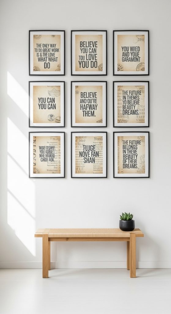
My reading corner got the word wall, because I am the kind of person who dog-ears pages and underlines sentences, and I wanted my favorite lines where I could see them. Seven prints, all in the same typeface family — a clean serif I found on a free font site — alternating between black text on cream and cream text on deep green. I framed them all in identical thin black frames, 21×30 cm, in two neat rows, and I was ruthless about the texts: only lines I’d actually underlined in real books. There’s one small candle shelf mounted at the right edge, which is both decoration and the practical bit — the corner needed light anyway. Typography walls demand discipline: same font, same two or three colors, same frames. Break two of those rules and you’re back to clutter. This one makes me happy every single evening.
9. Mixed Media Gallery Wall
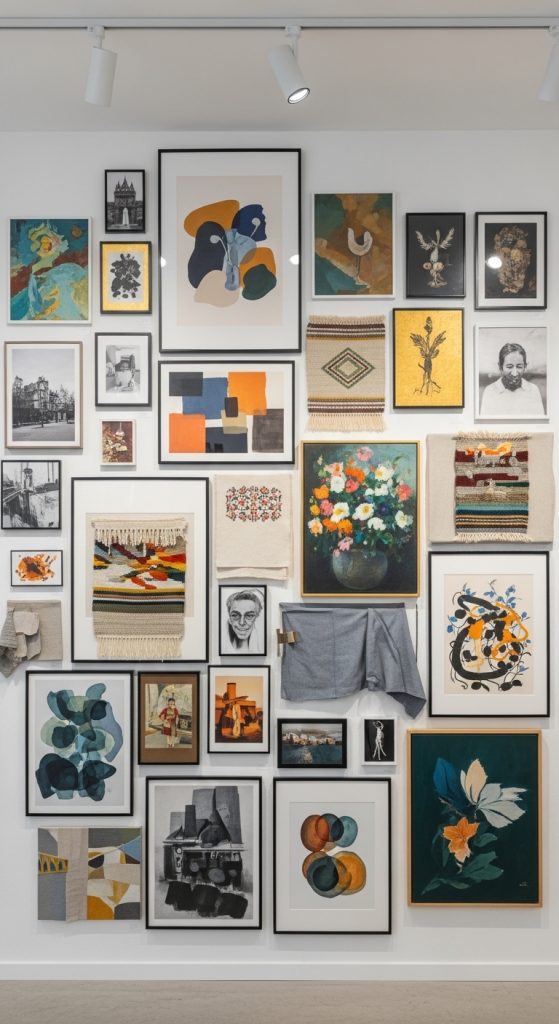
This wall was my permission slip to hang things that aren’t art — a small woven wall hanging my sister made, a ceramic tile from a Lisbon trip, a framed fabric swatch, plus photographs and prints mixed in. The cohesion comes from a muted palette of sage, sand, and charcoal, repeated in every single piece so the odd materials don’t feel random. The frames are all wood in similar tones, which matters more here than anywhere else: when the media varies this much, the frames have to be the steady voice. I built it in a cluster around the woven piece, the largest, sitting slightly off-center, and I repeated each material at least twice — because a single odd object looks like a mistake while two look like a decision. It’s the wall guests touch, which tells me it’s working; flat gallery walls don’t invite fingertips, but texture does.
10. Seasonal or Thematic Gallery Wall
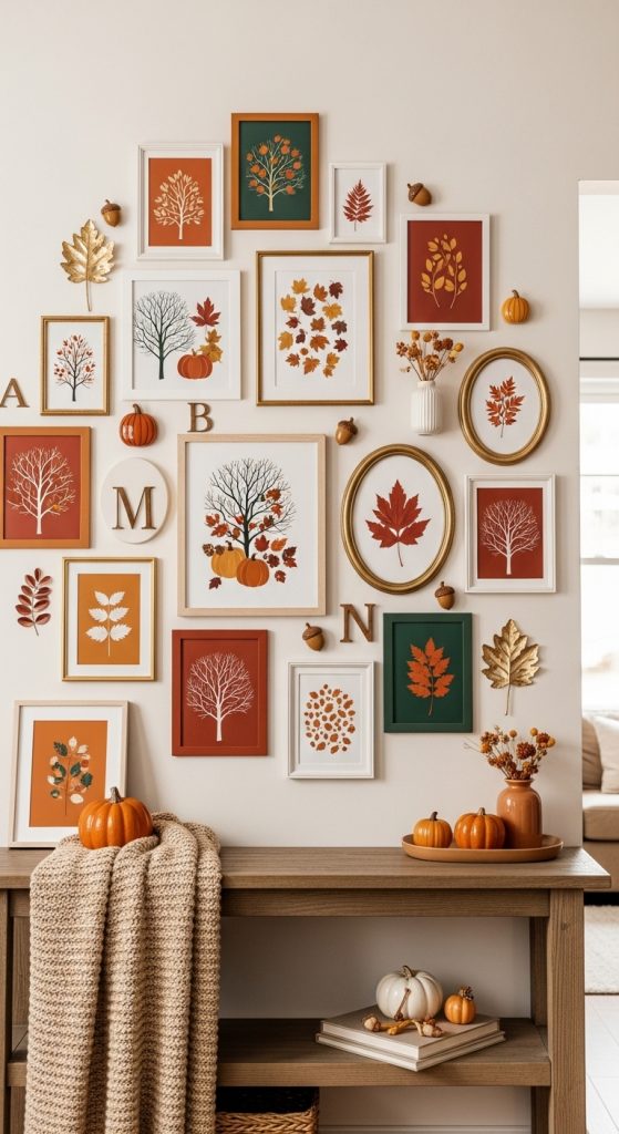
My hallway wall changes with the year, and I’ve come to love it as a ritual. The permanent backbone is travel: maps, ticket stubs, photographs from trips, all in slim black frames. Then, four times a year, I swap in a few seasonal pieces — dried autumn leaves behind glass in October, a simple winter landscape in December, pressed spring flowers in April. The swaps take twenty minutes because the frame layout never changes. The travel theme plus consistent black frames is the unifying thread, and the seasonal pieces stay in the same muted tones so nothing clashes. If you like change but dread commitment, a thematic wall with seasonal rotation is the sweet spot — one wall, refreshed quarterly, always cohesive.
11. Monochrome Storytelling Gallery Wall
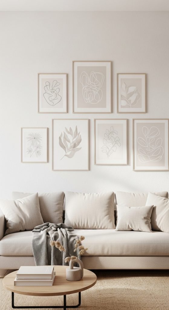
This is monochrome’s more emotional sibling, and it’s the wall I built in the small guest room where contrast would have felt harsh. Instead of pure black and white, I chose one warm family — creams, sands, soft taupes — and let every piece speak in those tones: a sepia photograph of my parents’ wedding, an abstract in beige and clay, a line drawing in brown ink, a typography print in taupe. I laid everything on the floor first and pulled three pieces that fought the palette — beautiful alone, but wrong for this story, so they went to other walls. The frames are all warm oak and cream. I started hanging from the center and worked outward, keeping gaps even but the arrangement slightly asymmetrical — and because the palette is controlled, you can add pieces over months and it still holds together.
12. Frame-Unity Gallery Wall
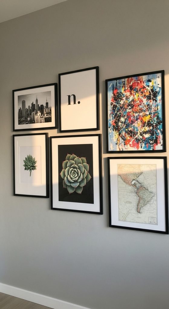
If you take only one idea from this whole article, take this one: buy identical frames, and your gallery wall is already halfway cohesive before you’ve chosen a single print. My staircase wall is twelve thin black frames, all the same profile, in mixed sizes — and inside them lives absolute chaos in the best way: family photos, an abstract I painted on a whim, a concert poster, two postcards, a botanical print. Nobody notices the chaos because the frames give every piece the same voice. I bought the frames first, in a bulk set at about 8 euros each, then filled them stress-free over weeks. I planned the layout on the stairwell floor, repeating a few dimensions for rhythm, and kept 6 cm gaps throughout. This is the most forgiving gallery wall formula I know, and it works anywhere you want variety without visual noise.
13. Theme-Based Cohesive Gallery Wall
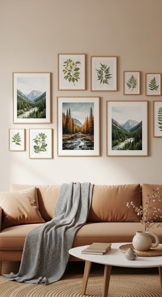
My kitchen wall answers one question: where have I been? It’s a travel wall — a hand-drawn map of Italy, black-and-white street photography from Lisbon and Prague, a watercolor of the Amalfi coast I bought from a street artist, and a framed train ticket from my first solo trip. The colors are all over the place and the frames are mixed wood and black, and it works anyway, because every piece answers the same emotional question. That’s the whole secret of theme-based walls: subject matter does the unifying, so color and frames are allowed to relax. I collected these slowly over about a year — a themed wall built in one shopping trip always looks like a hotel lobby. The floor layout told me to remove one beloved piece that didn’t fit the story; editing is the actual skill here. One large map anchors the composition, smaller pieces grouped around it with real breathing room.
14. Grid-Based Cohesive Gallery Wall
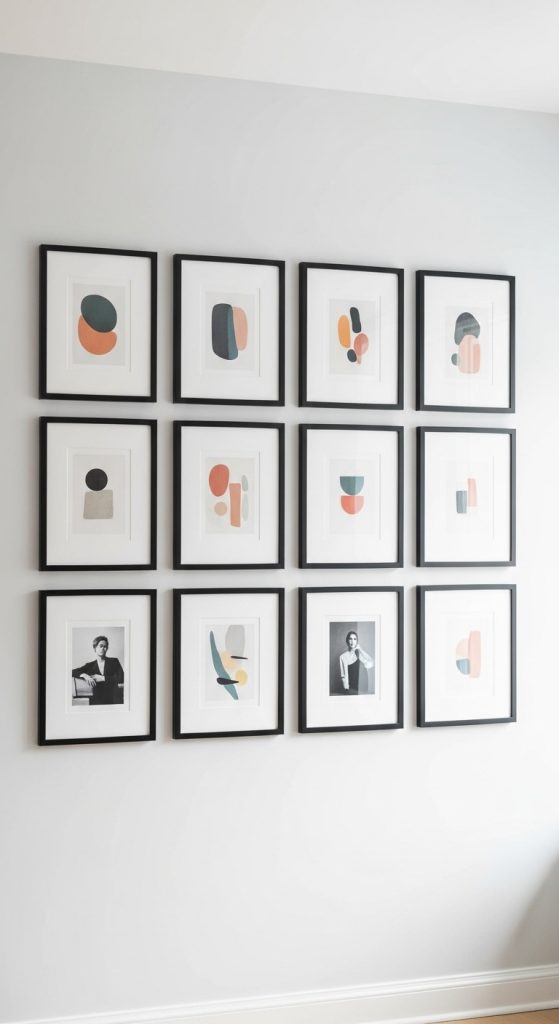
I know I already covered the minimalist grid in my office, but this is the grid as a philosophy rather than a single project, and I ended up applying it to the landing upstairs with completely different art. The principle is simple: identical spacing and repeated sizes do all the work, so the art can be bold. Upstairs I hung eight 30×30 cm frames in two rows of four — colorful abstract prints in saturated reds and ochres that would have been overwhelming in a free-form cluster, suddenly calm inside the grid. Measuring was the whole project: I marked every position in soft pencil, checked with a level three times, and hung from the top row down. One frame style, equal gaps, same sizes — that’s the entire recipe. It’s the wall I’d recommend to anyone who says “I’m not good at this” — because the grid is good at it for you.
15. Soft-Toned Mixed Media Gallery Wall
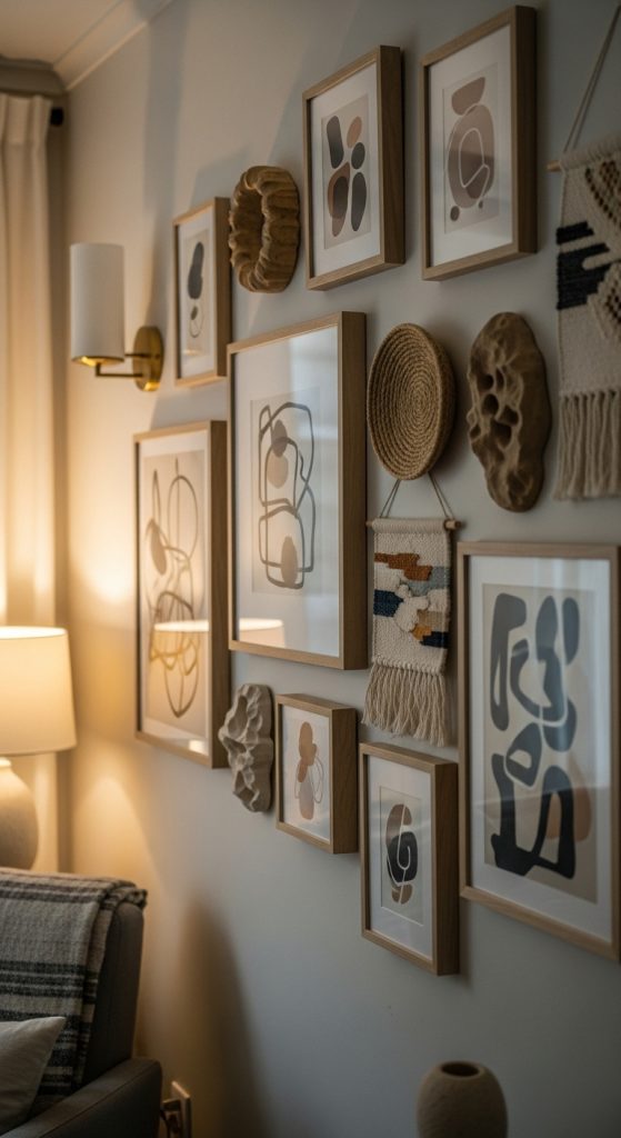
My last wall, and the one that feels most like me now: soft, textured, and a little bit imperfect on purpose. It hangs in the corner where I drink my morning coffee — muted prints in blush and stone, a small woven hanging, a ceramic disc, a dried grass arrangement in a slim vase on a little shelf bracket. Cohesion comes from texture and tone; everything is soft to look at, and the woven and organic materials repeat to give it rhythm. The palette never strays from warm neutrals with a whisper of sage, and the frames are all natural wood in the same honey tone. I arranged it organically, stepping back after every two pieces, and stopped before it felt “done” — a wall like this should feel like it could keep growing. It’s less gallery, more corner-of-my-home. If your style leans cozy over crisp, start here: soft tones, mixed textures, and the confidence to let the wall feel personal instead of polished.
Conclusion
Fifteen walls’ worth of experiments later, the lesson is simple: pick one thread — a color, a frame, a theme, a texture — and let it do the heavy lifting. My flat’s walls were built over two years, mostly with frames under 10 euros and art I already owned. Start with the wall you see most, choose your thread, and lay everything on the floor before a single nail goes in.