
My bedroom faces north, which in a Munich winter means the light is grey-blue from nine in the morning until it gives up entirely at four in the afternoon. Two years ago I lived through one of those stressful stretches where I woke up tired and went to bed wired, and my old white-walled bedroom felt more like a waiting room than a place to rest. On a whim — and against my partner’s very sceptical wishes — I painted the wall behind the bed a soft blush pink, the colour of the inside of a seashell. Within a week I was falling asleep faster, and honestly I stopped caring that he’d called it “ice-cream parlour.” Pastels don’t have to mean a teenager’s dream room; done slowly and with real furniture, they make a bedroom feel like an exhale. These are the ten pastel changes I actually lived with, in the order I made them.
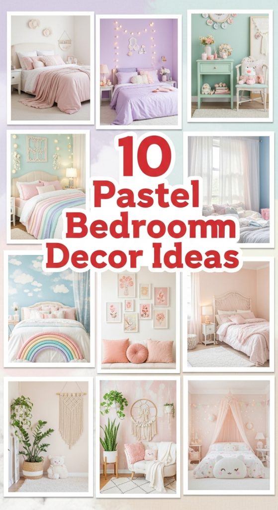
1. Soft Pastel Walls for a Serene Backdrop
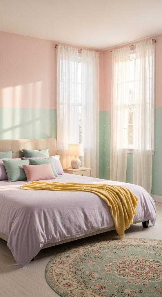
I started with the wall because paint is the cheapest square metre of change you can buy, and I learned the hard way that pastel walls live or die on the undertone, not the colour name on the swatch. My first pick was a blush that looked sweet in the shop but dried slightly peachy-orange in my north light, and I had to redo it. What finally worked was a cooler blush with the faintest grey in it — the shop mixed me a 5-litre tin for about forty-five euros, and one afternoon with a roller covered the whole feature wall twice. My rule now: paint a test patch at least a metre wide and look at it at breakfast, at noon, and under the bedside lamp at night before you commit. In a darker room, lean toward warmer pastels like apricot or blush; in a bright south-facing room you can get away with cool mint or powder blue without it feeling chilly. I only painted one wall and left the other three in a warm white, which keeps the pink from feeling like a theme park. Two years on, that blush wall is still the first thing I see in the morning, and it still makes me breathe out.
2. Pastel Bedding for a Cozy, Inviting Bed
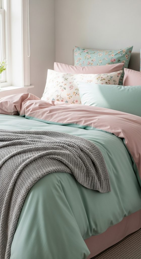
The bed is the biggest surface in any bedroom, so bedding is where pastels show up loudest — which is exactly why I didn’t buy a matching pastel set. Matching sets always read a little catalogue to me. Instead I built the bed in layers: plain white cotton sheets at the bottom, a washed-linen duvet cover in a soft mint that I found on sale, and then two large pillows in a dusty rose tucked in front. Linen wrinkles and that used to bother me, but in pastels the wrinkles actually help — the colour feels lived-in instead of sugary. If mint and pink sounds like a lot, start with the white sheets and add just one pastel layer; you can always add more. One practical note I wish someone had given me: pastel bedding shows washing wear faster than white, so I wash mine at forty degrees with a gentle detergent and skip the fabric softener, which dulled the mint on my first set within months. The whole bed, sheets included, cost me well under a hundred euros, and remaking it each morning with the layers folded down takes about two minutes and makes the whole room look finished.
3. Pastel Accents with Gold or Brass Details
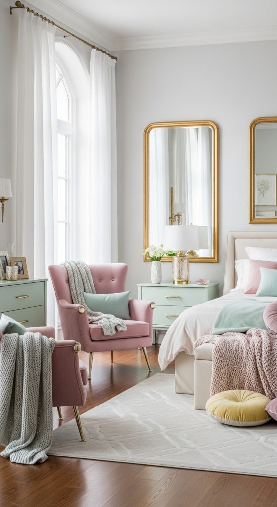
Pastels on their own can drift into sweetness, and in my flat the thing that keeps them grown-up is warm metal. I found a brass floor lamp at the Auer Dult flea market here in Munich for twenty-five euros — the shade was hideous, but the brass stem was solid, and a new cream shade made it the best-looking corner of the room. Brass and gold do something chrome never could: they bounce a warm glow onto pink and mint and stop the colours from feeling cold or flat. You don’t need to spend flea-market weekends on this either; I spray-painted three old wooden picture frames with a ten-euro can of gold spray paint, and from across the room they look properly gilded. Keep it to a few pieces — a lamp, a mirror edge, a tray on the dresser — because too much gold turns pastel into costume jewellery. One rule I follow without exception: never mix warm pastels with chrome. It clashes every single time, like wearing silver with a warm-toned dress. Brass is warm, pastels are warm, and together the room holds.
4. Pastel Floral Patterns for a Feminine Touch
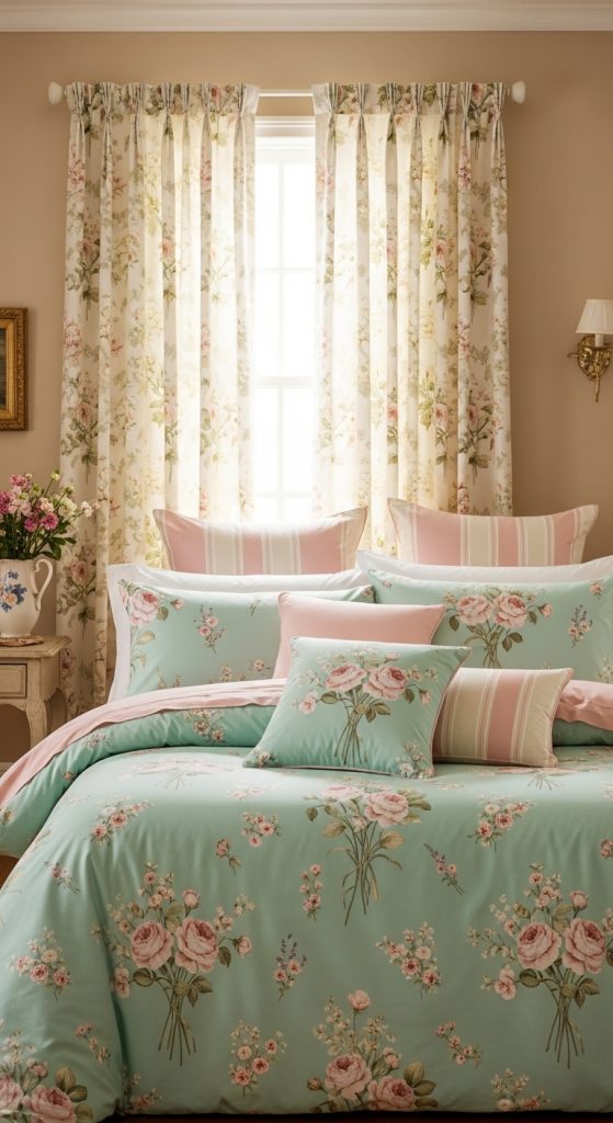
Florals in pastels are a short walk from looking like a grandmother’s guest room, so I set myself a strict one-floral rule and it has never failed me. In my room the single floral is the curtains — a soft watercolour-style print in rose and sage on a cream background — and everything else around them is solid. The scale matters enormously: a big, loose, painterly floral feels modern and calm, while a tiny tight ditsy print reads vintage and busy. I wanted calm, so I went painterly. If you already have a floral duvet you love, then make the curtains solid instead; the rule is one floral hero per room, not one per person. A mistake I made the first time: I bought curtains in a pattern whose background was stark white, and against my warm white walls they looked slightly clinical. I swapped them for a version on an ivory ground and the whole window softened instantly. Take the same care with cushions — one floral cushion among solids is charming; four floral cushions is a fabric shop.
5. Pastel Art and Wall Decor
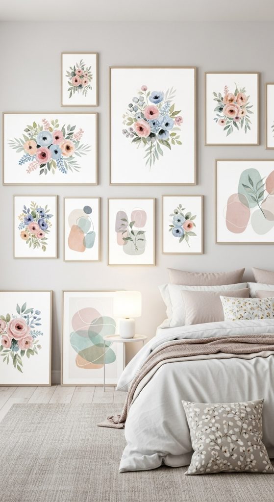
For a long time my walls above the dresser were completely bare, because I was waiting to find the “right” art and in the meantime the room felt unfinished. What broke the stalemate was deciding the frames matter more than the prints. I bought four cheap white frames — the standard kind every furniture shop sells for a few euros each — and filled them with botanical postcards I’d collected: a peony from the Munich botanical garden, a pressed-flower print from a market, two cheap art prints in blush and mint. Hung in a tight grid with identical frames, mismatched pictures suddenly look like a collection instead of clutter. That is the whole secret of a pastel gallery wall: keep the palette tight and the frames uniform, and almost any soft-coloured image will get along. I hung mine so the centre of the group sits at about eye level, roughly 150 centimetres from the floor, which felt low at first but is exactly right when you’re lying in bed looking at it. If drilling into the wall makes you nervous, the adhesive hanging strips genuinely do hold light frames — mine have survived two summers.
6. Soft Pastel Rugs for Warmth and Texture
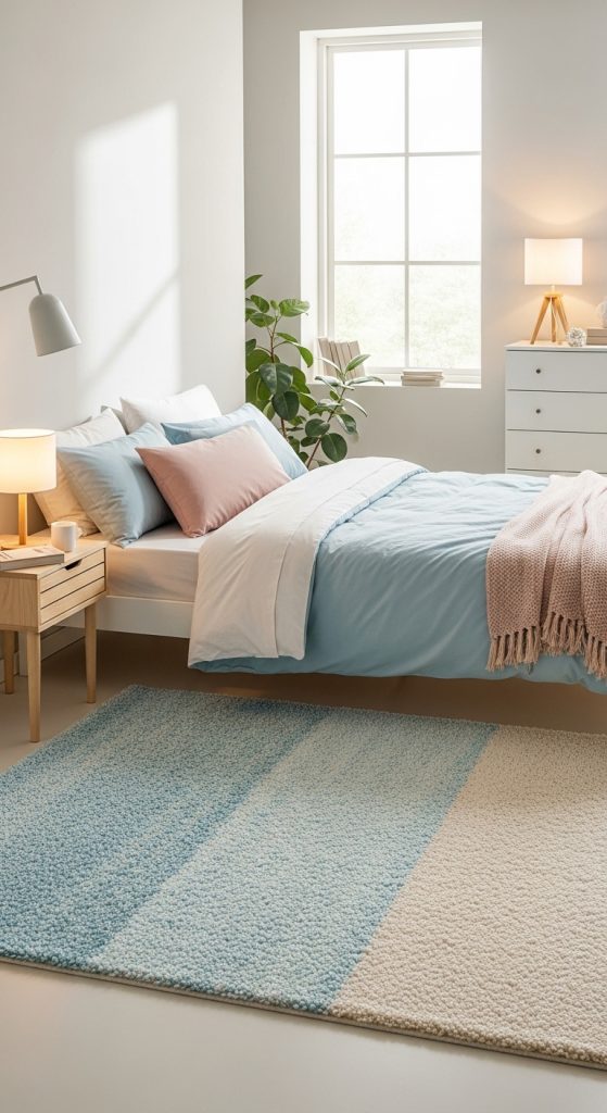
There is a specific small misery in stepping out of a warm bed onto cold laminate at six in the morning, and my pale blue rug ended that misery in one afternoon. I chose the palest blue-grey I could find — a low-pile cotton rug, about 160 by 230 centimetres, big enough to run under the front two-thirds of the bed and out both sides, which is the part your feet actually touch. A rug that only peeks out from one side looks like an afterthought; a rug you can stand on from either side of the bed feels like the room was planned. Blue was a deliberate choice against all the pink: it cools the blush wall down just enough that the room doesn’t tip into candy territory. Practical warning from someone who learned it the dusty way: a pastel rug in a bedroom will show every dark sock mark, so I deliberately picked a machine-washable one. Mine goes in the washer at thirty degrees twice a year and comes out fine. It cost me around sixty euros, and it is the single thing guests step on and immediately ask about.
7. Pastel Lighting for a Soft Glow
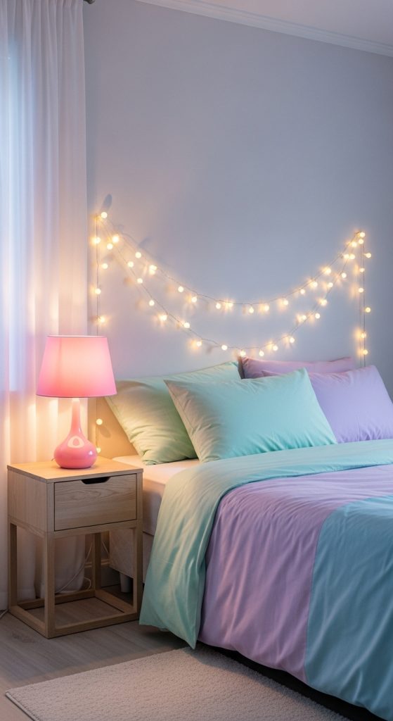
Pastels are colour-sensitive in a way bolder rooms are not — put a cool daylight bulb in a blush bedroom and the pink turns a queasy grey-mauve by evening. I switched every bulb in my bedroom to warm white, 2700 kelvin, and the difference was so immediate I actually laughed standing in the doorway. My bedside lamp wears a pale pink paper shade that tints the whole corner peachy at night, which makes the last half hour of reading feel like a ritual instead of a habit. I also ran a simple string of fairy lights along the headboard — the copper-wire kind with tiny warm LEDs, about eight euros — and they stay on a timer so the room is never pitch dark when I walk in. The overhead ceiling light barely gets used anymore; two low warm sources beat one bright ceiling light every time in a small bedroom. If you take one thing from this whole list, let it be the bulbs: warm light is what makes pastel paint look like the swatch you fell for in the shop. Everything else is decoration; the light is the colour.
8. Vintage Furniture in Pastel Shades
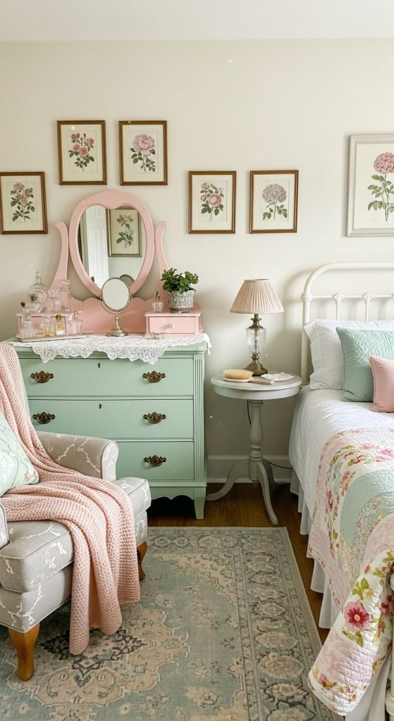
The mint dresser in my bedroom was a thirty-five-euro rescue from Kleinanzeigen, all scratches and one wobbly drawer, and it is now the piece I would save first if I ever had to move in a hurry. I painted it with chalk paint in a soft mint — one tin, about twenty-five euros, covered the whole thing with two coats and I didn’t even have to sand properly, just a light scuff and a wipe-down. Then came the part I almost skipped and am very glad I didn’t: a coat of clear wax, buffed with an old cloth, which is what makes chalk paint feel like furniture instead of a craft project. I distressed the edges very lightly with fine sandpaper — drawer corners, the top edge — because a mint dresser with zero wear looks like it came flat-packed, and the tiny worn spots make it look like it has a past. I also swapped the knobs for small brass ones, which ties it to the lamp across the room. The whole job took one weekend, most of it waiting for paint to dry, and it taught me that the best pastel furniture is secondhand furniture: new pieces in pastel can look toy-like, but a rescued dresser in mint just looks loved.
9. Pastel Wallpaper for a Subtle Background
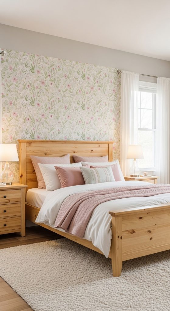
Wallpaper scared me for years — paste tables, matching seams, the whole commitment — so when I finally tried it I chose the gentlest possible option and put it on exactly one wall. The paper is a tone-on-tone pattern: pale blush background with a slightly deeper rose motif, no contrast at all, so from across the room it reads almost as texture. That subtlety is the entire point. A pastel wallpaper with strong contrast fights with everything else in the room; a whisper-quiet one just adds depth behind the bed like a headboard made of paper. I bought the paste-the-wall kind, which means you roll paste straight onto the wall and hang dry paper — no soaking, no paste table in my tiny flat, and I managed it alone on a Saturday with a YouTube video open on my phone. Measure your wall and buy one extra roll; I ran short by half a metre and waited two weeks for the same batch number. One wallpapered wall behind the bed, painted walls everywhere else — that balance gives you the pattern without the pressure of living inside a jewellery box.
10. Personal Touches with Pastel Art and Accessories
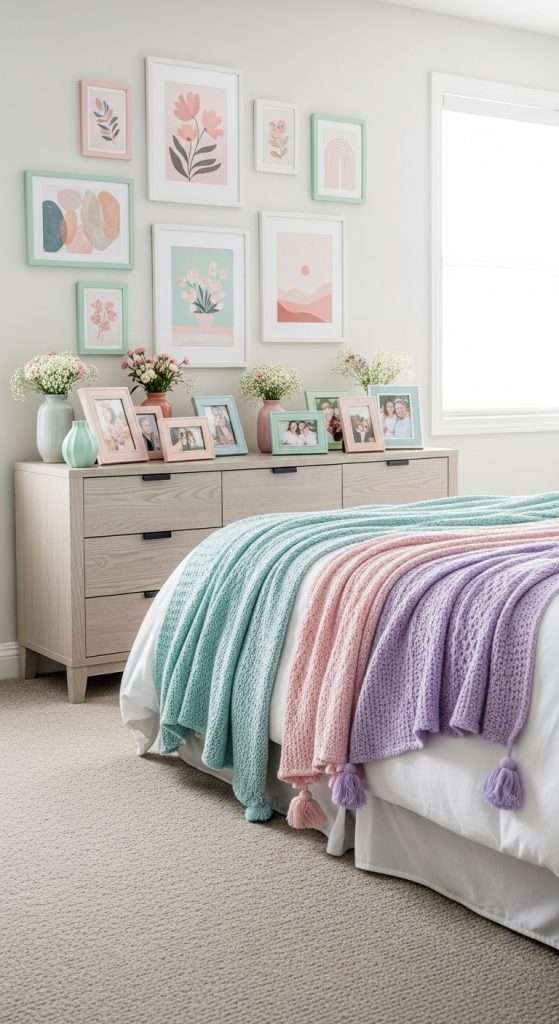
The top of my mint dresser, like the one in this photo, is the most personal square metre in my flat — a small cluster of things that mean something to me, all loosely held together by colour. There’s a framed photo of my grandmother’s garden in a blush frame, a little ceramic dish in speckled mint that holds my rings, and a candle in a pale rose glass jar that I light on Sunday evenings. None of it was bought as a set and none of it is expensive; what makes it work is that everything within arm’s reach is soft-toned, so the eye reads it as one calm arrangement instead of clutter. My rule for the dresser top is the same as for the whole room: if something doesn’t fit the palette or the story, it lives in a drawer. A pastel bedroom only stays restful if you protect it from becoming a storage surface, so the personal touches get a boundary — this tray, this corner — and everything else finds a home elsewhere. Yours should look nothing like mine; that’s rather the point.
Conclusion
I didn’t set out to build a pastel bedroom so much as I kept removing everything that made the room feel tense, and pastels were what was left. If you’re starting from a plain white room, begin with the light and the bedding — the two cheapest changes — and live with them for a fortnight before you touch a paintbrush. Colour is slow work, but a bedroom that lowers your heart rate is worth every test patch. Sleep sweet.