My niece moved into her first dorm room last autumn, and the first photo she sent me was of a bare cinder block wall under a buzzing fluorescent tube. It looked like a waiting room, not a home. I went over the next weekend with a bag of warm-white fairy lights, a pack of Command clips and a shoebox of her favourite prints, and by Sunday evening that same wall glowed soft amber and held the faces of everyone she missed. That afternoon taught me more about small-space decorating than any magazine spread: a string light photo wall works in a dorm because it asks almost nothing of the room and gives back so much warmth. These are the ten layouts I have tried, tweaked and lived with since then, each one built to survive a semester of real student life.
1. The Parallel Geometric Wire Grid
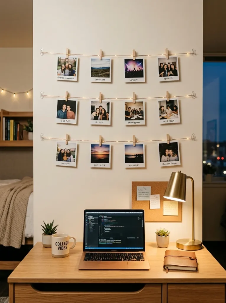
I started with this one because it is the most forgiving layout I know. I ran four horizontal strands of ultra-fine copper fairy wire across the wall above my niece’s desk, spacing them about 25 centimetres apart, and clipped square retro-style prints along each line with tiny wooden pegs. The trick that made it look like a proper gallery instead of a jumble was keeping every print the same size and leaving the same gap between them, so the eye reads clean rows rather than clutter. I used clear Command clips every 60 centimetres to hold the wire, and I learned to pull each strand gently taut before pressing the last clip home, because a sagging wire ruins the whole effect. Warm-white 2700K bulbs were non-negotiable for me; the first set I bought was a cold 5000K and it made the wall look like a hospital corridor until I swapped it out. Matte prints matter here too, since glossy paper throws the LED light straight back at you and washes the photos out. A battery pack tucked behind the desk keeps the cable invisible, and the whole grid cost me under 25 euros.
2. The Cascading Fairy Light Curtain with Floating Polaroids
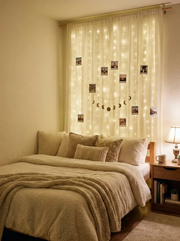
This one came from a rainy Saturday when my niece wanted her wall to feel less like a noticeboard and more like a window. I hung a vertical curtain of fairy lights from a slim tension rod above her bed, letting the strands fall in a soft sheet, and clipped Polaroids at different heights so they looked as if they were floating inside the glow. The vertical lines do something lovely in a low-ceilinged dorm room: they draw your eye upward and the room feels taller than it is, which is no small thing in 12 square metres. I kept the photo count low, around twelve, because too many prints turn a curtain into a cluttered laundry line. The clips need to be light — I use mini wooden pegs rather than metal ones, since heavier clips drag the fine wires sideways over a few weeks. I also tucked the battery pack into a small fabric pouch pinned behind the top corner, so there is no dangling cable. At night, with the overhead light off, this is the version my niece says makes her room feel like the cosiest place on her floor.
3. The Asymmetrical Botanical Driftwood Branch
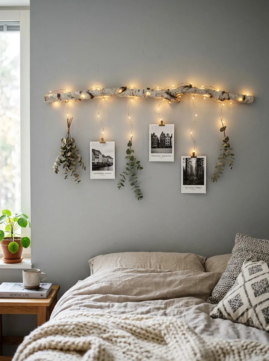
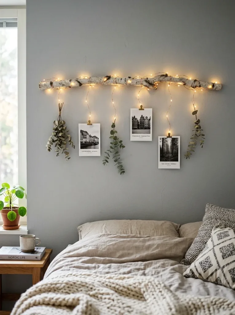
I found the branch for this one on a walk along the Isar, a smooth piece of driftwood about a metre long, and it still sits above my niece’s bed two semesters later. I sanded it lightly, hung it horizontally on two Command hooks, and let delicate copper string lights drop from it in uneven lengths, tucking in a few dried eucalyptus sprigs and three small travel postcards between the strands. The asymmetry is the whole point: nothing lines up perfectly, and that looseness is what keeps it from looking like a shop display. The mistake I made the first time was hanging the branch too high, so the lights pooled uselessly near the ceiling; lowering it to just above eye level made the photos readable from the bed. Because the branch holds the weight, the wire itself carries almost nothing, which means no sagging even after months. If you cannot find driftwood, a birch branch from a florist works just as well, and the whole thing still reads calm and Scandinavian rather than fussy.
4. The Minimalist Zig-Zag Memory Canopy
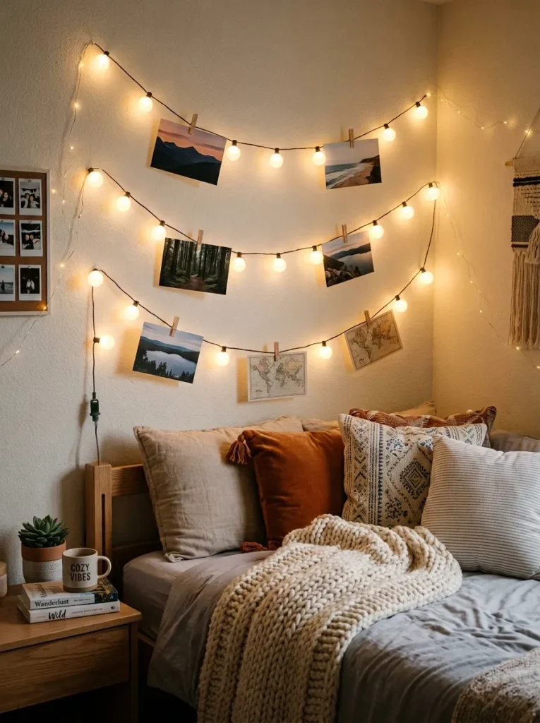
When my niece wanted a reading nook instead of another flat wall display, I zig-zagged a single strand of warm frosted mini globe lights across the corner above her armchair, running it from one wall to the ceiling and down the other side. The canopy effect is immediate: sitting underneath it feels sheltered, like a tent made of light, and the zig-zag keeps the strand from looking like a straight washing line. I clipped photos only at the low points of each zig-zag, which spaces them naturally and stops the wire from being overloaded in any one spot. The practical lesson here was measuring twice — I bought a 6-metre strand for a corner that needed nearly 9 metres once the zig-zags were counted, and had to join a second strand mid-project. Frosted globes suit this layout better than bare fairy wire because the light is softer and the strand itself reads as a design element. At exam time my niece does her revision in that chair, and she swears the canopy is the reason she can sit there for two hours without feeling boxed in.
5. The Vertical Monolith Column
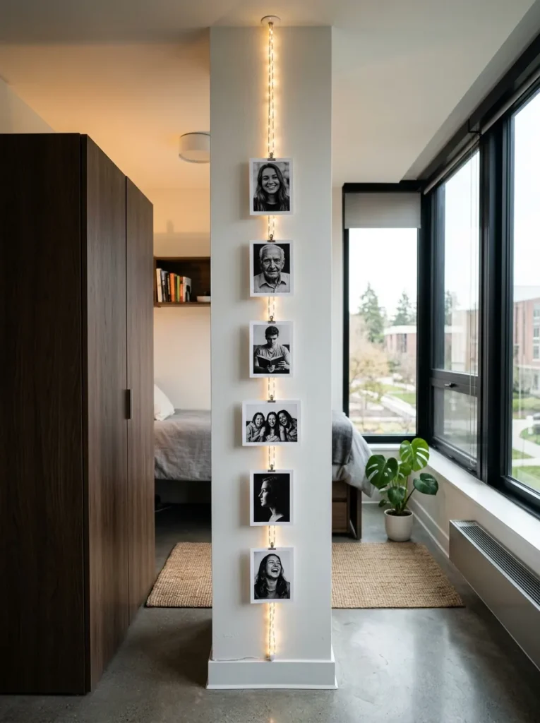
Every dorm has one of those useless narrow strips of wall, and my niece’s was between her wardrobe door and her desk, barely 40 centimetres wide. I ran a single vertical braided string of lights from ceiling to floor there and clipped five photos in a neat column down its length, and it turned dead space into the most complimented corner of her room. The column works because it respects the architecture instead of fighting it: one straight line, one photo width, no fuss. I anchored the strand top and bottom with Command clips and added a middle clip so the wire stays dead straight rather than bowing out from the wall. Keeping the prints to five or six matters, since cramming more in makes the column look crowded and the wire starts to pull. I chose black-and-white prints for this one, which gives the slim column a graphic, almost editorial feel against the white wall. It took twenty minutes to hang and it is the layout I recommend to anyone who says they have no wall space at all.
6. The Neutral Arch Wall Decal & Silhouette Frame
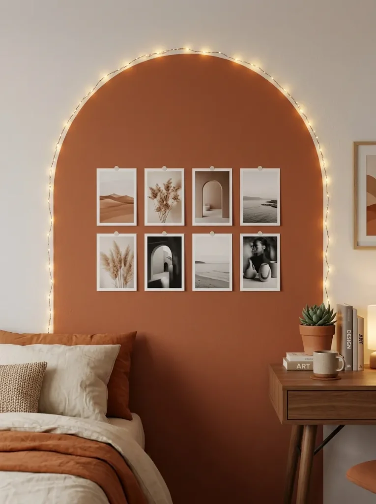
I was sceptical about wall decals until I tried this one, because most of them peel off painted cinder block within a week. A peel-and-stick arch in warm terracotta changed my mind: it went up in ten minutes, gave the wall a soft coloured backdrop, and came off cleanly at the end of term when I tested a corner. I traced the curved edge of the arch with a strand of micro fairy lights, which frames the photos inside like a halo, and kept the collage loose, around eight prints in different sizes but the same warm palette. The arch does the heavy lifting visually, so the lights can be subtle rather than doing all the work. My one warning is to check the decal’s adhesive rating for textured walls before you buy, and to press it down firmly with a dry cloth so the edges do not lift in a warm room. Sage or warm beige work just as well as terracotta if your bedding leans cooler. It is the most grown-up looking of the ten, and it photographs beautifully for anyone who likes sharing their room online.
7. The Scandi Geometric Hexagon Floating Grid
This is the layout I reach for when someone wants their photo wall to look deliberate rather than decorative. I bent stiff brass floral wire into a hexagon about 70 centimetres across, wrapped fairy lights around the perimeter, and suspended four photos in the centre on short lengths of the same wire. The geometry does something a straight line cannot: it gives the eye a shape to rest on, and the empty space inside the hexagon makes the photos feel chosen rather than accumulated. Bending the wire takes patience — I used a round tin as a form for the corners and wore gloves, because brass wire will bite your fingers if you rush it. I hung the hexagon with two small Command hooks at the top corners, and I keep the photos small, 9 by 9 centimetres, so the frame stays the star. A diamond shape works just as well if a hexagon feels too fiddly, and the whole piece costs less than a takeaway dinner. My niece has moved hers twice now and it still holds its shape perfectly.
8. The Continuous Single-Line Wave Swag
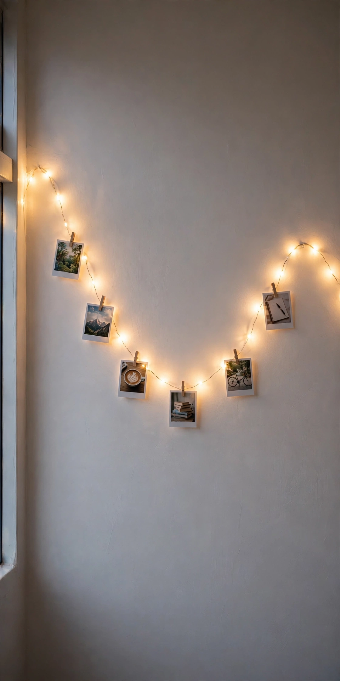
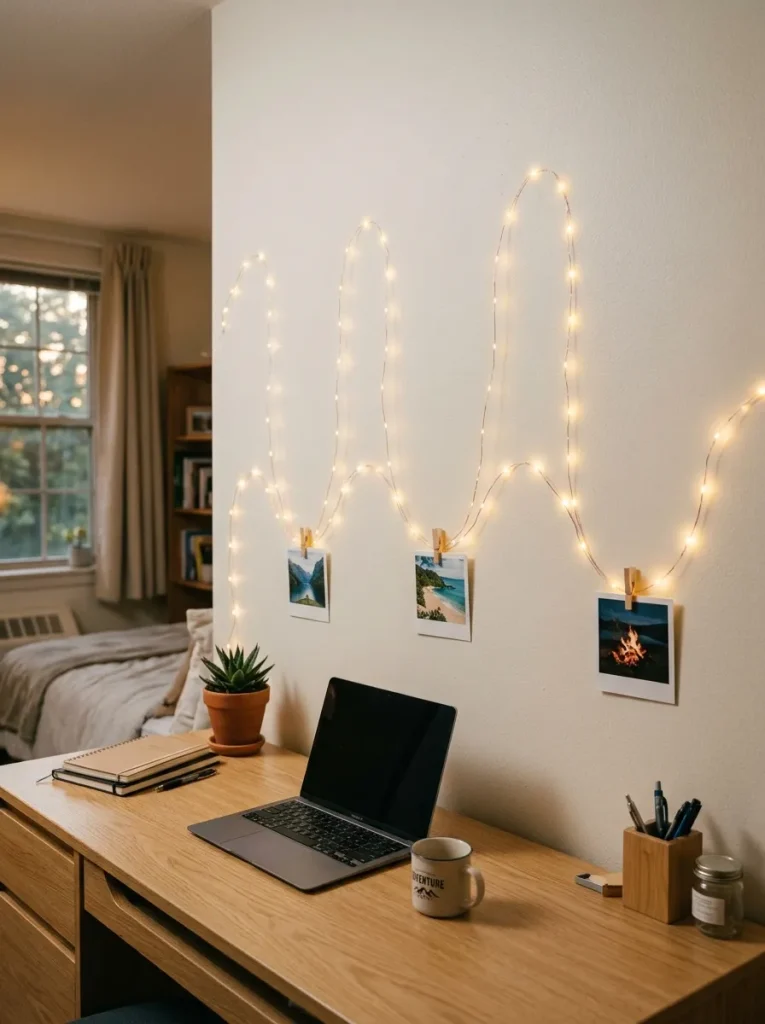
Of all ten layouts, this is the one I find most relaxing to look at, and it is also the simplest to hang. I took one long strand of warm micro-string lights and ran it across the wall in a slow, flowing wave, fixing it with clear clips at the top of each curve and letting it dip naturally between them. Photos go at the low point of each wave, clipped where the strand hangs lowest, which creates a gentle rhythm across the wall instead of a rigid row. The secret is in the spacing: I mark the wave peaks on the wall with tiny pencil dots first, about 50 centimetres apart, so the curves come out even rather than drifting wider as I go. Because it is a single strand, there is only one cable to hide, and I run it down the corner of the room in a clear adhesive channel. The mistake to avoid is overloading the valleys — one print per dip is plenty, since two pull the wire down and flatten the wave. It suits a long wall above a bed beautifully, and it is the layout I would choose if I could only have one.
9. The Oversized Polaroids & Industrial Brass Bulldog Clips
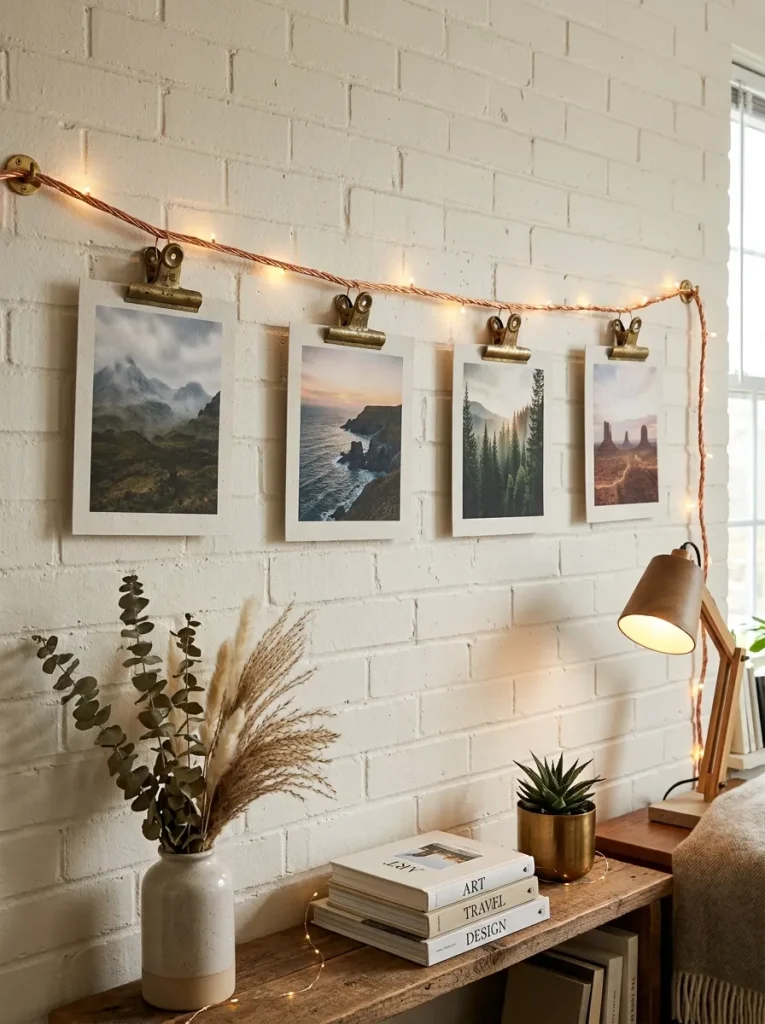
After months of tiny prints, I wanted one wall that felt substantial, so I printed four large-format photos, two at 13 by 18 centimetres and two at 20 by 25, and hung them from a single clean wire run using heavy vintage-brass bulldog clips. The effect is completely different from a wall of small snapshots: each photo gets room to breathe, and the brass clips read as jewellery rather than hardware. Weight is the thing to respect here, because big prints on thick paper will drag a fine copper wire down within days. I switched to a slightly heavier braided cord for this run and used Command clips every 45 centimetres, and the line has stayed perfectly straight for a whole semester. Matte paper is essential at this size, since a glossy 20 by 25 print catches the LED light and glares across the room. I keep the count to four or five prints maximum, which forces me to choose only the photos that really matter, and that restraint is exactly why visitors always stop at this wall first.
10. The Cozy Corner Wrap-Around Reading Nook
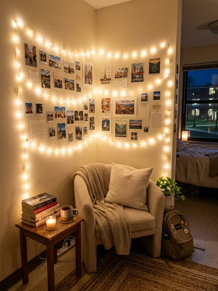
My niece’s room has a corner that used to hold nothing but a laundry basket, and wrapping lights around it turned it into her favourite spot in the flat. I ran a continuous strand across both walls of the 90-degree corner, above a second-hand armchair and a small stack of books, and clipped photos along both sides so the display surrounds you when you sit down. The corner layout works because it uses two walls that would otherwise be wasted, and the wrap-around glow makes a small room feel layered instead of flat. The corner itself needs one extra clip right at the angle, or the wire cuts across the gap instead of hugging the wall. I kept the photos to the same warm palette on both sides so the two walls read as one display rather than two competing ones, and I hid the battery pack behind the chair where it is easy to reach but invisible. She reads there every evening now, and honestly, that corner is the reason I stopped worrying about whether her room felt like home.
Conclusion
A dorm room photo wall does not need to be complicated or expensive to feel like yours. Pick the layout that fits your wall, buy warm-white lights and matte prints, hang everything with clips that will not eat your deposit, and let the photos do the talking. My niece still changes her prints every few months, and each time the wall feels new again without a single new purchase.