I first fell for filet crochet on a rainy October afternoon in my Munich flat, when a friend showed me a lacy panel with her grandmother’s initial worked right into the mesh. I had always assumed letters in crochet meant complicated colorwork, but here the alphabet appeared simply by filling some little squares and leaving others open, and I was hooked before my tea went cold. That first swatch was a crooked letter C that looked more like a moon, yet I kept it, because it taught me that filet crochet is really just drawing on graph paper with yarn. Since then I have stitched initials into mug rugs, blankets, and banners all over my home, and these ten projects are the ones I reach for again and again.

1. Minimalist Sans-Serif Monogram Mug Rug
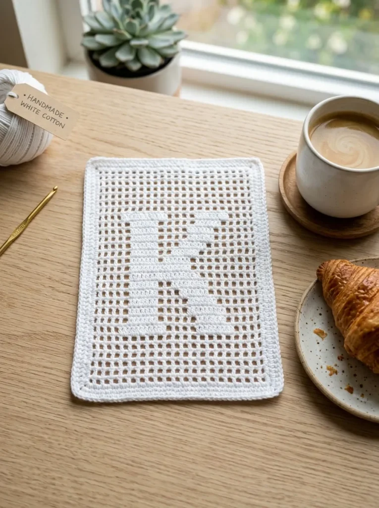
This was the very first filet project I ever finished, and it still sits under my morning coffee cup on the kitchen table. I chose a plain sans-serif capital M for my surname, worked in solid blocks on a five-by-seven grid with two rows of open mesh as a border, using a soft cream cotton yarn and a 3.5 mm hook. The whole piece measures about five by seven inches, which made it the perfect low-stakes practice ground, because I could finish it in a single evening and see my letter take shape row by row. My early mistake was pulling the turning chains too tight, so the edges wobbled and the letter leaned slightly to the left, and I learned to count my stitches out loud at the end of every row until it became habit. Now I make these as housewarming gifts, always in the recipient’s initial, and a DK-weight cotton works beautifully because it holds its shape under a hot mug without stretching. If you are new to filet crochet, start here, because a mug rug forgives small wobbles and still looks intentional on a desk or a bedside table.
2. Vintage Victorian Floral Alphabet Wall Banner
I made this banner for the hallway wall beside my front door, and it is the piece visitors always stop to look at. The design pairs an ornate serif letter with trailing filet roses and little leaf motifs that curl around the edges, and I worked it in a soft ecru thread so the floral details read clearly against the dark green wall behind it. I mounted the finished panel on a natural oak dowel with a short fringe at the bottom, which gave it the feel of an old-fashioned sampler rather than a modern print. The Victorian style takes patience, because the letters sit on a nine-by-thirteen grid and the curves come from stepped diagonal increases, so I charted the whole thing on graph paper first and marked off each row with a pencil as I went. My one regret is that I rushed the fringe and cut it uneven. A brass or oak dowel and a quiet corner of wall are all this one needs to look like something passed down rather than made last weekend.
3. Nursery Name Keepsake Baby Blanket

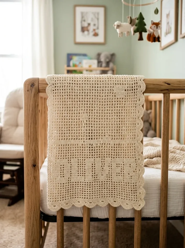
When my cousin asked me to make something for her daughter’s first birthday, I knew a name blanket would be the gift she actually kept. I spelled the baby’s full first name in bold, rounded solid-block letters across the lower third of an open-mesh field, using a gentle baby-soft cotton in pale sage, and I kept every letter exactly nine grid rows tall so the baseline stayed perfectly level. Working with a name means there is no room for a miscounted letter, so I taped my chart to the wall above my armchair and checked off each row with a sticky note as I finished it. The blanket took me about three weeks of evening stitching, which sounds long, but most of that time was simply enjoying the slow rhythm of it while listening to audiobooks. I added a simple scalloped border in a slightly deeper green, and my cousin told me later that the blanket now lives folded over the back of the nursery rocking chair. If you try this one, choose a short name for your first attempt, because every extra letter adds a whole evening of careful counting.
4. Modern Farmhouse Kitchen “COFFEE” & “TEA” Valance
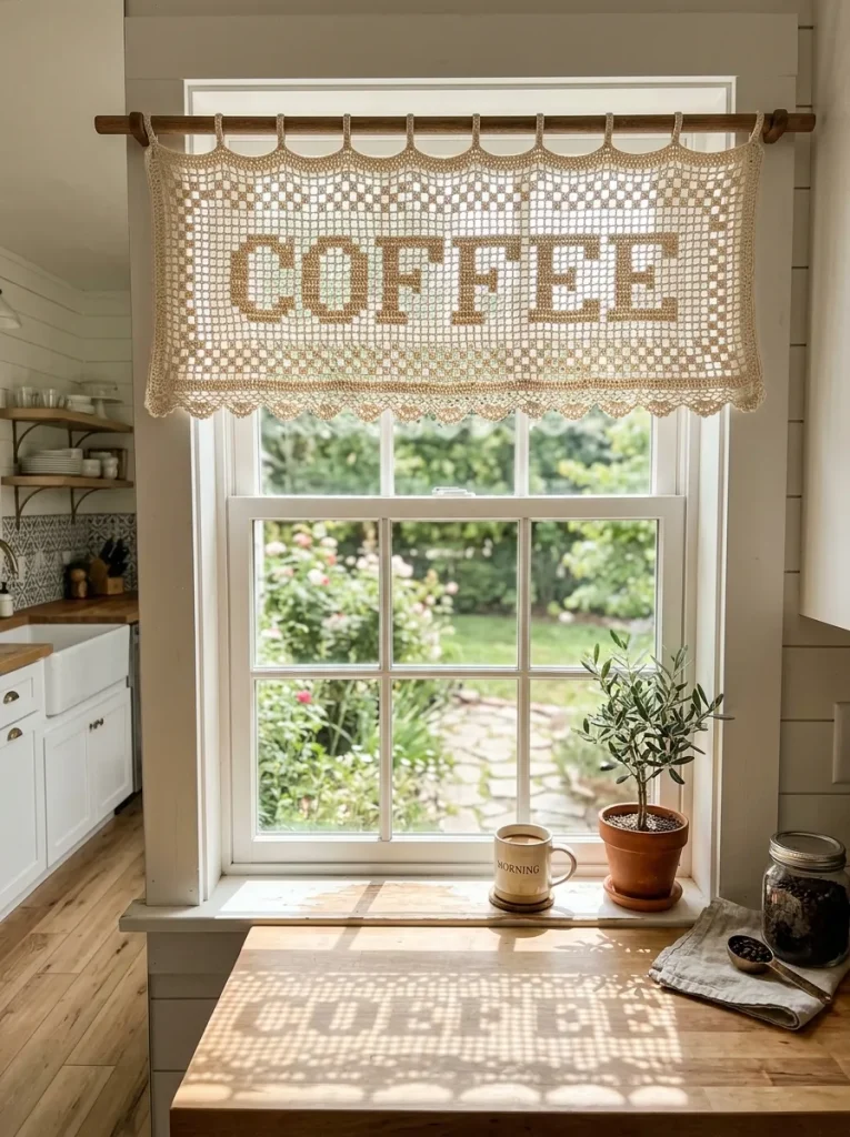
My kitchen window was the dullest spot in my flat until I hung a filet valance spelling COFFEE in big rustic typewriter letters above the sink. I worked it in size 10 mercerized cotton thread in a warm cream color, with simple diamond meshes framing the word, and the whole thing took on that farmhouse feel the moment it caught the morning light. The letters are bold and chunky, which makes them far easier to read through the mesh than a delicate script would be, and I would recommend that same bold style to anyone making a word piece for a kitchen. I measured my window twice before starting and still ended up with a valance two inches too narrow, so I added a row of open mesh on each side and it actually improved the drape. A matching TEA valance now hangs over the little window by the stove, and together they make the kitchen feel like a place where someone actually cooks and lingers. Mercerized cotton is worth the small extra cost here, because it keeps its crisp shape after washing and does not go fuzzy the way ordinary cotton can.
5. Gothic Calligraphy Alphabet Pocket Patch

I made my first gothic patch on a whim after seeing a blackletter initial on an old book cover at a flea market, and it turned out to be one of the most satisfying small projects I have done. The design is a single dramatic Old English letter with sharp stepped diagonals, worked in jet-black thread on a tight seven-by-eleven grid, and I sewed it onto the pocket of a light-wash denim jacket where it looks deliberately edgy rather than crafty. Gothic letters are all angles and attitude, so they suit this style far better than soft rounded letters would, and the contrast of black thread on pale denim does most of the visual work for you. My mistake the first time was choosing a letter with too many flourishes, so I simplified the design to its boldest strokes and the letter suddenly read clearly from across the room. A 1.5 mm steel hook and a steady hand are all you need, plus the patience to count the diagonals twice.
6. Coastal Beach House “WELCOME” Door Banner
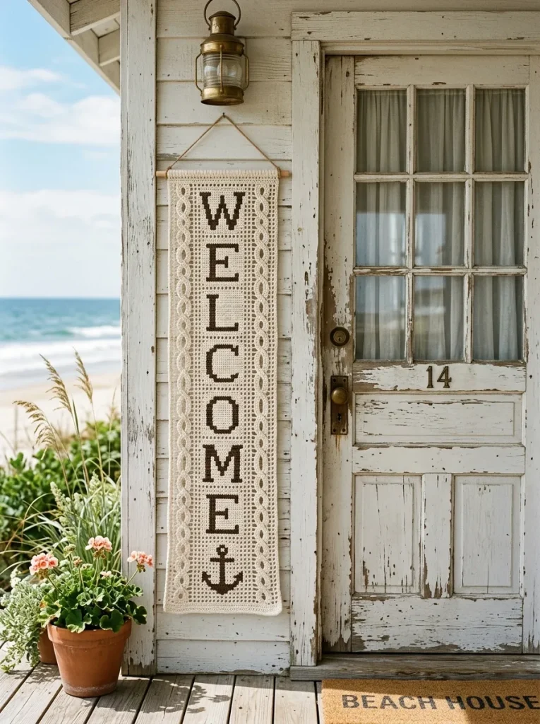
I stitched this vertical WELCOME banner for the door of our little holiday flat by the Baltic Sea, and it has survived two summers of sea air without losing its shape. The letters run down the panel one beneath the other, flanked by a simple rope-style border and a small anchor motif at the bottom, worked in a sandy ecru cotton with a touch of sea-blue thread in the border. Vertical lettering is wonderfully forgiving to chart, because every character uses the same row width and you simply stack them, which made this a relaxing project after the fiddly Victorian banner. I hung it from a driftwood dowel I found on the beach. One practical lesson I learned is that cotton thread holds up well outdoors in a sheltered porch, but I would not leave it in direct rain, so it comes inside at the end of each season and gets a gentle hand wash. If your home leans coastal, this banner is a lovely way to greet guests, and the vertical format fits narrow doors and hallway walls that a wide banner never could.
7. Roman Serif Initial Throw Pillow Cover
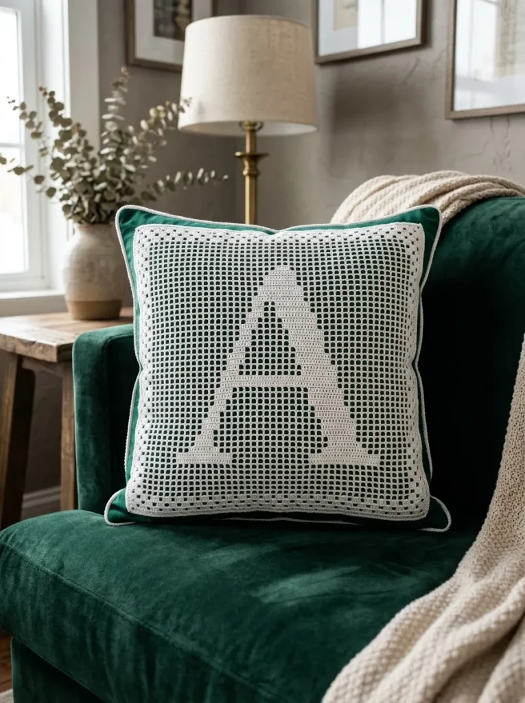
There is a pillow on my living room sofa with a grand Roman capital C on the front, and it is the single most complimented thing I have ever crocheted. The letter sits on a seven-by-nine grid with those elegant little serif feet at the corners, framed by a delicate open lace border, and I backed the white crochet panel with deep forest-green linen so the initial stands out boldly instead of fading into the sofa cushions. I made the panel to fit a standard sixteen-inch pillow form, and I added a simple envelope-style fabric backing with two wooden buttons so the cover can come off for washing. Roman serif letters suit this project so well because they carry a quiet formality that feels right in a living room, and the larger grid gives the curves room to breathe. My tip is to block the finished panel properly before sewing it to the backing, because a few pins and a light steam press will straighten any wavering edges and make the letter look crisp. This one takes a little longer than a mug rug, but the result looks like something from a boutique rather than a weekend hobby.
8. Playful Lowercase Cursive Table Runner

I had never tried cursive in filet crochet until a friend asked for a runner spelling the word gather for her dining table, and it taught me that lowercase script letters have a softness that block capitals simply cannot match. The letters flow along the runner in connected-looking script, built from stepped one-block diagonal increases, and I worked it in a warm cream thread that glows a little in candlelight. Cursive takes more charting than straight letters, because the curves have to step up and down gradually, so I drew the whole word on graph paper first and practiced the trickiest letter on a small swatch before committing to the full runner. The finished piece now lives on my friend’s table under a vase of dried flowers, and she tells me guests always run their fingers over the letters when they sit down. My advice is to pick a short word for your first cursive piece, something like joy or gather, because a long word means a long runner and a lot of patient counting. Once you get the hang of the diagonal steps, though, the script feels almost like handwriting with yarn.
9. Monogram Wedding Ring Dish / Trinket Mat
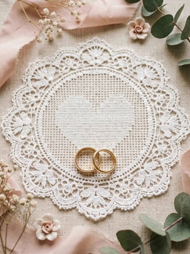
I made this little mat as a wedding gift for two friends, and it was the smallest project on this list but somehow the one that meant the most. The design is a five-by-five-inch square with the couple’s interlocking initials and a tiny heart nestled between them, worked in size 30 ultra-fine cotton lace thread with a 1.25 mm steel hook. Fine thread makes for slow stitching, and I will be honest that my eyes needed a break every twenty minutes, but the result is so delicate that it looks like something from a jewelry box rather than a crochet hook. I placed the finished mat under a small ceramic ring dish on their bedside table, where it now holds their rings every night, and that practical little role makes me smile every time I think about it. If you have never worked with such fine thread before, practice on a plain swatch first, because the stitches are tiny and it is easy to lose your place in the grid. A trinket mat like this also makes a thoughtful anniversary gift, and the couple’s initials mean it can never be mistaken for a shop-bought piece.
10. Educational ABC Animal Alphabet Blanket
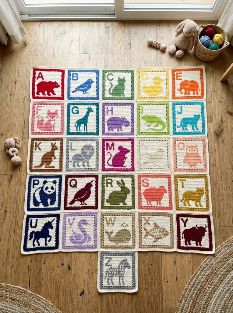
This blanket was my biggest filet undertaking, and also the one that made me laugh the most while I worked on it. The idea is simple: twenty-six individual square blocks, each with an uppercase letter paired with a tiny filet silhouette, like A with an apple and B with a bear, joined into one big patchwork blanket for a child. I worked each square in a soft cotton yarn and kept the letters on the same five-by-seven grid so every block came out the same size, which mattered a lot when it came time to join them. Joining took an entire weekend, and I used a flat slip-stitch seam in a cheerful mustard color that frames each square like a little picture. My nephew now points at the letters and shouts out the animals, which is exactly the reaction I hoped for. If you take this one on, work a few squares at a time rather than all twenty-six in a row, because the variety keeps it fun and you can adjust your tension as you go. It is a long project, but a child learning their letters on a blanket you made is worth every evening of counting.
Conclusion
Filet crochet taught me that letters do not need ink or a printer to feel personal, and every piece in this list started as a simple grid on graph paper before it became something I use every day. If you are just starting, pick the mug rug and give yourself one quiet evening with a hook and a chart, because that first readable letter is the moment the whole technique clicks. And if you have already made a few of these, I would love to hear which letter you stitched first and where it ended up in your home.