I bought my first set of watercolours on a rainy Saturday in Munich, mostly because the little tin looked so pretty on the shelf, and I had no idea what I was doing. My first attempt was a muddy grey puddle that was supposed to be a sunset, and I almost put the whole set back in the cupboard. What kept me going was how forgiving the paint turned out to be once I stopped trying to control every brushstroke and let the water do some of the work.
Over the next few months I painted at my kitchen table in the evenings, usually with a mug of tea going cold beside me, and I learned that simple subjects paint best. These ten ideas are the ones I kept coming back to, because each one taught me something small and useful, and none of them needs expensive supplies to look good on the wall.
1. Minimalist Sunset Silhouette
For this one I wet the whole sheet first with clean water, then dropped in bands of yellow, peach, and a soft coral, letting them melt into each other while the paper was still shiny. I waited until the wash had lost its wet shine before painting a simple dark hill and a bare tree shape on top, because painting the silhouette too early makes the dark paint bleed into the sky.
The paint I used was a student-grade pan set that cost about twelve euros, and a size eight round brush did the whole painting. If your colours look dull, you probably used too much water or scrubbed the same spot twice, which lifts the pigment right off. Let each layer dry fully before adding the next, and keep the silhouette to just one or two shapes so the sunset stays the star of the picture.
2. Loose Floral Lavender Stalks
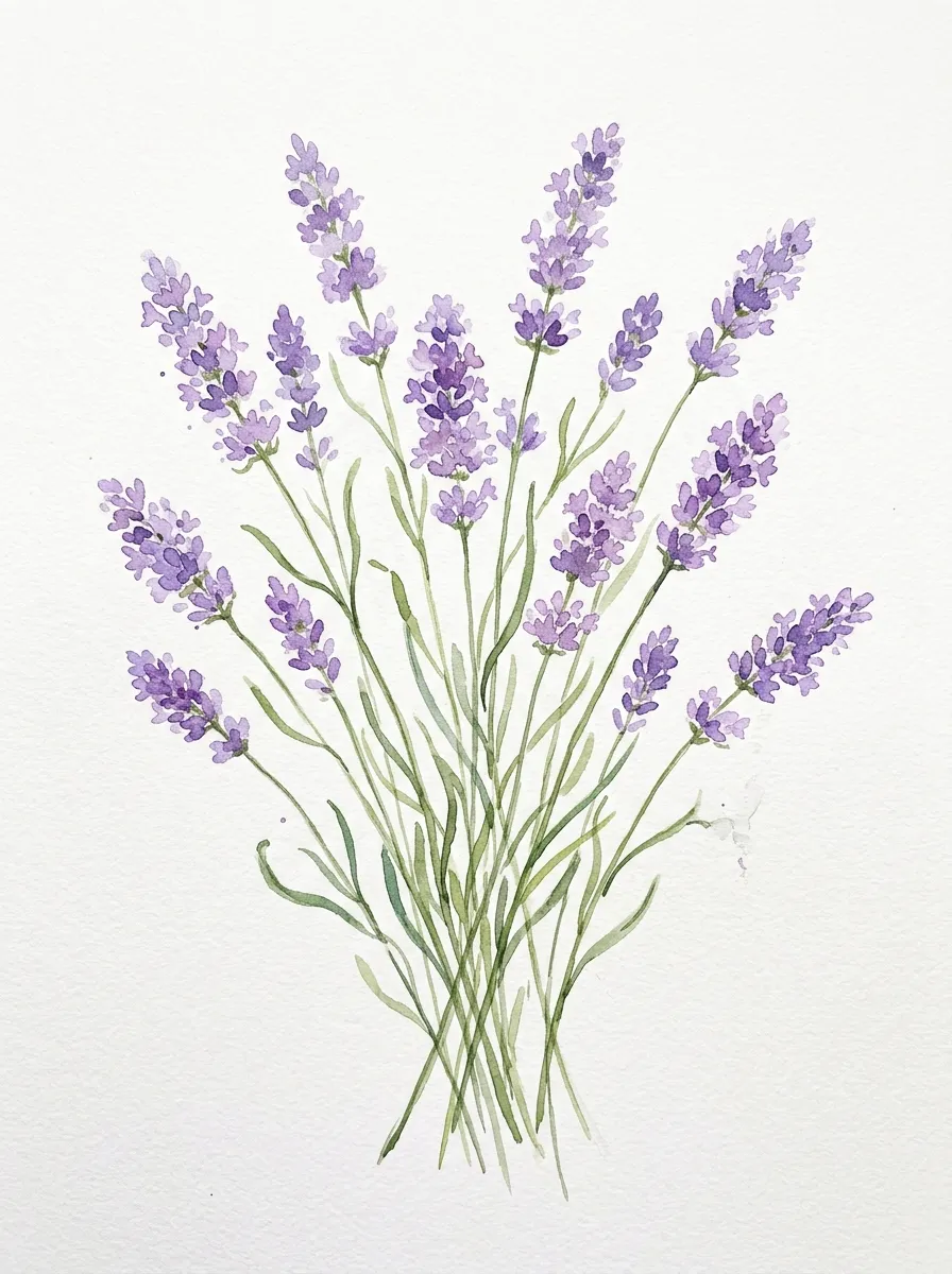
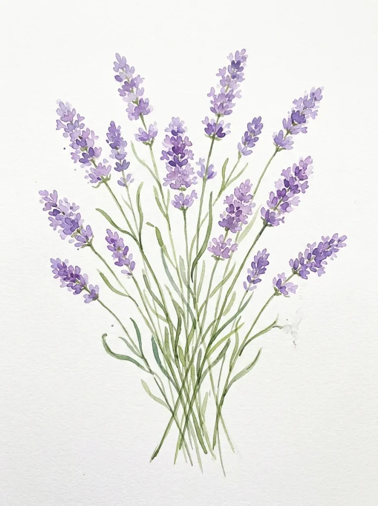
Lavender is wonderfully forgiving because the real plant is already a little scruffy, so wobbly lines actually look right. I painted the stems first with a thin green wash, using quick upward strokes, and then dabbed small purple ovals along the top third of each stem while the green was still slightly damp. I learned not to outline every tiny bud, because the painting looked stiff and fussy when I tried that, and much more alive when I left gaps of white paper showing through.
A rigger brush, or even the tip of your round brush, works well for the thin stems, and I mix my purple from ultramarine and a touch of rose rather than using it straight from the pan. If the stalks start leaning in different directions, step back and check the overall shape, since a loose bundle reads better than five perfectly parallel lines. I usually paint three or five stalks together, because odd numbers look more natural in a small bunch.
3. Cosmic Galaxy Night Sky
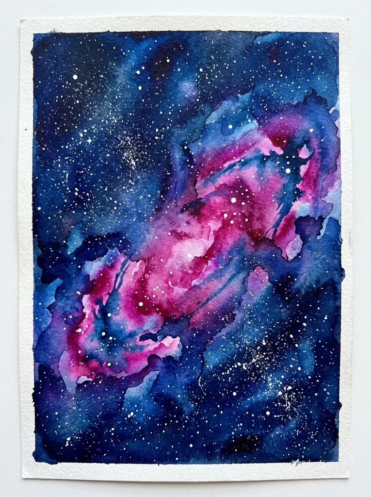
This painting feels like magic the first time it works, because you start with a dark, messy wash and end up with something that looks like deep space. I wet the paper, brushed on indigo and a little violet, then dropped in touches of teal and magenta while everything was still wet, and tilted the board gently so the colours swirled together. The mistake I made at first was adding black too early, which killed all the colour, so now I keep the darkest paint for the very last layer only.
Once the wash is bone dry, I flick tiny white gouache or diluted white paint off a toothbrush for the stars, holding the brush about twenty centimetres above the paper. A few larger dots made with the tip of a brush give the sky depth, and the whole thing takes under an hour including drying time.
4. Simple Monstera & Palm Leaves
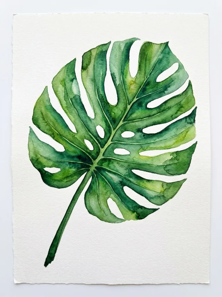
I painted this one after my monstera finally grew a new leaf with proper splits in it, and I wanted to remember that shape on paper. I sketched the leaf lightly in pencil, just the outline and the main slits, then filled it with two greens: a yellow-green wash first, and a deeper sap green on one side once the first layer was dry. Painting the slits after the wash, with the dark green, gave the leaf its shape without me having to cut anything out or paint around tiny gaps.
What helped me most was leaving a thin line of untouched paper along the central vein, which makes the leaf look lit from one side. If your green turns muddy, you are probably mixing too many colours on the paper, so stick to two greens and let them layer instead. I keep the background plain white for this one, because a busy background fights with the bold leaf shapes and makes the whole painting feel crowded.
5. Soft Ombré Mountain Ranges

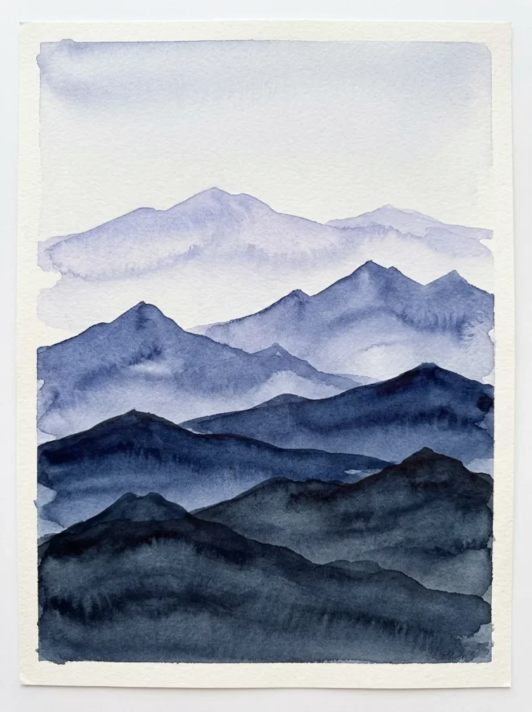
Mountains are a lovely way to learn about layering, because each ridge just needs to be a little darker than the one behind it. I started with the farthest range in a very pale blue-grey wash, let it dry completely, then painted the next ridge slightly darker and lower on the page, and repeated that three or four times. My early versions looked flat because I made all the ridges the same colour, and the painting only gained depth once I really pushed the contrast between the front and back layers.
I use a flat brush for the long, straight-ish edges of the ridges, and I do not worry if the line wobbles a little, since real mountains are not ruler-straight. This one is also a good evening project, because the drying time between layers gives you a natural excuse to step away and make tea.
6. Translucent Watercolor Jellyfish
Jellyfish suit watercolour perfectly because they are mostly water themselves, and a pale wash is exactly what you need. I painted the bell shape with a very diluted rose and peach wash, leaving most of the paper white in the middle so it looks see-through, then added a slightly stronger rim once the first wash had dried. The tentacles came last, drawn with the tip of a thin brush in wavy vertical lines, and I kept them uneven in length because perfectly matched tentacles look like a diagram rather than a creature.
If your jellyfish looks heavy and solid, you used too much pigment, so try mixing your colour with twice as much water as you think you need and test it on scrap paper first. This painting taught me patience more than any other, because every layer needs to be fully dry before the next one goes on.
7. Cheerful Watercolor Citrus Slices
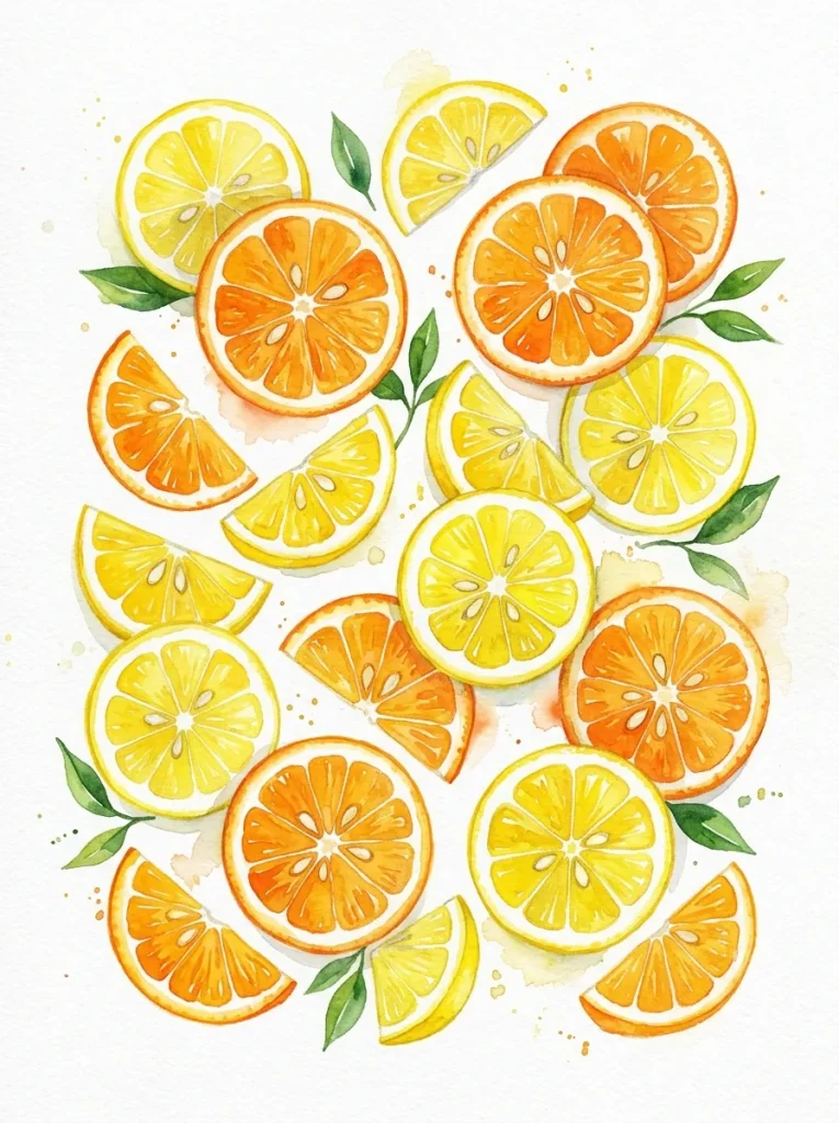
I painted citrus slices on a morning when I had half a lemon left over from baking, and cutting it open gave me the perfect reference right there on the chopping board. I painted the outer rind first in a warm yellow, then the pale pith as a thin white ring left unpainted, and finally the segments in a juicy yellow wash with a few darker lines radiating from the centre. The segments look best when you do not fill them in completely, because those little white gaps read as light bouncing off the fruit.
A small round brush is all you need, and I keep a scrap sheet beside me to test how strong the yellow looks before it touches the real painting. My first lemon looked orange because I added too much warm pigment, so now I start pale and deepen the colour in a second layer if needed. Two or three slices overlapping on the page make a cheerful little composition, and this one dries fast enough to frame the same afternoon.
8. Loose Abstract Watercolor Circles
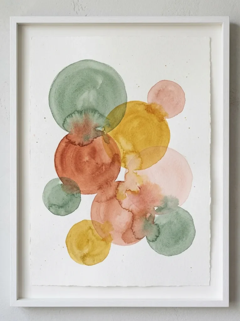
When I am too tired to paint something recognisable, I paint circles, and it is still one of my favourite ways to play with colour. I load a big round brush with a watery colour, touch it to the paper, and let the paint spread into a soft-edged blob, then repeat with a different colour overlapping the first while it is still damp. The colours blend at the edges in ways I could never plan, and that surprise is the whole point, so I try not to fix or tidy the shapes afterwards.
The only rule I give myself is to leave some white space between groups of circles, because a page that is completely covered looks busy rather than calm. I use colours straight from the pan for this, diluted with plenty of water, and I work on cheaper practice paper so I do not feel precious about the result.
9. Snowy Birch Tree Forest
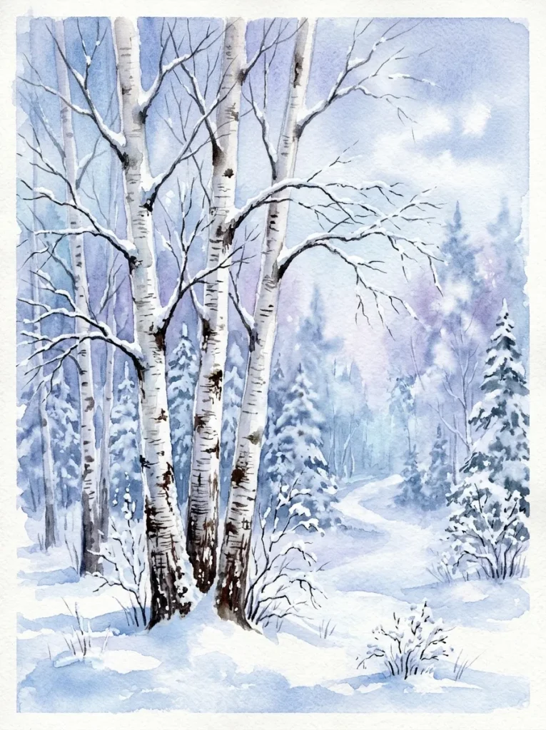
Birch trees are easier than they look, because the white bark does most of the work for you. I painted a pale blue-grey background wash first, with a hint of lavender for the snowy ground, and once it was dry I painted the tree trunks by leaving narrow white strips and shading just one side of each with a light grey. The little black marks on the bark came last, dabbed on with the tip of a fine brush, and I kept them small and scattered rather than drawing neat rows, which would look printed instead of natural.
The trees look best when they vary in width and spacing, with a couple of thin ones leaning slightly, so the forest feels like a real place rather than a fence. I add a few soft shadows on the snow with a very diluted blue, painted while the background is still slightly damp so the edges stay gentle. If the trunks look too stark, a thin wash of warm grey over the whole painting ties everything together without hiding the white bark.
10. Moody Pine Tree Horizon
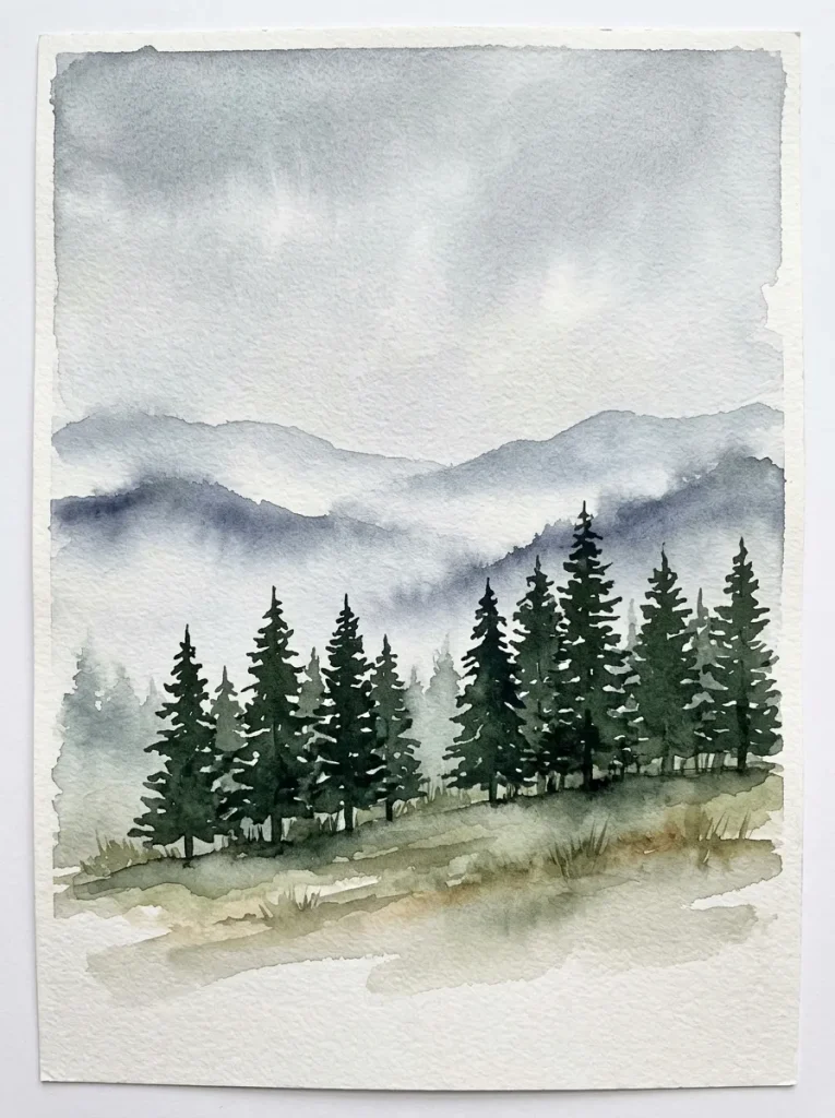
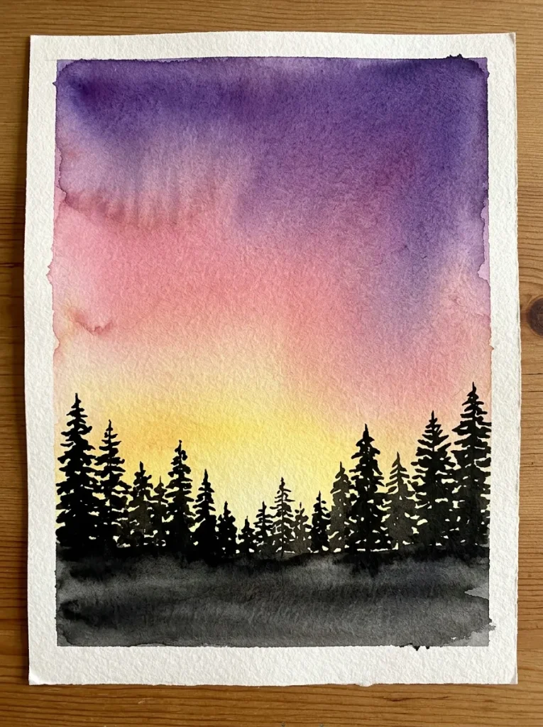
For the last idea I wanted something quieter, a row of dark pines against a misty sky, and it turned out to be the painting I reach for on grey winter afternoons. I washed the sky in pale grey-blue, left a band of white near the horizon for mist, and then painted the tree line in a single dark green-grey, using short downward strokes for the branches. The trees in the distance are just soft triangles, while the ones in front get a few more branch marks, and that simple difference creates all the depth.
I mix my dark green from sap green and a touch of indigo, because straight black-green from the pan looks flat and dull on paper. The biggest mistake here is painting every tree the same height, so I vary them and let one or two stand taller than the rest. Once it is dry, I sometimes add a tiny warm dot of light in one tree, like a distant window, and that one small detail changes the whole mood of the painting.
If you try just one of these ideas this week, start with the one that made you smile when you read it, and give yourself permission to make a messy first version. My kitchen table is still covered in practice sheets that never made it to a frame, and that stack is proof that I learned something from every single one. Watercolour rewards a light hand and a little patience, and the second version is almost always better than the first.