10+ Cohesive Gallery Wall Design Ideas
Gallery walls have become one of the most popular ways to display art, photography, and meaningful items in homes. When curated carefully, a gallery wall can transform a blank wall into a visually captivating focal point. However, designing a gallery wall that feels cohesive rather than cluttered can be challenging. The key to a successful gallery wall lies in balancing variety with harmony—mixing different frames, prints, and objects while maintaining a unified theme, color palette, or style.
Cohesive gallery wall designs allow each piece to shine while contributing to an overall aesthetic that enhances the space. They can suit any room in your home, from living rooms and bedrooms to hallways, offices, or even kitchens. Cohesive walls can reflect personal style, tell a story, or highlight a theme, making them a deeply personal and decorative statement.
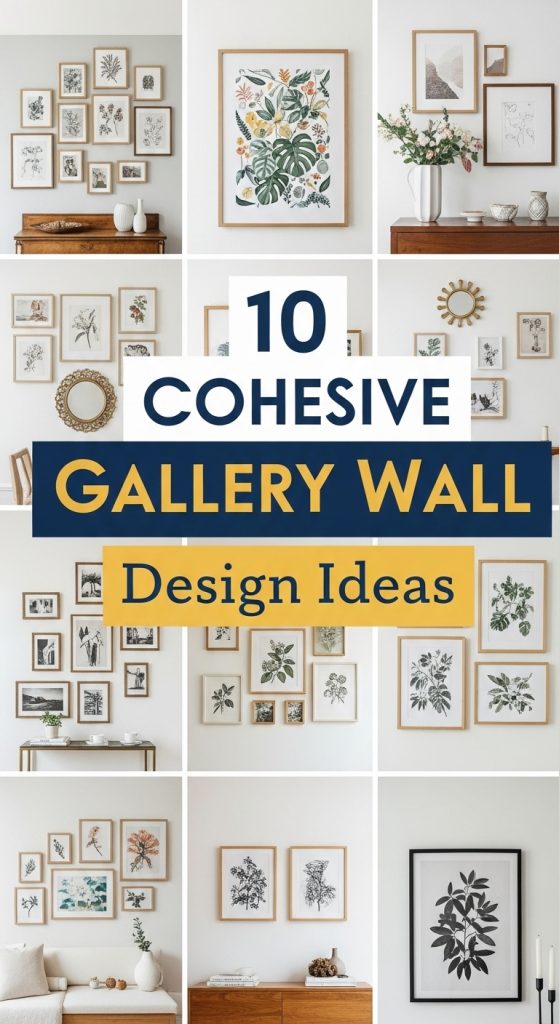
In this guide, we will explore 10 cohesive gallery wall design ideas. Each concept includes tips on selecting prints, arranging frames, choosing a color palette, and incorporating texture and depth. Whether you prefer a minimalist approach, a colorful display, or a vintage-inspired aesthetic, these ideas will help you create gallery walls that are both visually appealing and harmoniously styled.
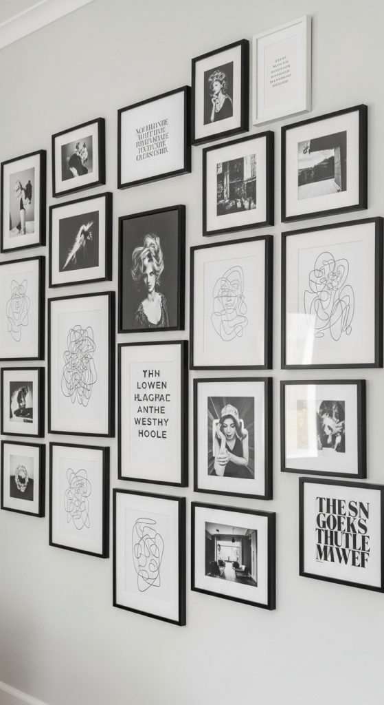
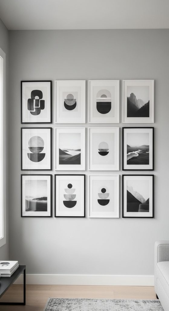
1. Monochrome Masterpiece Wall
Monochrome gallery walls focus on a single color palette, usually black-and-white, to create a sleek and timeless look. This design emphasizes shapes, patterns, and contrasts rather than colors.
Tips:
- Select black-and-white photographs, line drawings, or typography prints.
- Use frames in black, white, or natural wood for uniformity.
- Arrange prints in a symmetrical grid for a structured look or a staggered layout for casual elegance.
- Add subtle textures, like canvas prints or embossed papers, to create depth.
This approach works well in living rooms, bedrooms, or office spaces where sophistication and visual simplicity are desired.
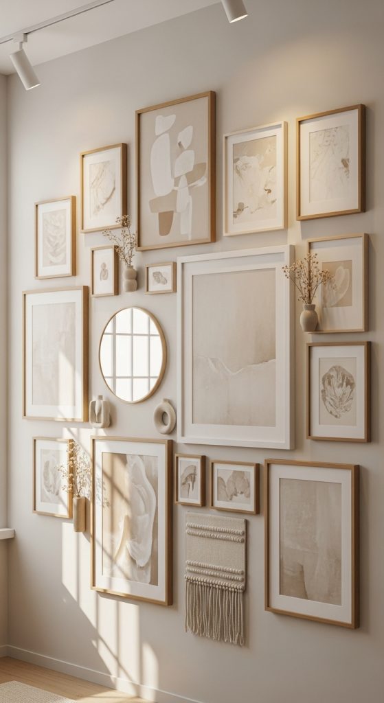
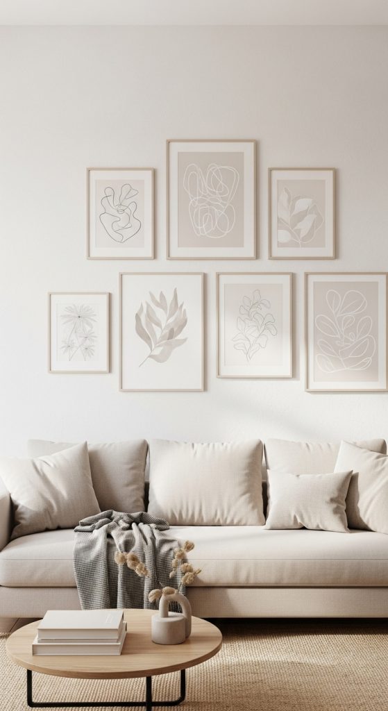
2. Neutral Tone Gallery Wall
Neutral tones create a calming and cohesive gallery wall. Think beige, taupe, cream, and soft gray. Neutral walls allow the artwork to complement each other without overwhelming the space.
Tips:
- Mix prints with muted colors, soft patterns, and organic textures.
- Choose frames in white, wood, or light metallics to maintain harmony.
- Incorporate small decorative objects like dried flowers or simple sculptures.
- Balance wall space with varying frame sizes while keeping colors within the neutral palette.
This wall design is perfect for minimalistic interiors, cozy bedrooms, and calming living spaces.
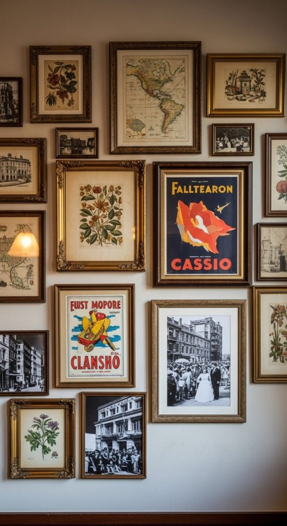
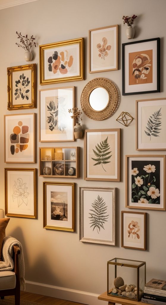
3. Vintage-Inspired Gallery Wall
A cohesive vintage gallery wall combines antique prints, retro posters, and old photographs to create a nostalgic and timeless display.
Tips:
- Choose a consistent frame style or color, such as distressed wood or gold.
- Mix black-and-white photos, botanical prints, maps, and vintage advertisements.
- Arrange frames in a grid or organic cluster to suit the room’s aesthetic.
- Add small vintage objects, like miniature clocks or keys, to enhance the theme.
This design is ideal for living rooms, home libraries, or hallways, offering history and charm in a single wall.
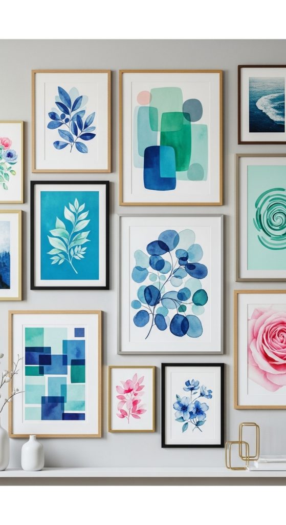
4. Color-Themed Gallery Wall
A color-themed gallery wall uses a consistent color palette to unify various prints and artworks. For instance, all pieces may contain shades of blue, green, or pink.
Tips:
- Choose prints that include the target color, whether in full or as an accent.
- Use frames in complementary colors or a uniform finish to tie the wall together.
- Include varied media: paintings, photographs, typography, or fabric pieces.
- Arrange from largest to smallest or in an alternating pattern for balance.
This approach adds vibrancy while maintaining cohesion, making it suitable for living rooms, kitchens, or creative spaces.
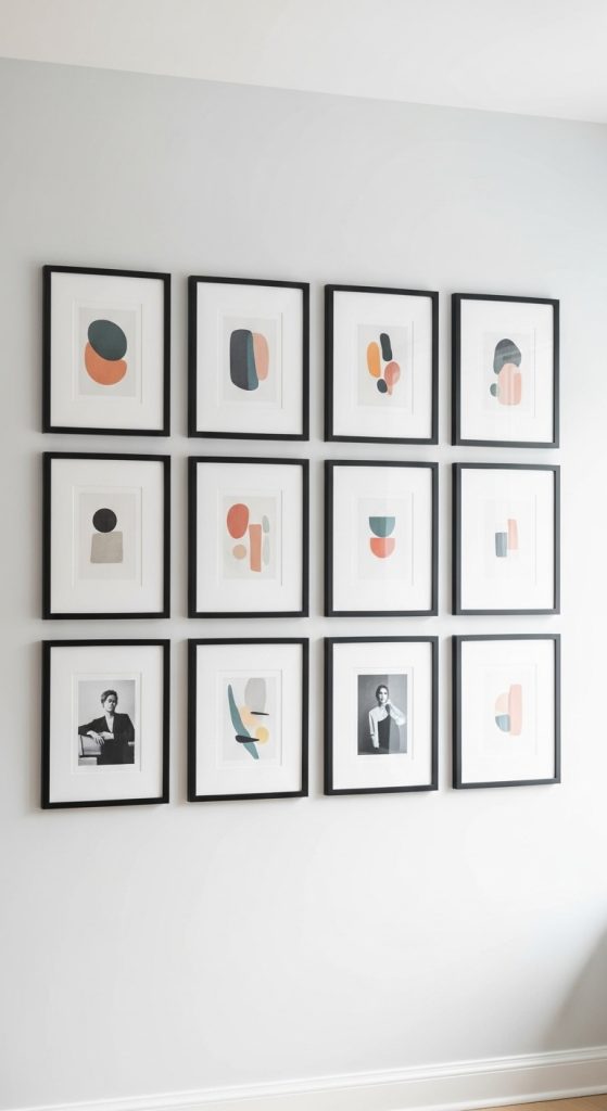
5. Minimalist Grid Layout
Minimalist gallery walls focus on simplicity and symmetry. The grid layout is a classic choice for cohesive design, providing balance and order.
Tips:
- Choose similar-sized prints or frames to maintain symmetry.
- Keep frame styles consistent, preferably black, white, or wood.
- Use a limited color palette or monochromatic prints.
- Maintain even spacing between frames for a polished look.
This style suits modern interiors, offices, and bedrooms, creating a refined and structured focal point.
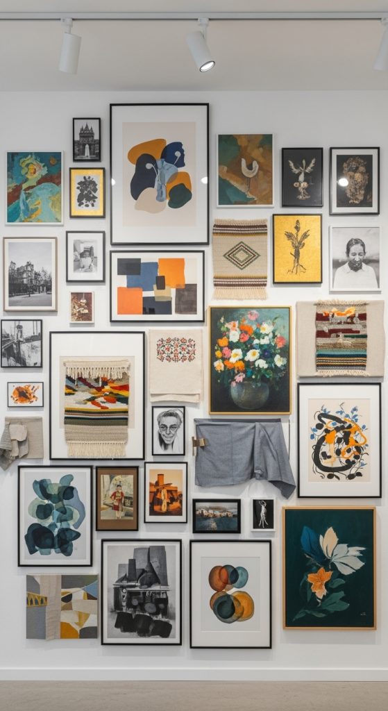
6. Eclectic Yet Cohesive Wall
Eclectic gallery walls combine diverse prints, frames, and objects but maintain cohesion through a consistent theme, color palette, or visual rhythm.
Tips:
- Select a unifying element, such as color, style, or subject matter.
- Mix frames, shapes, and textures, but repeat certain elements to maintain harmony.
- Arrange the wall organically while leaving negative space to prevent clutter.
- Include decorative objects like mirrors, shelves, or small sculptures.
This approach works well in creative spaces, family rooms, or living areas, offering a dynamic yet balanced display.
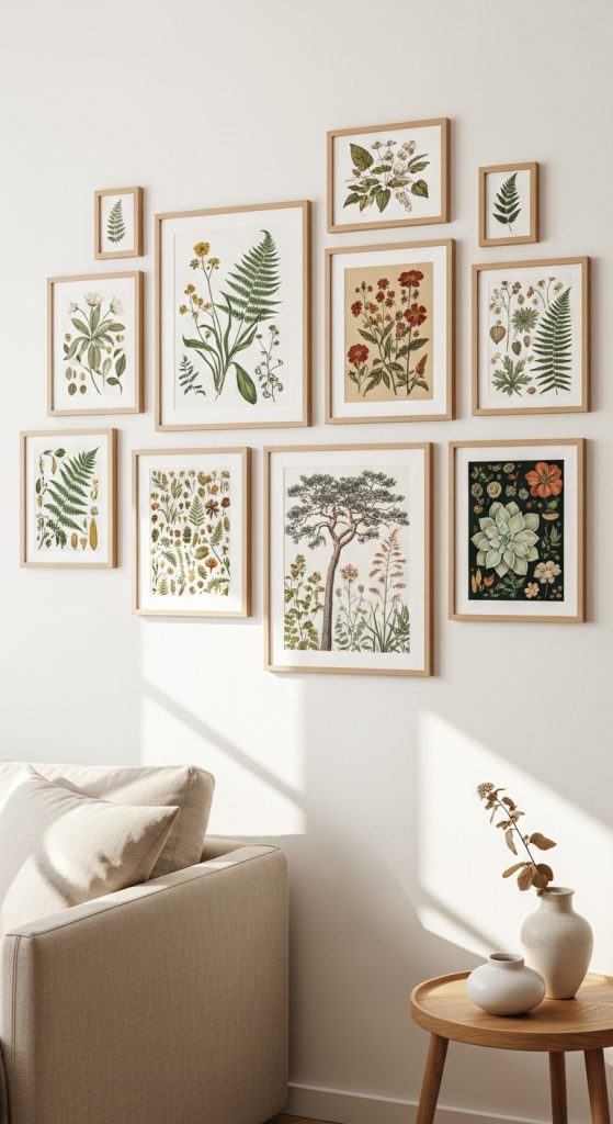
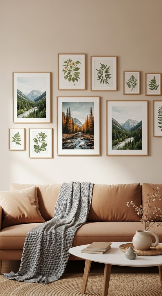
7. Nature and Botanical Gallery Wall
A cohesive gallery wall focused on nature and botanical prints brings organic beauty and calm into a room.
Tips:
- Choose prints of plants, flowers, landscapes, or animals.
- Use earthy tones and soft colors for harmony.
- Select frames in natural wood, white, or muted metallics.
- Arrange in a loose cluster or symmetrical grid, incorporating space for texture variation.
This type of gallery wall is ideal for bedrooms, bathrooms, or living spaces seeking tranquility and visual interest.
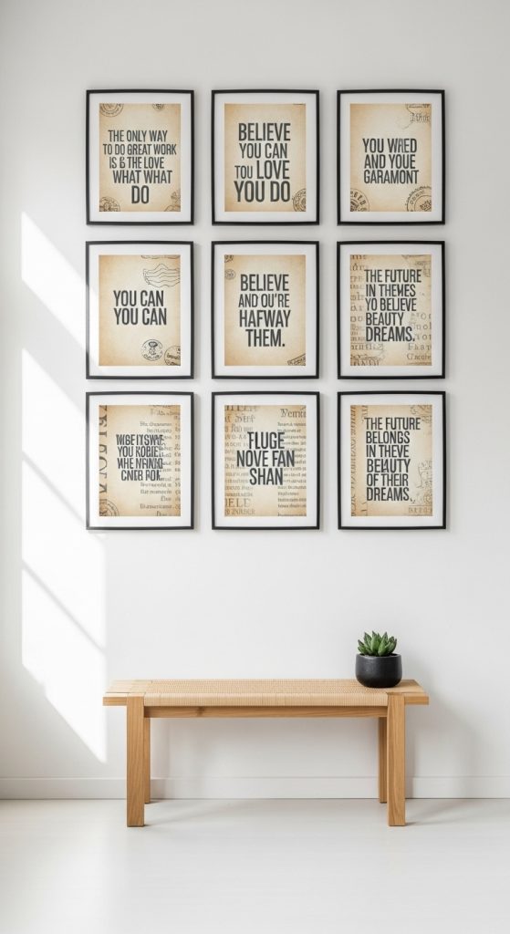
8. Typography and Quote Wall
Typography-focused gallery walls combine inspirational quotes, literary excerpts, or vintage text prints for a cohesive, meaningful display.
Tips:
- Maintain a consistent font style, size, or color scheme.
- Use uniform frames to unify the wall visually.
- Mix different formats (e.g., black-and-white, colored backgrounds) while keeping colors complementary.
- Include minimal decorative objects like small shelves or candles to maintain focus on the typography.
This wall design works perfectly in home offices, libraries, or bedrooms, providing motivation and aesthetic appeal.
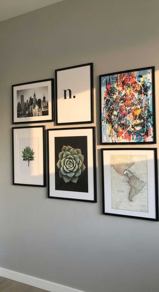
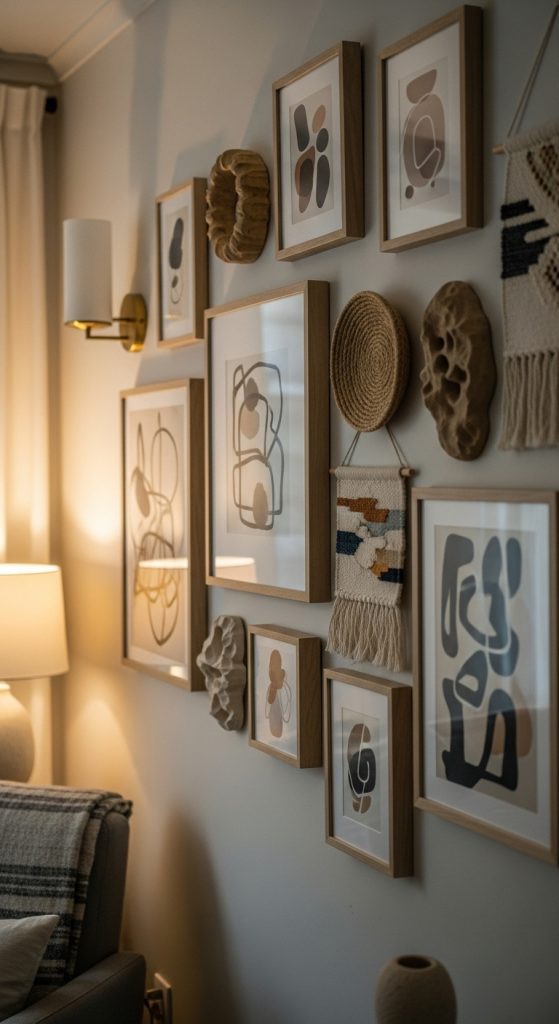
9. Mixed Media Gallery Wall
A cohesive mixed media gallery wall combines photographs, paintings, prints, and even fabric or 3D objects. Cohesion comes from repeating colors, frames, or shapes.
Tips:
- Stick to a consistent color palette to unify varied media.
- Use similar frames or recurring materials for harmony.
- Arrange pieces in clusters or grids with careful spacing.
- Incorporate subtle textures to add depth without overwhelming the eye.
This design is ideal for living rooms, creative studios, or artistic homes, offering layered visual interest.
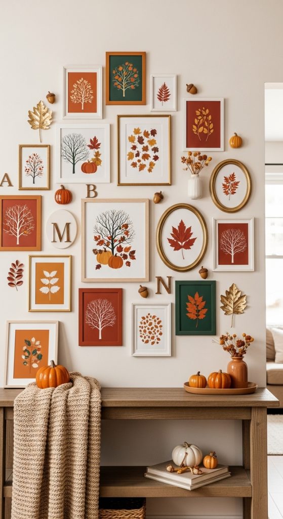
10. Seasonal or Thematic Gallery Wall
A cohesive thematic gallery wall reflects a particular subject or season, creating a focused yet unified display.
Tips:
- Choose a central theme: seasonal imagery, travel, family memories, or hobbies.
- Repeat colors, motifs, or frame styles to tie the wall together.
- Use varying sizes and orientations to add depth and rhythm.
- Include small objects related to the theme to enhance cohesion.
This approach is perfect for hallways, living rooms, or feature walls, allowing personalization while maintaining visual unity.
Cohesive gallery wall designs are a perfect way to combine personal expression with aesthetic harmony. By carefully considering color palettes, frame styles, themes, and layout, you can create walls that are both visually captivating and unified. Whether your preference is monochrome elegance, vibrant color themes, eclectic displays, or vintage nostalgia, there is a gallery wall style to suit every taste and space.
The key to cohesion lies in repetition, balance, and thoughtful selection. By unifying elements like color, frame style, or subject matter, a diverse collection of art and prints can become a polished, meaningful display. Cohesive gallery walls transform ordinary walls into extraordinary spaces, reflecting your personality and enhancing the ambiance of any room.
11. Monochrome Storytelling Gallery Wall: One Color, Many Emotions
A cohesive gallery wall doesn’t begin with frames or layouts—it begins with a feeling. A monochrome storytelling gallery wall uses a single color family to create emotional continuity, allowing many different artworks to coexist without visual chaos. This idea works beautifully when you want your wall to feel calm, intentional, and deeply aesthetic rather than loud or cluttered.
The power of monochrome lies in restraint. When everything speaks the same color language—be it warm beige, soft black-and-white, muted sage, or dusty blush—the eye relaxes. The wall stops feeling like a collection of random pieces and starts feeling like a single visual story unfolding across the surface. Each artwork becomes a sentence; together, they become a paragraph.
What makes this approach Pinterest-worthy is how effortlessly it photographs. There’s no visual noise competing for attention. Instead, texture, composition, and spacing take center stage. Line drawings, abstract shapes, typography, and photography can all coexist as long as they stay loyal to the same tonal family. The result feels modern, emotional, and timeless.
This gallery wall style is especially powerful in small homes or minimalist interiors where too much contrast can feel overwhelming. It creates depth without clutter and personality without distraction. The wall feels curated, not decorated—like someone thought deeply before placing each piece. That sense of intention is exactly what makes people stop scrolling and save.
A monochrome gallery wall also grows well over time. You don’t need to finish it in one day. Because the color palette is controlled, new pieces can be added later without breaking cohesion. It becomes a living wall that evolves with you, while still feeling visually complete.
How to Style / How to Apply
First, choose your dominant color family. This doesn’t mean everything must be the exact same shade, but all tones should feel related. For example, if you choose beige, you can mix cream, sand, taupe, and soft brown. Next, collect artwork before hanging anything. Lay all pieces on the floor and remove anything that visually fights the palette.
Use variation through size and texture, not color. Mix photography with illustrations, soft abstracts with typography. Keep frames either all the same color or within one finish family. When arranging on the wall, start from the center and build outward, keeping spacing consistent. Step back often and adjust until the wall feels balanced, not symmetrical.
Let negative space breathe. A cohesive wall doesn’t need to be dense. Sometimes fewer pieces create a stronger emotional impact.
Materials Used
Monochrome art prints or photos, neutral-toned frames, matte or soft-finish paper, measuring tape, removable wall hooks or nails, level tool, soft pencil for marking layout.
12. Frame-Unity Gallery Wall: Different Art, Same Frame Language
One of the easiest ways to achieve cohesion in a gallery wall is through frame unity. When all frames share the same style, finish, or shape, even wildly different artwork feels connected. This idea is perfect for people who love variety but still want a clean, polished result.
Frame unity creates structure. It acts like a visual container that holds all the art together. Whether you choose thin black frames, warm wooden frames, or soft white ones, consistency here allows your art to breathe. The wall feels curated instead of chaotic.
This style is highly popular on Pinterest because it feels achievable and flexible. You don’t have to limit your art choices—you just need to be disciplined about the frames. Personal photos, abstract prints, vintage illustrations, and quotes can all live together peacefully when framed the same way.
There’s also a quiet sophistication in this approach. The viewer’s eye moves smoothly from piece to piece without being interrupted by clashing borders. The frames disappear slightly, allowing the content to shine. It feels intentional, grown-up, and design-forward.
Frame-unity gallery walls work well in hallways, living rooms, staircases, and bedrooms. They adapt easily to both modern and classic interiors, depending on the frame style you choose.
How to Style / How to Apply
Decide on one frame style before buying anything. Keep the finish, thickness, and shape consistent. Rectangular frames are easiest for cohesion. Once frames are chosen, curate your artwork freely—this is where personality comes in.
Plan the layout on the floor first. Mix sizes, but repeat certain dimensions to create rhythm. On the wall, maintain even spacing between frames to reinforce unity. Avoid mixing frame colors; if you must, keep them within the same tone family.
If the wall feels too rigid, soften it with organic artwork or hand-drawn pieces inside the frames.
Materials Used
Uniform frames (same color and style), assorted art prints and photos, mounting hardware, level tool, measuring tape, layout paper or floor space for planning.
13. Theme-Based Cohesive Gallery Wall: One Story, Many Visuals
A theme-based gallery wall is cohesive because everything answers the same emotional question. Instead of relying on color or frames, this approach uses subject matter to create unity. The wall feels like a story told through different images, styles, and perspectives.
Themes can be subtle or obvious: nature, travel, architecture, faces, line art, typography, or even a feeling like “calm” or “movement.” What matters is clarity. When every piece connects to the same idea, the wall feels intentional even if the visuals vary.
This approach is deeply emotional. A travel-themed wall might remind you of places you love. A nature-focused wall might bring calm into a busy home. Pinterest users are drawn to these walls because they feel personal and meaningful, not just decorative.
The beauty of a theme-based wall is flexibility. You can mix photography with illustrations, old with new, minimal with detailed. As long as the theme is clear, cohesion follows naturally.
How to Style / How to Apply
Define your theme clearly in one sentence before starting. Collect artwork slowly and intentionally. Lay everything out and remove pieces that don’t emotionally fit, even if they look beautiful alone.
Frames can be mixed here, but keep them within a similar scale or tone. Arrange the wall so the eye flows naturally—group similar visuals together. Let one or two anchor pieces lead the composition.
Avoid overcrowding. A themed wall feels strongest when each piece has room to speak.
Materials Used
Theme-aligned art prints or photos, mixed but harmonious frames, mounting tools, layout planning space, soft lighting to enhance mood.
14. Grid-Based Cohesive Gallery Wall: Calm Through Structure
A grid-based gallery wall creates cohesion through order. Clean lines, equal spacing, and repetition bring a sense of calm and balance. This idea is perfect for modern, minimalist, or Scandinavian-inspired homes.
The grid removes guesswork. Every piece feels equal, and the wall feels architectural. Even bold or busy artwork becomes calmer when placed within a strict structure. That contrast—expressive art within a disciplined layout—is what makes this style so striking.
Pinterest loves grid walls because they feel visually satisfying. The symmetry is soothing, the repetition hypnotic. It’s a gallery wall that feels confident and intentional.
How to Style / How to Apply
Choose artwork of the same size or a clearly repeated pattern. Measure carefully before hanging. Use a level and mark all points in advance. Keep spacing exactly equal to maintain visual calm.
Stick to one frame style for best results. Let the grid be the hero; the art supports it.
Materials Used
Same-size frames, uniform artwork, measuring tape, level, pencil, mounting hardware.
15. Soft-Toned Mixed Media Gallery Wall: Cohesion Through Texture
This gallery wall achieves cohesion through texture rather than strict rules. Soft tones connect everything, while mixed media—prints, textiles, small objects—add depth and warmth. The result feels cozy, artistic, and lived-in.
This style is emotionally rich. It feels less like a gallery and more like a personal corner of the home. Pinterest users save these walls because they feel real and inviting, not overly styled.
How to Style / How to Apply
Choose a soft, muted color palette. Mix flat art with small sculptural elements. Keep spacing organic but intentional. Let textures repeat to create rhythm.
Materials Used
Soft-toned art prints, small wall objects, neutral frames, fabric or woven elements, mounting hooks, warm accent lighting.