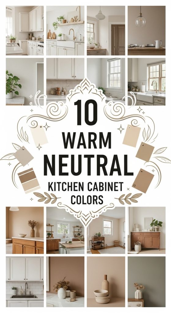
10 Warm Neutral Kitchen Cabinet Colors
When we bought our Munich flat, the kitchen came with cabinets in a shade I can only describe as rental-beige despair — not warm, not intentional, just the color of giving up. We lived with them for two years before I finally snapped, and repainting those cabinets myself (three weekends, one very patient husband, and approximately 9 liters of paint) taught me more about warm neutrals than any showroom ever could. I tested every color on this list either on my own cabinets, on friends’ kitchens I helped with, or on sample boards I taped to my wall and argued with for weeks. Here are the ten warm neutral cabinet colors that actually survived contact with a real kitchen.
1. Soft Cream
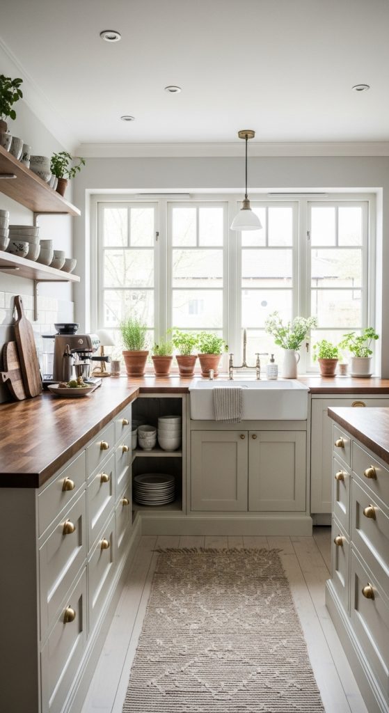
This was my own starting point, because I was too nervous to go dark and too tired of the old beige to stay there. I painted my upper cabinets in a soft cream — warm enough that it never reads as hospital white — and the change was immediate: the kitchen felt bigger, the morning light bounced instead of dying, and my dark oak floor suddenly looked expensive instead of heavy. I paired them with unlacquered brass cup pulls that cost 6 EUR each and have developed the most gorgeous patina after a year of greasy fingers. One thing I learned the hard way: soft cream shows every splash near the stove, so I keep a small bottle of diluted dish soap under the sink and wipe the cabinet fronts while dinner simmers. Two minutes a day, and they still look freshly painted. If your kitchen is small or north-facing, start here — cream is the safest transformation on this list, and I mean that as a compliment.
2. Taupe
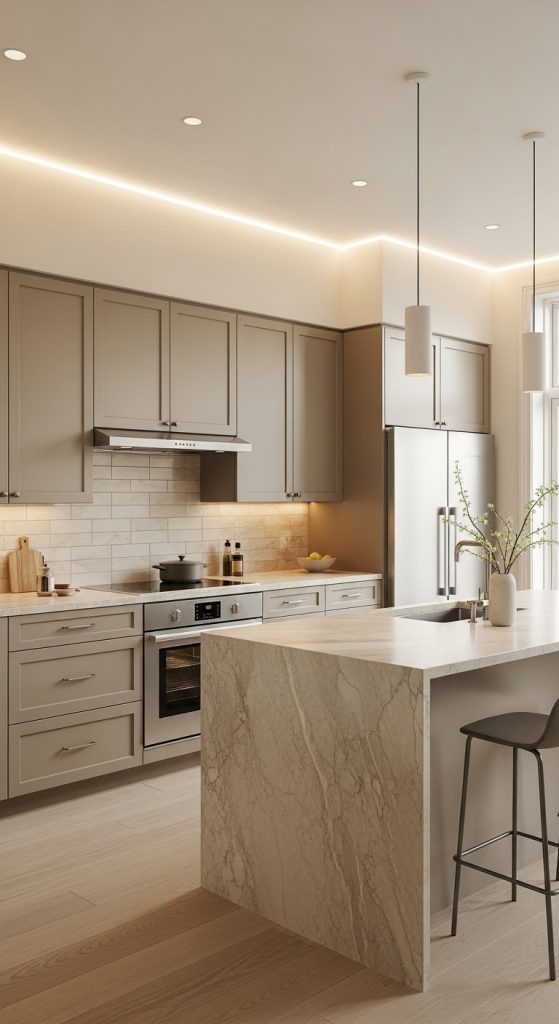
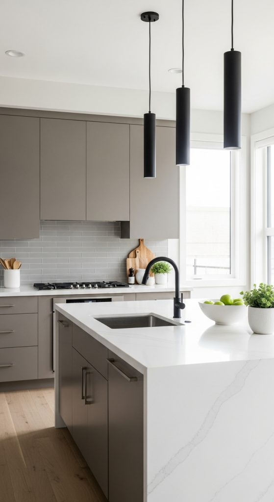
My friend Lena chose taupe for her lower cabinets after months of agonizing between gray and brown, and honestly she ended up with the best of both. The color shifts through the day — warmer in the morning sun, cooler and moodier in the evening — which means the kitchen never looks flat. She paired hers with a white quartz worktop and matte black bar handles, and the combination reads as quietly expensive in a way that cost her about 40 EUR in paint for the whole run of lowers. The mistake she nearly made was picking a taupe with pink undertones from the swatch alone; under her LED spotlights it went mauve at night. We caught it on the sample board stage, which is why I now preach the gospel of taping up a painted A3 card and living with it for a full week before committing. Taupe forgives a lot, but undertones are the one thing you have to check in your own light.
3. Greige (Gray + Beige)
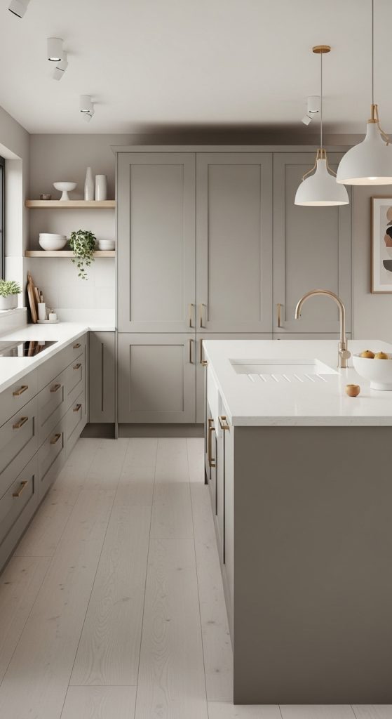
Greige is the color I recommend to anyone who says “I want neutral but not boring,” because it genuinely sits in the sweet spot between warm and cool. I used it on the island in my sister’s kitchen while the perimeter stayed soft cream, and the two-tone effect gave the whole room a designed feel without any actual design budget. The greige we used has a slight green-beige cast that plays beautifully with her oak floor and the brushed-brass tap she splurged on. One practical note from that project: greige is unforgiving of bad prep — every brush mark shows on a mid-tone color, so we sanded between coats with 220-grit and used a foam roller for the flat panels. Three thin coats, not two thick ones. The island gets leaned on, spilled on, and climbed on by a toddler, and eighteen months later it still looks sharp.
4. Warm Beige
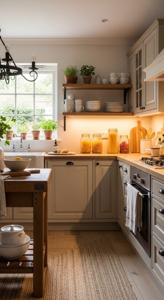
Warm beige gets dismissed as boring, which I think is unfair — done right, it is the color equivalent of a cashmere jumper. My parents’ kitchen went warm beige five years ago, and it is the room in their house where everyone ends up standing with a glass of wine, because the color makes the light feel golden even at 9 pm in November. They paired it with cream stone worktops, antique-bronze knobs, and a terracotta tile backsplash I was skeptical about until I saw it in person. The trick that keeps beige from going flat is texture: their beadboard backs, the woven runner on the floor, the wooden bread box on the counter — all of it gives the eye something to do. My honest warning is about yellowing: cheap beige paints can drift mustard over time near a gas hob, so spend the extra 10 EUR on a quality acrylic eggshell. Theirs hasn’t shifted a shade.
5. Warm Gray
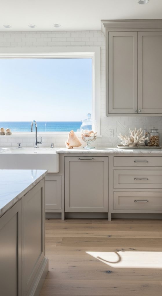
Warm gray is what I suggested to my brother when he wanted modern but was afraid of the cold, blue-gray look that dominated kitchens a few years ago. The version we picked has a distinct brown undertone — hold the swatch next to a true gray and the difference is obvious — and it gave his rental kitchen a calm, tailored feeling without any of the chill. He paired it with white quartz, a white subway tile backsplash, and black hardware, and the whole thing took one long weekend and two tins of paint at 34 EUR each. The thing I like most about warm gray is how it handles clutter: unlike white cabinets, which make every stray mug scream, warm gray absorbs the visual noise of a working kitchen. His counters are never tidy and the room still looks composed. If you cook daily and hate the pressure of a pristine white kitchen, this is your color.
6. Soft Sand
Soft sand is the palest color on this list, and I fell for it in a holiday rental on the Baltic coast where the kitchen felt like being inside a seashell in the best way. I recreated it for a friend’s tiny galley kitchen — barely 6 square meters — and the effect was dramatic: the walls visually receded, the single window’s light doubled, and the room stopped feeling like a corridor. We used a sand with a whisper of pink in it, paired with pale oak open shelves and a Carrara-look laminate worktop that cost a fraction of the real thing. Her one regret is not doing it sooner. My practical tip for pale colors: they need contrast somewhere, or the kitchen dissolves into a beige cloud. We added matte black tap and handles, and that single dark note anchors the whole room. Without it, the sand would have floated away.
7. Charcoal
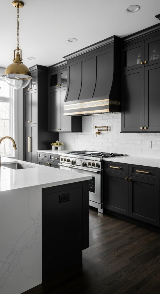
Charcoal was the bravest choice anyone in my circle has made, and it paid off spectacularly — but only because we used it strategically. My friend Jonas painted just his lower cabinets and island in a warm charcoal, keeping the uppers and walls a soft white, and the kitchen went from forgettable to the room everyone photographs. The warmth in the charcoal matters: it has a brown-black base, not blue-black, so it reads as cozy rather than industrial. He paired it with butcher-block worktops and brass hardware, and the contrast is genuinely striking. The honest downside is dust and fingerprints — dark cabinets in a kitchen with a toddler show every smudge, and he wipes the island front weekly. My rule for charcoal: commit to the lower two-thirds only, keep the lighting warm (2700K, never cooler), and make sure you have enough natural light that the room doesn’t cave in after dark.
8. Soft Mocha
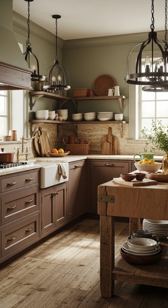
Soft mocha is the color that smells like coffee just looking at it — rich, enveloping, and unapologetically cozy. I helped my aunt paint her farmhouse kitchen cabinets in a soft mocha three years ago, and it remains my favorite transformation because the color does something no pale neutral can: it makes the kitchen feel like an embrace. She paired it with natural wood worktops, a cream Aga-style cooker, and copper pans hung on the wall, and the whole room glows. The key to mocha is balance — we kept her walls a warm white and the backsplash a handmade-look cream tile, so the dark cabinets have light to push against. Without those pale surfaces, mocha can close a room in. She sealed the paint with a matte polyurethane because mocha near a cooker takes a beating, and three years of Sunday roasts later it still wipes clean.
9. Blush Taupe
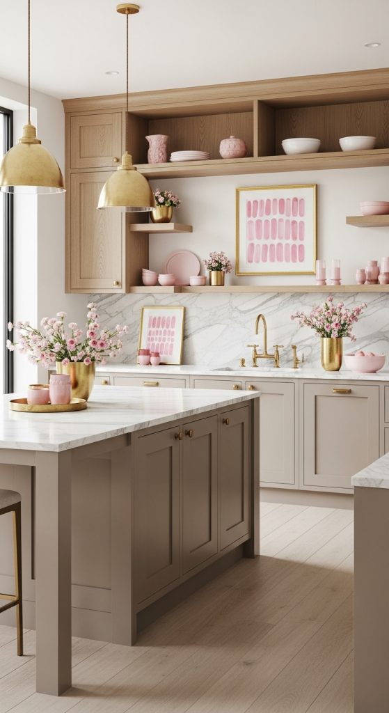
Blush taupe is the wildcard on this list, and I include it because it surprised me. I was helping a friend choose between taupe and greige when the paint-shop assistant slid a blush-taupe swatch across the counter, and in her south-facing kitchen it glowed — warm, soft, with the faintest rosy undertone that made the whole room feel lit from within. She went for it on the full run of cabinets, paired with white marble-look worktops and brushed-gold handles, and the result is elegant without being precious. It is not pink, to be clear — nobody walks in and thinks “pink kitchen” — but it has a warmth that straight taupe lacks. One caution: test it in evening light, because the blush undertone amplifies under warm bulbs, and in a dim kitchen it can drift toward mauve. In a bright kitchen, though, it is quietly magical, and she gets asked about the color constantly.
10. Muted Olive Green
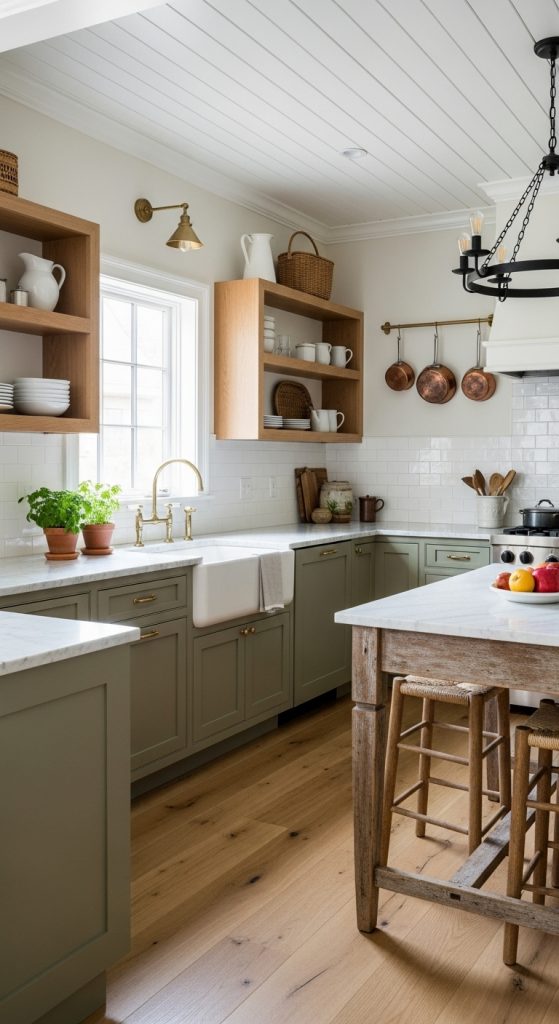
Muted olive green is the color I chose for my own kitchen island last year, after the cream uppers had been in place for a while and I wanted one confident note. It was the right call: the olive grounds the room, ties into the plants on my windowsill, and makes the brass hardware look intentional instead of decorative. I paired it with the existing cream perimeter cabinets, oak worktops, and a simple white tile backsplash. The olive I picked is desaturated — more sage-meets-army than bright green — which keeps it firmly in neutral territory. My practical advice: olive is a commitment color in the sense that it sets the room’s personality, so make sure you love it in all lights before you paint twenty cabinet doors. I lived with a sample board for three weeks. A year in, I still catch myself admiring it while the kettle boils, which is the only review that matters.
Conclusion
Three years after I first picked up a paintbrush in my own kitchen, I have learned that the “right” warm neutral is the one that makes you exhale when you walk in. Start with a sample board, live with it for a week in your own light, and don’t let anyone talk you into a color that doesn’t suit your kitchen’s actual orientation and size. The paint is cheap; the living with it is long.