
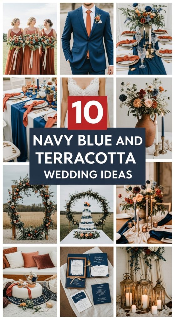
I will be honest: when my friend showed me her navy blue and terracotta mood board two years ago, I was skeptical. A deep, almost stern blue next to a warm, earthy clay? In my head it looked like a paint swatch gone wrong. Then I stood at her ceremony in a converted barn outside Munich, navy ribbons fluttering against terracotta clay pots of marigolds, and I completely got it. This palette has the formal backbone of navy with the sun-warmed softness of terracotta, and it photographs like nothing else. Here are the ten ways I have seen this color scheme done beautifully, from weddings I have styled and ones I have simply attended as a very observant guest.
1. Navy Blue and Terracotta Wedding Invitations
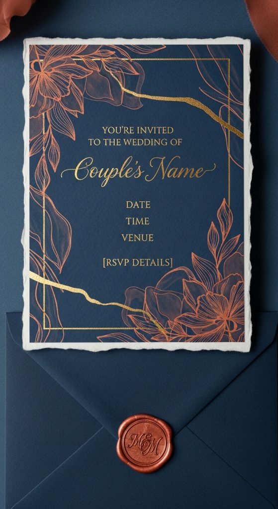
Invitations are the one piece of stationery your guests will actually keep, so I always say they deserve a real budget and a real paper. For this palette, I have seen the prettiest results on thick cotton paper in ivory with the main text in deep navy ink and a loose terracotta watercolor wash along the edges, the kind of organic, slightly imperfect border that no printer can quite fake. A bride I helped last spring ordered hers from a small letterpress studio for about 4 euros a suite, and the tactile quality was immediately obvious the moment people pulled them from the envelope. One detail I loved: she tucked in a tiny sprig of dried rust-colored amaranth behind the invitation card. It cost almost nothing and set the tone better than any “themed” insert card ever could. If letterpress is too steep, a good digital print on 300gsm matte card still reads beautifully, but order a sample first. I learned the hard way that navy can print almost black on cheaper paper, and then your terracotta details get swallowed entirely.
2. Navy Blue and Terracotta Wedding Florals
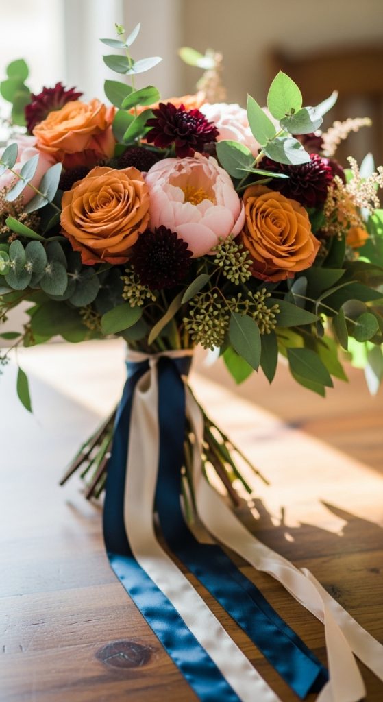
Here is the thing about navy flowers: true blue blooms are rare, so trying to force navy into the florals themselves usually looks artificial. What actually works, and what every florist I have worked with now recommends, is letting terracotta, rust, and peach carry the flowers while navy comes in through ribbon, fabric, and vessel. Think copper-toned garden roses, terracotta dahlia varieties like “Waltzing Matilda,” dried wheat and rust-colored celosia, all tied with wide navy silk ribbon that catches the light. For a late-summer wedding I styled, we used navy-glazed stoneware vases from a local pottery studio at around 12 euros each, and the contrast against warm flowers was genuinely striking. A mistake to avoid: dyed navy flowers from the wholesale market. I once saw a bouquet where the dye bled onto the bride’s white dress the moment it rained. Trust the ribbon. Trust the vases. Let the flowers be the warm part of the story.
3. Navy Blue Bridesmaid Dresses with Terracotta Accents
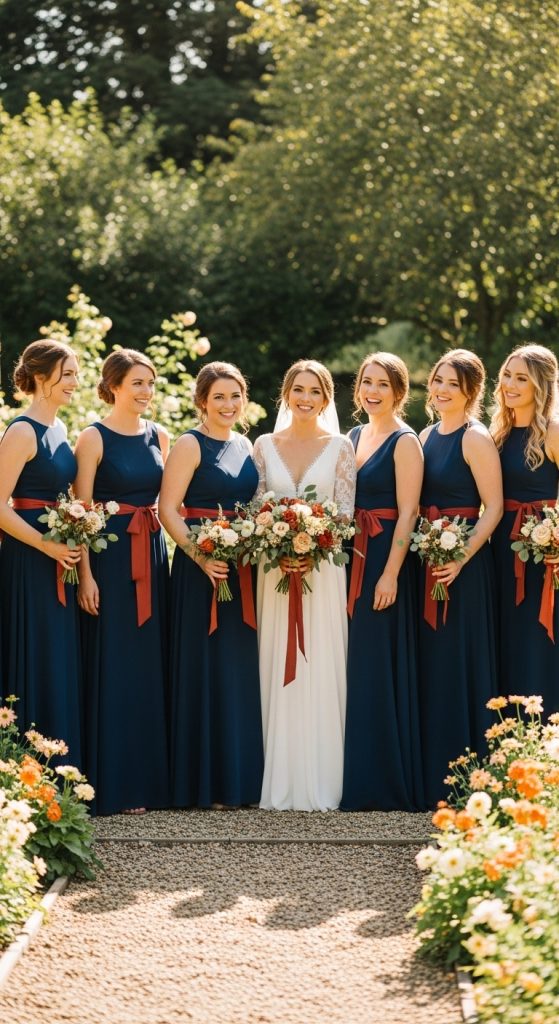
Navy is one of those rare dress colors that flatters basically every skin tone, which is why it keeps winning for bridesmaid dresses, and pairing it with terracotta keeps it from reading as formal corporate wear. I have seen this best when the navy dresses stay simple, floor-length silk or chiffon, and the terracotta shows up in the accessories: rust-colored satin heels, a dried terracotta rose nosegay instead of a full bouquet, terracotta stone earrings. One maid of honor I know went rogue in a full terracotta dress while the others wore navy, and honestly it looked deliberate and gorgeous in photos, a little like a planned color-block. If you go the mixed route, keep the dress fabrics in the same weight so it reads as intentional rather than last-minute. And a practical note from watching bridesmaids struggle: navy chiffon shows every wrinkle. Steam the dresses at the venue, not the morning of at home, because they will crease again in the car.
4. Terracotta and Navy Blue Wedding Cake
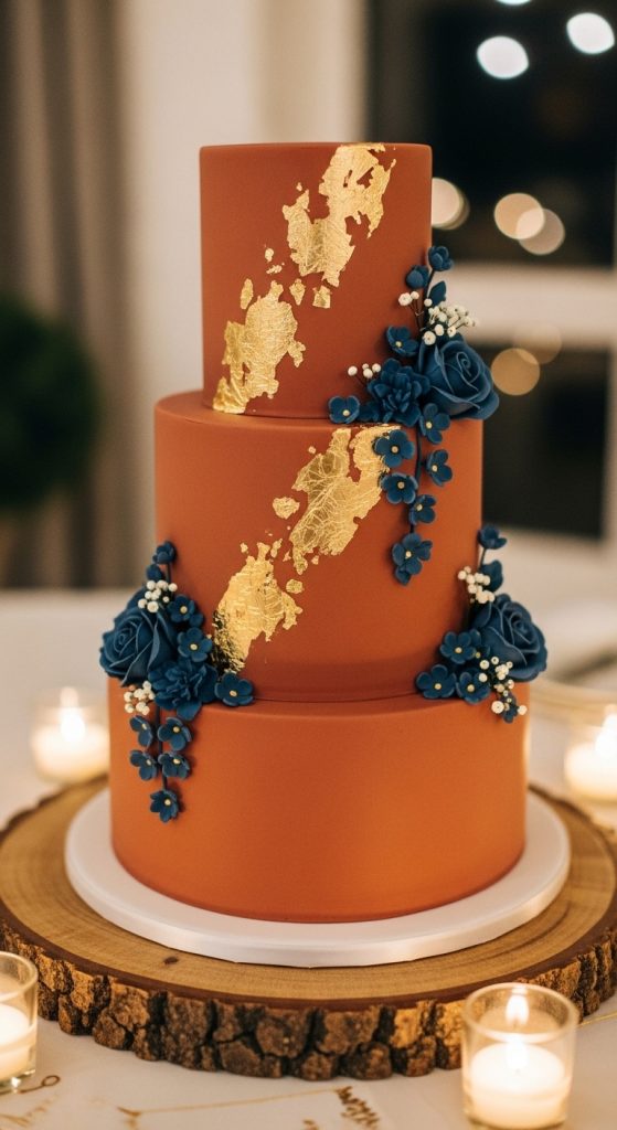
Cake is where this palette gets dramatic in the best way, but it needs a confident baker. The most memorable version I have seen was a three-tier cake with a deep navy bottom tier, a terracotta middle tier, and a top tier in warm ivory, finished with fresh rust-colored roses and a drizzle of gold leaf on the edges. The baker charged about 550 euros for 80 servings, which felt fair for that level of detail. If a full navy cake feels like too much commitment, a cleaner option is a simple ivory cake with terracotta sugar flowers and a hand-painted navy watercolor band around the base, which costs less and still ties the whole dessert table to the palette. I learned something important at one wedding: navy fondant stains. Ask your baker about darker, almost-slate navy rather than true midnight blue, because guests will photograph the cake, and nobody wants blue mouths in the cake-cutting photos. Terracotta, thankfully, photographs like caramel and flatters everyone.
5. Navy Blue and Terracotta Wedding Table Settings
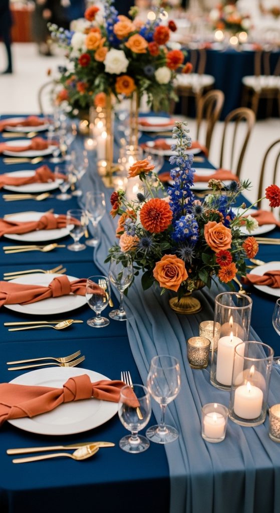
Tablescapes are where I get to be bossy, because this is the part guests stare at for two hours and it matters more than almost any other decor line item. The combination I keep coming back to is a natural linen tablecloth, a navy runner down the center, and terracotta elements layered on top: rust-colored tapered candles in brass holders, terracotta napkins folded over navy charger plates, and place cards in navy ink on cream cotton paper tucked into a sprig of dried flowers. For one wedding we sourced terracotta candleholders from a flea market at about 2 euros apiece, and the mismatched, slightly handmade feel was the detail everyone commented on. One tip from experience: light the room with warm light, not cool white. Cool lighting turns navy cold and clinical and makes terracotta look orange. Warm candlelight does the opposite, it makes the whole table glow, and your photographer’s job becomes ten times easier.
6. Terracotta Wedding Favors with Navy Blue Packaging
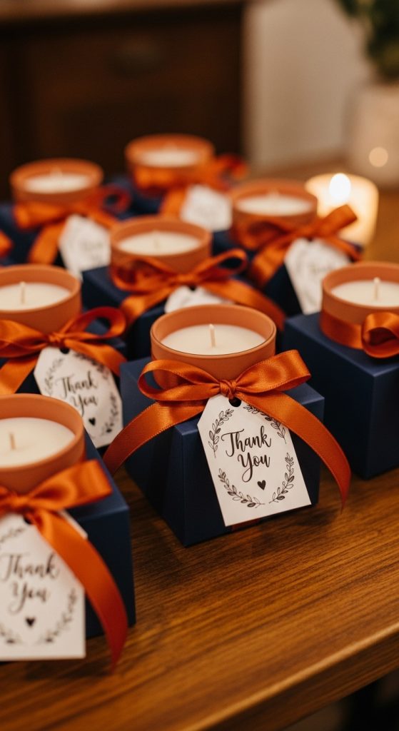
I have a strong opinion about wedding favors: they should be something people actually want, not something they politely carry home and quietly recycle. For this palette, terracotta-colored practical favors in navy packaging hit that sweet spot. Small terracotta pots with a succulent or herb seedling wrapped in navy tissue and tied with twine have been the biggest hit I have seen, and they run about 3 euros each if you order the seedlings in bulk from a local nursery. Terracotta-scented candles, think cedar and amber, in little navy boxes also worked beautifully at an autumn wedding I attended; my candle burned for weeks afterward, which is more than I can say for any sugar almonds I have ever received. Keep the packaging simple and skip the monogrammed tags unless you love them, a plain navy box with a handwritten thank-you note in terracotta ink feels warmer and far more personal than anything engraved.
7. Navy Blue and Terracotta Wedding Ceremony Decor
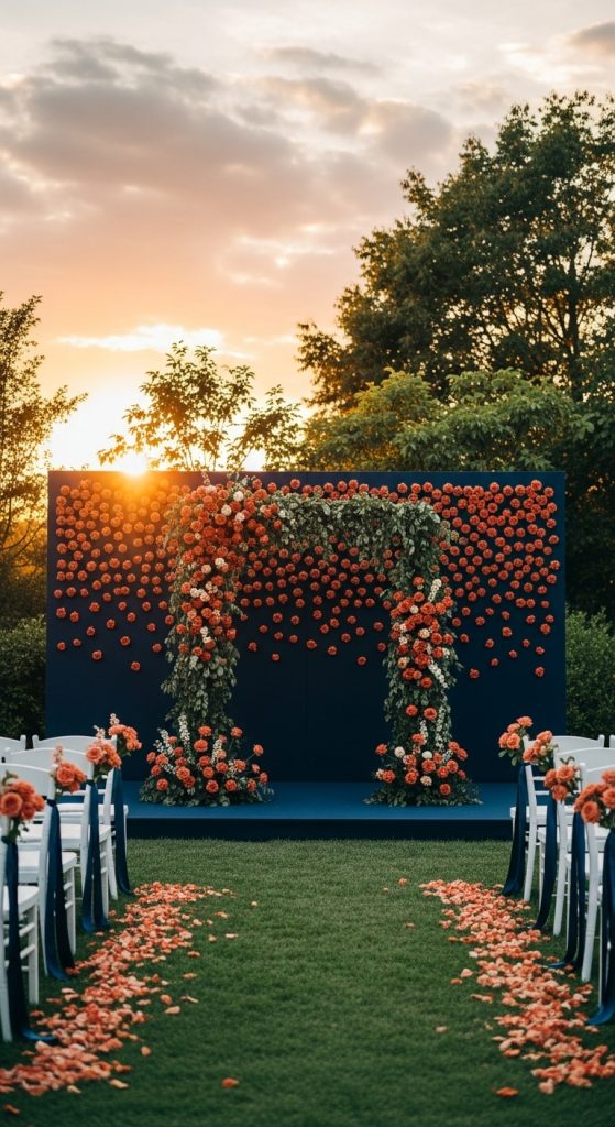
The ceremony is the emotional core of the day, and this palette gives you real drama if you let it. The most moving setup I have seen used a simple navy linen drape as the backdrop, which made the terracotta florals in front of it look almost luminous, like stained glass in warm light. The aisle was lined with terracotta lanterns and small clay pots of marigolds, nothing fussy, nothing that would wilt in the sun. Here is what I would do differently if I planned it again: keep the backdrop fabric matte, never satin, because satin navy photographs with harsh shiny patches that distract from everything else. Also, think about wind. At an outdoor wedding I attended, the lightweight navy drape billowed so dramatically during the vows that the couple’s faces were hidden in half the photos. A heavier linen or secured canvas would have solved it. Ceremony decor does not need to be complicated to be unforgettable; it needs to frame the couple, and this palette does that naturally.
8. Terracotta and Navy Blue Wedding Signage
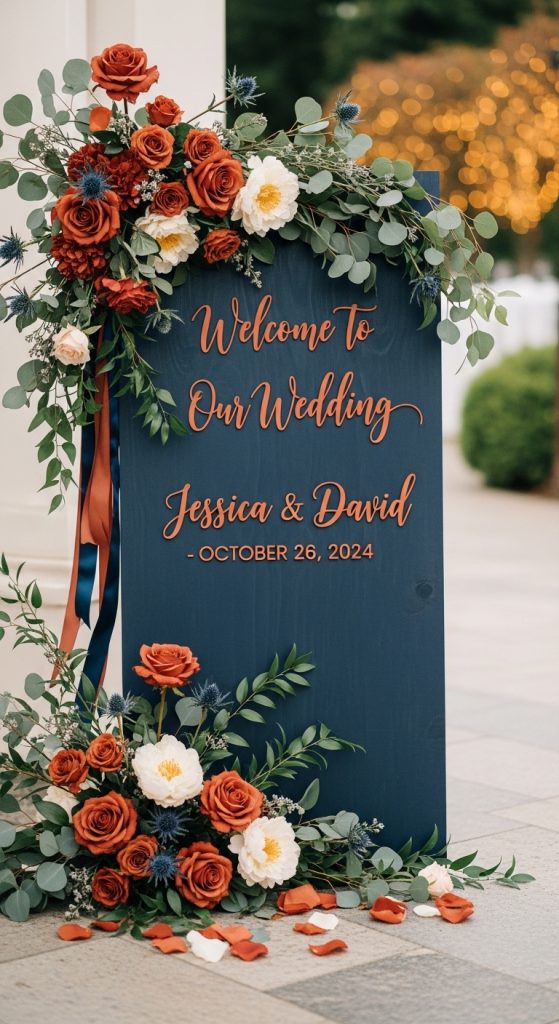
Signage is the unsung workhorse of a wedding, and it is also one of the easiest places to carry your colors through the day. My favorite approach for this palette is navy board signs with hand-lettered terracotta calligraphy in a simple script, framed in warm wood rather than gold, which keeps the whole thing feeling grounded and organic instead of flashy. For a seating chart at a wedding last year, the couple used individual navy cards with terracotta names clipped to a eucalyptus-wrapped frame, and guests actually stopped to photograph it, which tells you everything. If your handwriting is not ceremony-worthy, and mine certainly is not, order lettering from a calligrapher on Etsy or locally; it typically runs 5 to 8 euros per sign, and the difference between decent calligraphy and printed text is visible from across the room. One practical tip: make the text big. I have watched too many guests squint at a beautiful but unreadable bar menu sign, and readability is the whole point.
9. Navy Blue and Terracotta Wedding Shoes
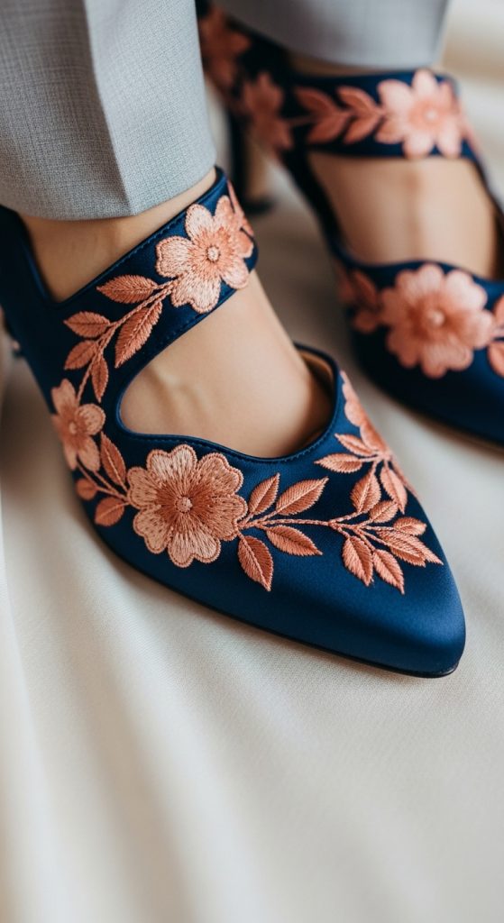
Shoes are the quiet little rebellion in a wedding outfit, and I love when couples let the palette peek out down there. A bride in a classic ivory dress with terracotta suede heels is a look I will never get tired of, partly because she can wear the shoes again, which is the true test of any wedding purchase. For grooms, navy dress shoes with terracotta laces or even just terracotta socks are a wink of a detail that shows up beautifully in photos without looking costume-y. The one thing I would warn against, having seen it go wrong: full navy shoes under a floor-length dress get zero payoff since nobody sees them, so save the color moment for shoes that will actually be visible, or put the budget toward heels you will see in getting-ready photos. And break them in. I once watched a bride switch to hotel slippers before the first dance because her new terracotta heels were merciless. Wear them around the house for two weeks, no exceptions.
10. Navy Blue and Terracotta Wedding Photography
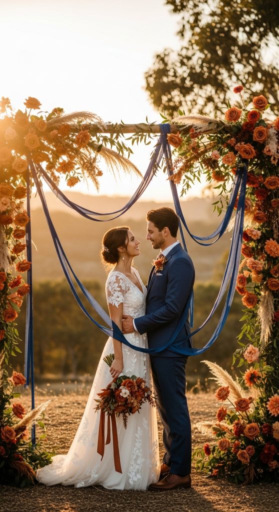
Photographers quietly love this palette because the contrast does half the composition work for them. Terracotta pops against a navy bridesmaid dress in a way that needs no staging, and navy suits photograph with real depth instead of washing out to black, which is the fate of so many dark colors on camera. The one conversation worth having with your photographer beforehand is about white balance in mixed lighting. I have seen photos from a wedding where the reception’s cool LED lights turned the terracotta centerpieces a flat orange and the navy napkins went nearly black, and it took the photographer a lot of editing to rescue them. Ask them to shoot a few test frames during setup, when the candles are lit, so they can dial in the warmth. And schedule at least twenty minutes of couple portraits in natural light if you can, because daylight is where these two colors truly sing together, the navy deep and rich, the terracotta glowing like late afternoon sun.
Conclusion
What I keep returning to about navy blue and terracotta is that it never feels like a trend, it feels like a decision, a couple who knew exactly the atmosphere they wanted and committed to it. If you are drawn to this palette, lean all the way in. Let the navy be deep and confident, let the terracotta be warm and a little wild, and do not let anyone talk you into softening it with blush. This is one of those rare color schemes that works in a barn, a ballroom, and a backyard, and I have seen it done beautifully in all three.