10 minimalist reading corner designs
My reading corner started as a guilty compromise. Our Munich flat has no spare room, and the living room was already full, so I wedged a worn armchair into the corner by the window and promised myself it would be temporary. Three years later, that corner is the only piece of furniture in the flat I would rescue in a fire. I have tried six different setups there — everything from a designer-looking bucket chair that looked like it was digesting me, to a floor-cushion arrangement that ended with my back filing a formal complaint. Somewhere between the experiments I figured out that a minimalist reading corner is not about owning less. It is about every object earning its place. These are the ten setups that genuinely worked for me or for friends whose corners I have since shamelessly copied.
1. Neutral Palette Perfection
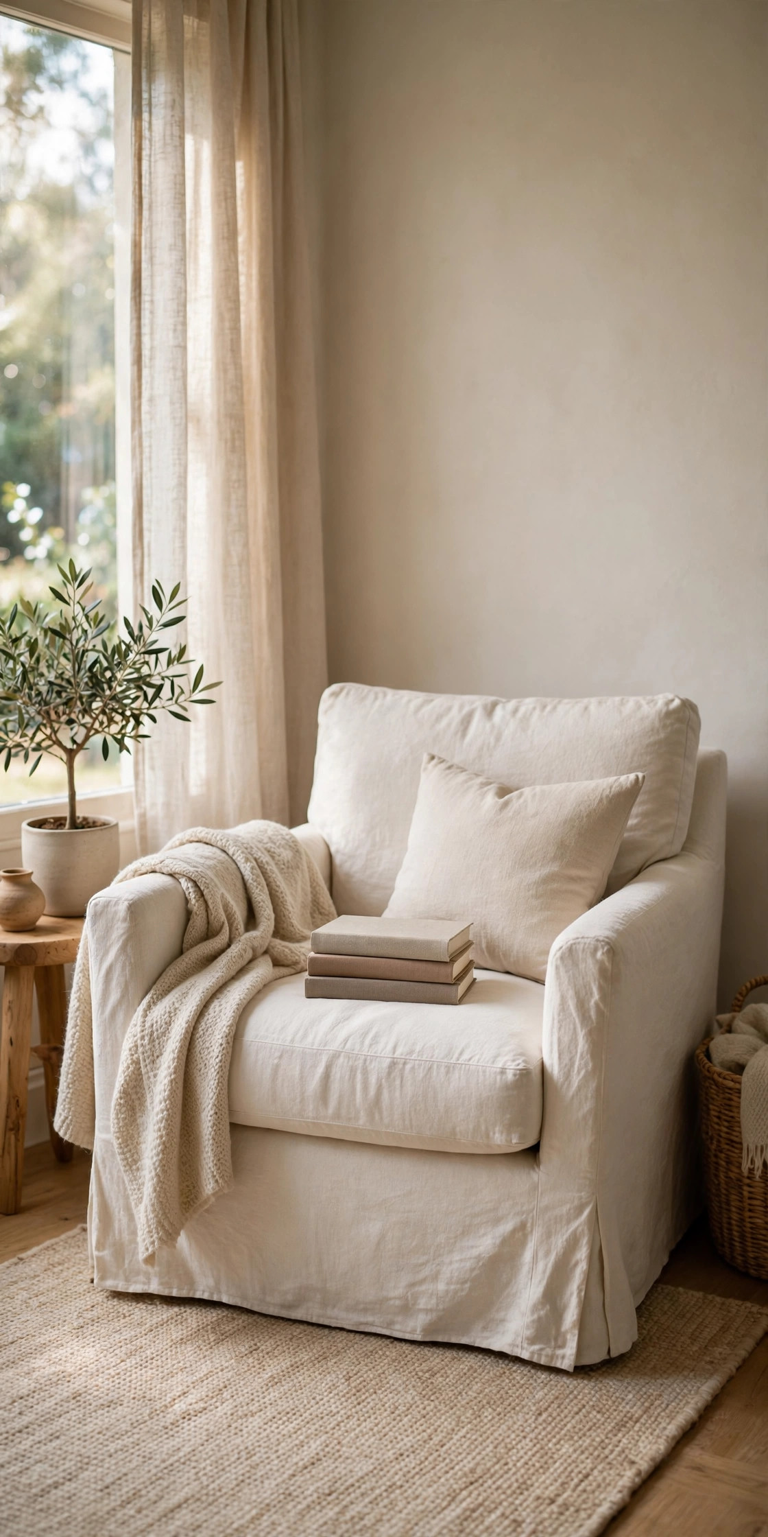
The first corner I built properly was all cream, beige, and soft grey, and I will defend this look against anyone who calls it boring. I bought a linen-upholstered armchair in off-white for around €180 from a secondhand shop — new it would have been closer to €450 — and paired it with a 120×170 cm jute rug I found at a market for €60. The real lesson was the light: my west-facing window gives about 800 to 1,000 lux of daylight on a decent afternoon, and with gauzy white curtains it spreads softly instead of glaring on pages. I added a slim oak side table and a floating shelf above the chair holding just six books, no more, because the moment the shelf overflows the whole corner stops feeling calm and starts feeling like a library sale. The neutral scheme hides dust between cleanings, which is my kind of practical, and it works in the smallest corner because there are no visual borders breaking up the space. If you try one thing from this list, try the restraint first — it costs nothing.
2. Scandinavian-Inspired Simplicity
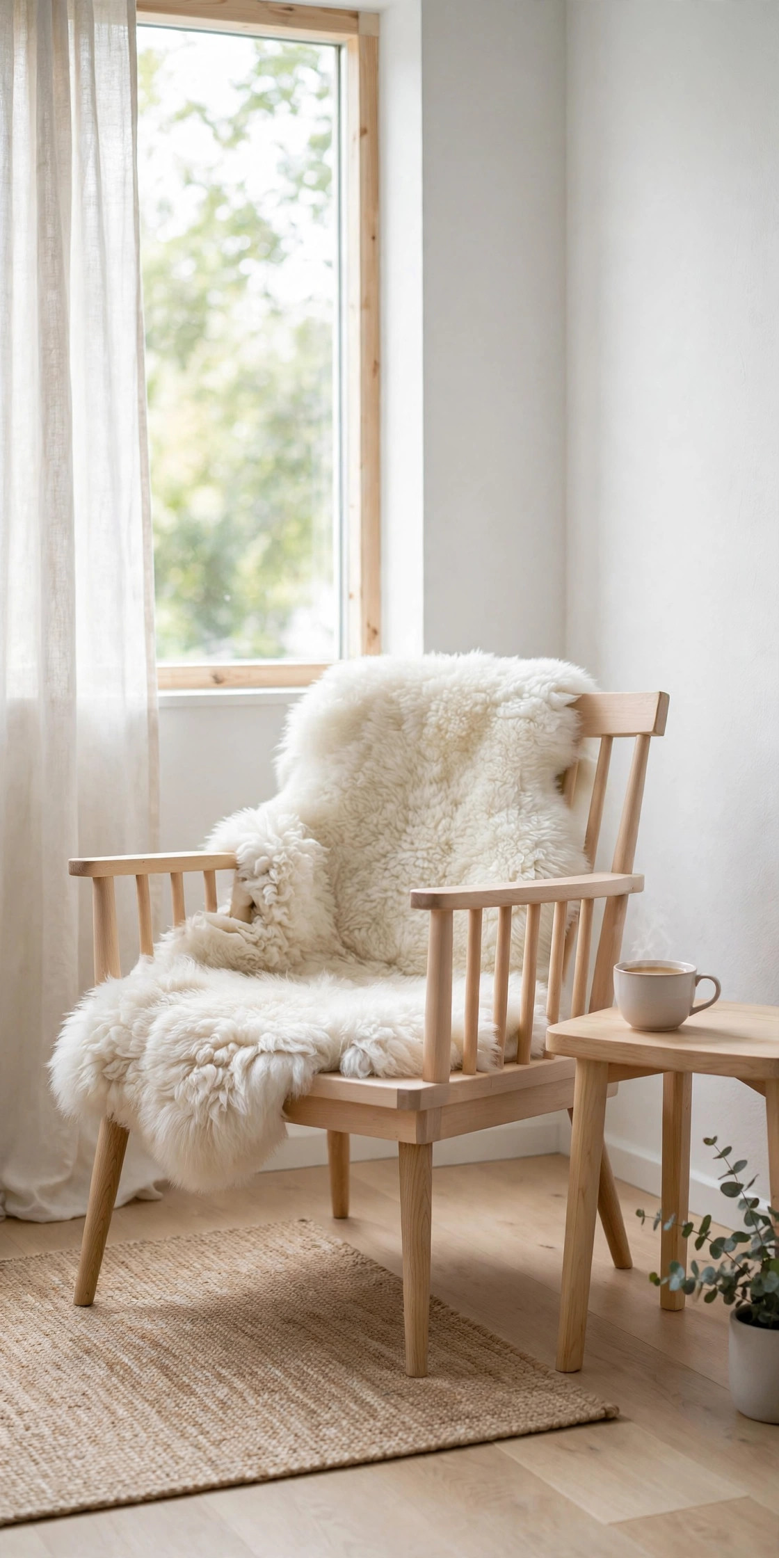
Living near enough to Scandinavia that I can fake a cultural connection, I went through a heavy hygge phase and built the reading corner of a thousand Danish design blogs. The chair was the splurge: a tapered-leg armchair in pale grey with a proper sprung seat, roughly €520, which still hurts less than the chiropractor would have. Beside it I put a floor lamp with a warm 2700 Kelvin bulb — anything above 3000K makes me feel like I am reading in an office — and threw a genuine sheepskin over the seat for winter, about €45 from a Christmas market. The shelves were the smart part: one long floating shelf in light ash, 140 cm wide, mounted at chest height when seated so the books are genuinely reachable. I kept it to one shelf instead of a bookcase, and that single decision is what keeps the corner airy instead of cluttered. The Danish have a word for the feeling this creates, but honestly, the word I use is “done.”
3. Bohemian-Minimalist Fusion
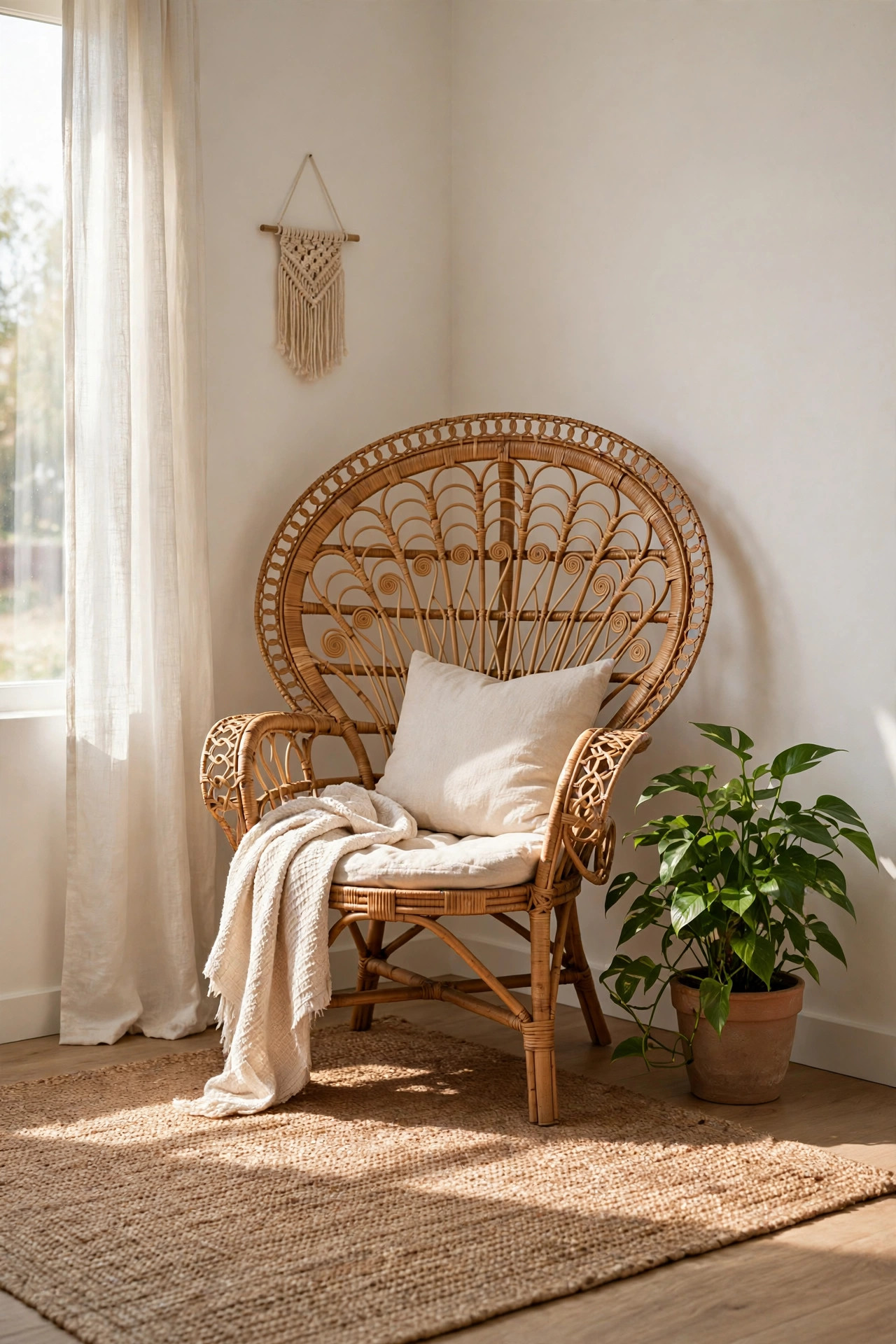
This one sounds like a contradiction and it is, but it is the corner my friend Marta built in her shared flat and I have been low-key jealous of it ever since. The anchor is a low rattan peacock-style chair — she paid €120 for it at a flea market in Giesing, and the slight creak when you sit down is part of the charm. She kept the minimalism by limiting herself to one pattern: a single macramé wall hanging behind the chair, nothing else on the walls. Around it, earthy tones do the work — a terracotta throw, one sage cushion, a jute basket for the current book stack. Her rule, which I have adopted, is the “three textures maximum” rule: rattan, cotton, and clay, and if something new comes in, something old goes out. She hung a paper lantern light above it for about €25, and in the evening the whole corner glows honey-coloured. It is proof that minimalism does not have to mean white-on-white-on-grey.
4. Industrial Edge with Minimalist Lines
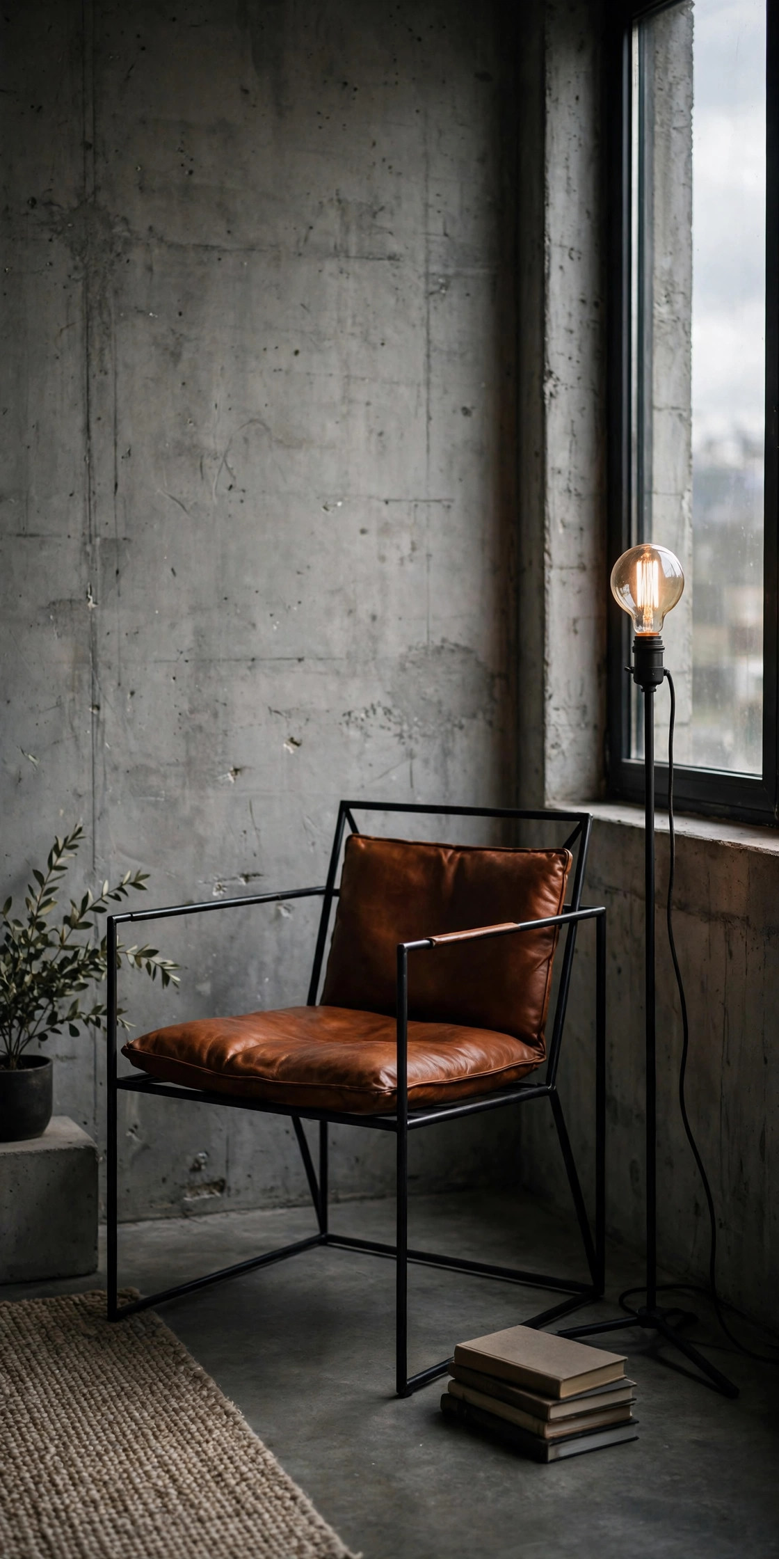
My brother built this corner in his Leipzig loft and I would have called it a cliché if it did not work so well. The base is a black metal-frame armchair with a cognac leather seat — his cost about €380 — set against a wall of bare plaster he deliberately never painted. The shelf is industrial-plumbing-pipe construction: two flanges, one horizontal pipe, a stained pine board, maybe €40 in hardware-store parts and an afternoon of work. Lighting is a black wall sconce with a narrow beam aimed at the page, which gives a dramatic pool of warm light and makes the rest of the corner fade into shadow — very cosy in winter, slightly theatrical all year. The palette is charcoal, slate, and black, and the only thing soft in the whole setup is the wool throw on the chair, which honestly carries the comfort burden single-handedly. I learned from him that industrial minimalism only works if at least one thing is soft, otherwise you end up reading in a sculpture gallery.
5. Window Alcove Oasis
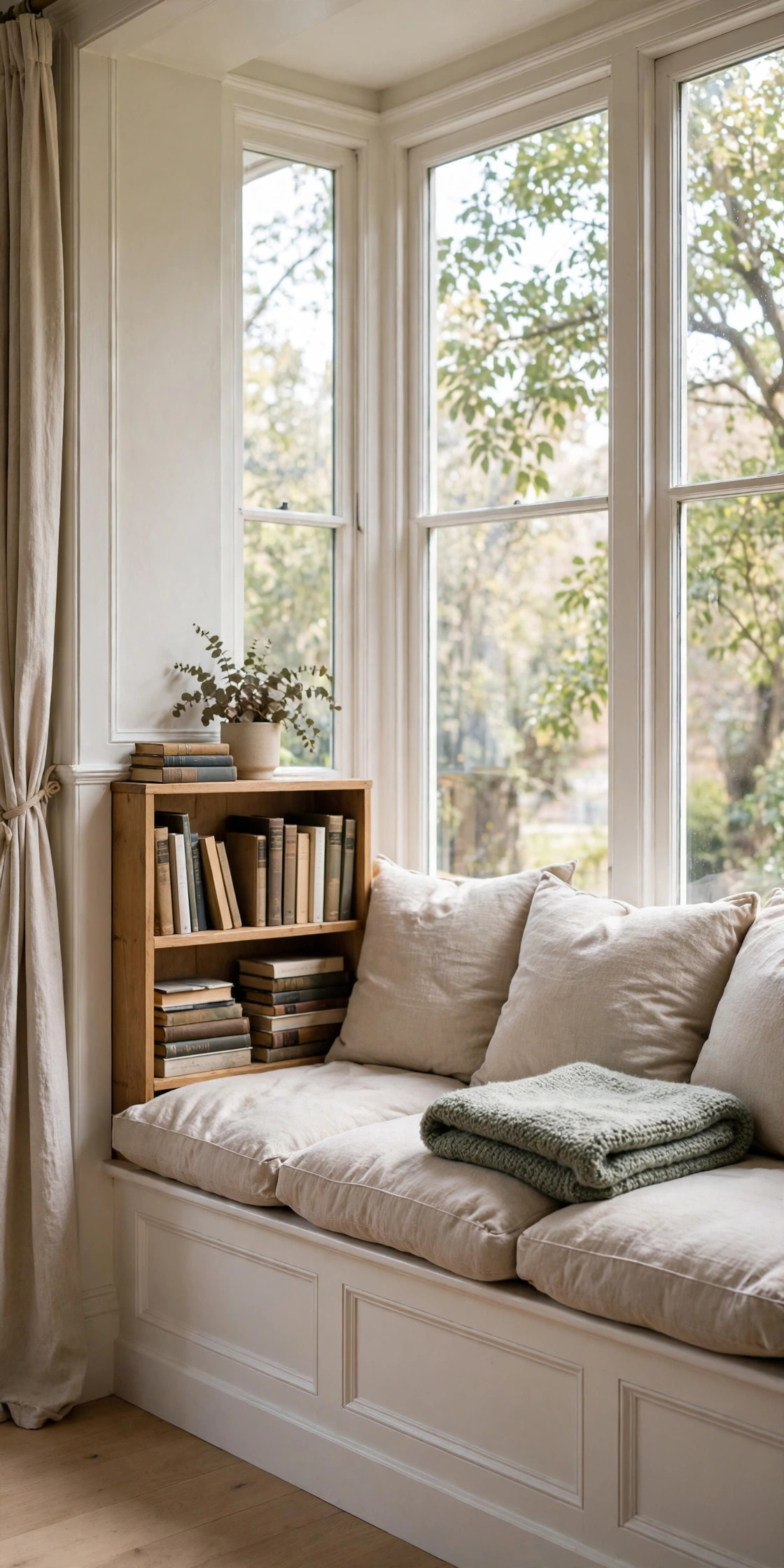
This is the setup I have now, and the one I recommend to anyone who says they have no room for a reading corner. Our flat has a deep window sill — about 45 cm — and I built a bench across it with a custom foam cushion covered in washable white canvas for €70 at a tailor on Fraunhoferstraße. Above it, two floor-to-ceiling shelves that my husband insisted were overkill and which now hold 90% of our books. Sheer white curtains diffuse the daylight so I can read until dusk without squinting, and a small tray table beside the bench holds the essentials: reading lamp, tea, the inevitable second book I pretend I am not also reading. The genius of the alcove is that it uses space the flat was wasting anyway — it added zero footprint to the room. If your flat has one deep window and one narrow wall, you have a reading corner. You just do not know it yet.
6. Monochrome Meditation Corner
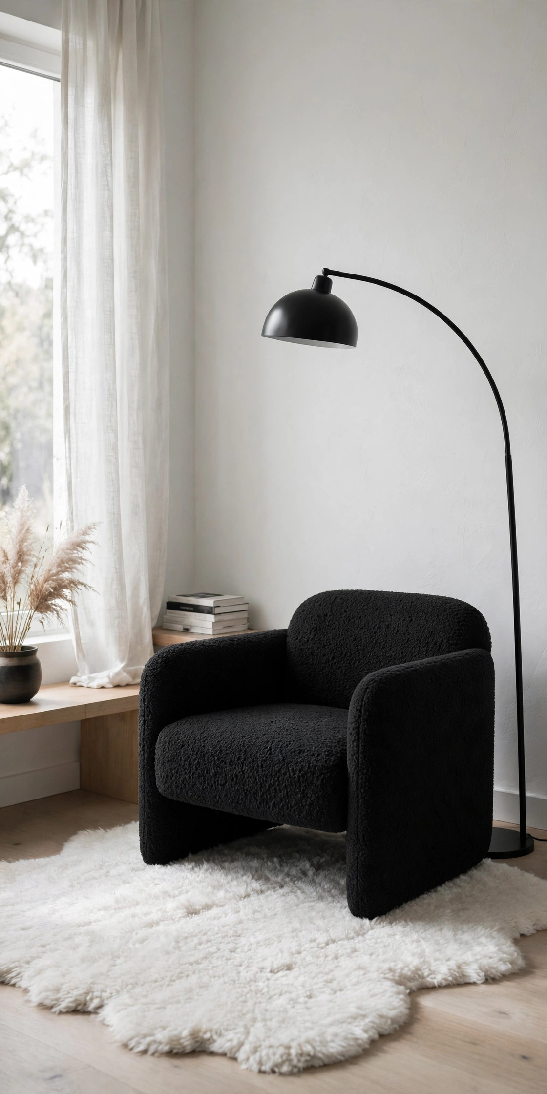
After years of neutrals, I briefly went full black-and-white and I am not ashamed of how dramatic it felt. The chair was a secondhand Eames-style lounger in black leather — €250, my best flea-market negotiation — on a white 160×230 cm shag rug that I vacuum obsessively. The shelf is a black geometric cube holding a row of spines sorted in monochrome order, which visitors assume is a design statement and I must confess is mostly because colourful spines would have broken the illusion. A framed black line-art print above the chair and a matte-black arc floor lamp with a 2700K bulb complete it. The strict palette makes the corner feel like a separate room even though it is three metres from the sofa, and I found myself sitting down with my book far more often when the spot felt intentional instead of accidental. The maintenance warning: black leather shows every crumb and the white rug is a full-time job. Nothing in life is free.
7. Compact Floor-Level Lounge
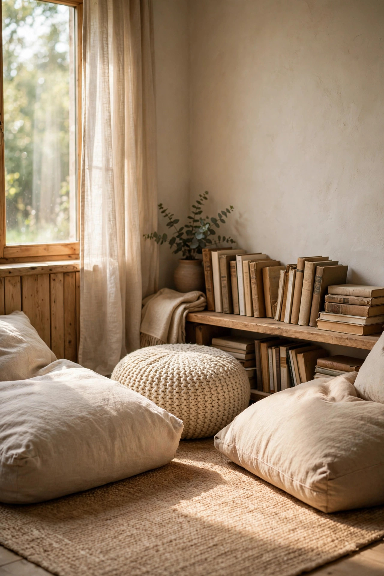
When my daughter was small, the low reading nook in her room doubled as my spot during long bedtime negotiations, and I learned that floor-level reading has a real charm when done properly. The base is a proper zabuton cushion — the thick Japanese floor cushion, 60×60 cm, about €55 — on a low rug, with a slatted wood screen behind it that separates the spot from the rest of the room without blocking light. Books go on a wall-mounted shelf at floor-sitting height, which sounds obvious but took me three tries to get right. A small bamboo mat tray holds tea, because you will knock things over, and a string of warm LED lights along the shelf edge gives about 200 lux at page level — enough for reading without glare. The whole arrangement packs away in ten minutes when guests come, which is the actual superpower of floor seating. My back eventually vetoed this as my main setup, but for kids and flexible flats it is hard to beat.
8. Modern Farmhouse Retreat
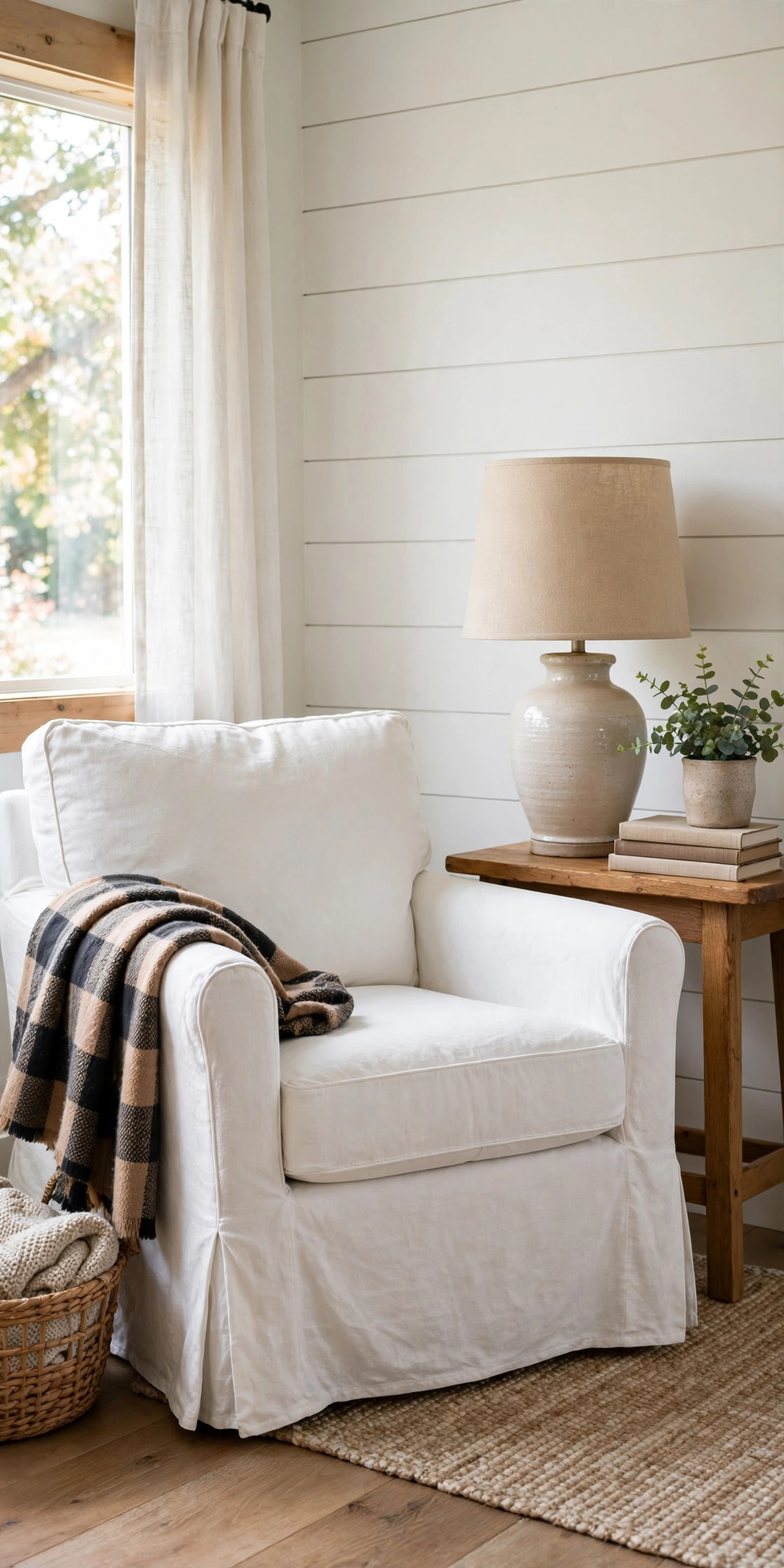
My aunt’s farmhouse in the Allgäu has the kind of reading spot that makes city minimalists weep, and when I redecorated my corner two summers ago I stole the recipe. The chair is a simple Shaker-style wooden armchair — clean lines, no ornament, about €230 from a carpentry shop — topped with two linen pillows in oat and moss. Behind it leans a distressed ladder shelf in whitewashed pine holding books and one terracotta pot of lavender that has survived two years through sheer stubbornness. The wall art is a single framed botanical print, and the pendant above is a wrought-iron lantern with a warm filament bulb. Farmhouse minimalism is a tightrope: too much rustic and it is a theme restaurant, too little and it is just a wooden chair. My rule is one weathered piece per corner — the ladder shelf is mine — and everything else clean and plain. It smells of wood and lavender when the sun hits it, and that is worth more than any design rule.
9. High-Tech Minimalist Hub
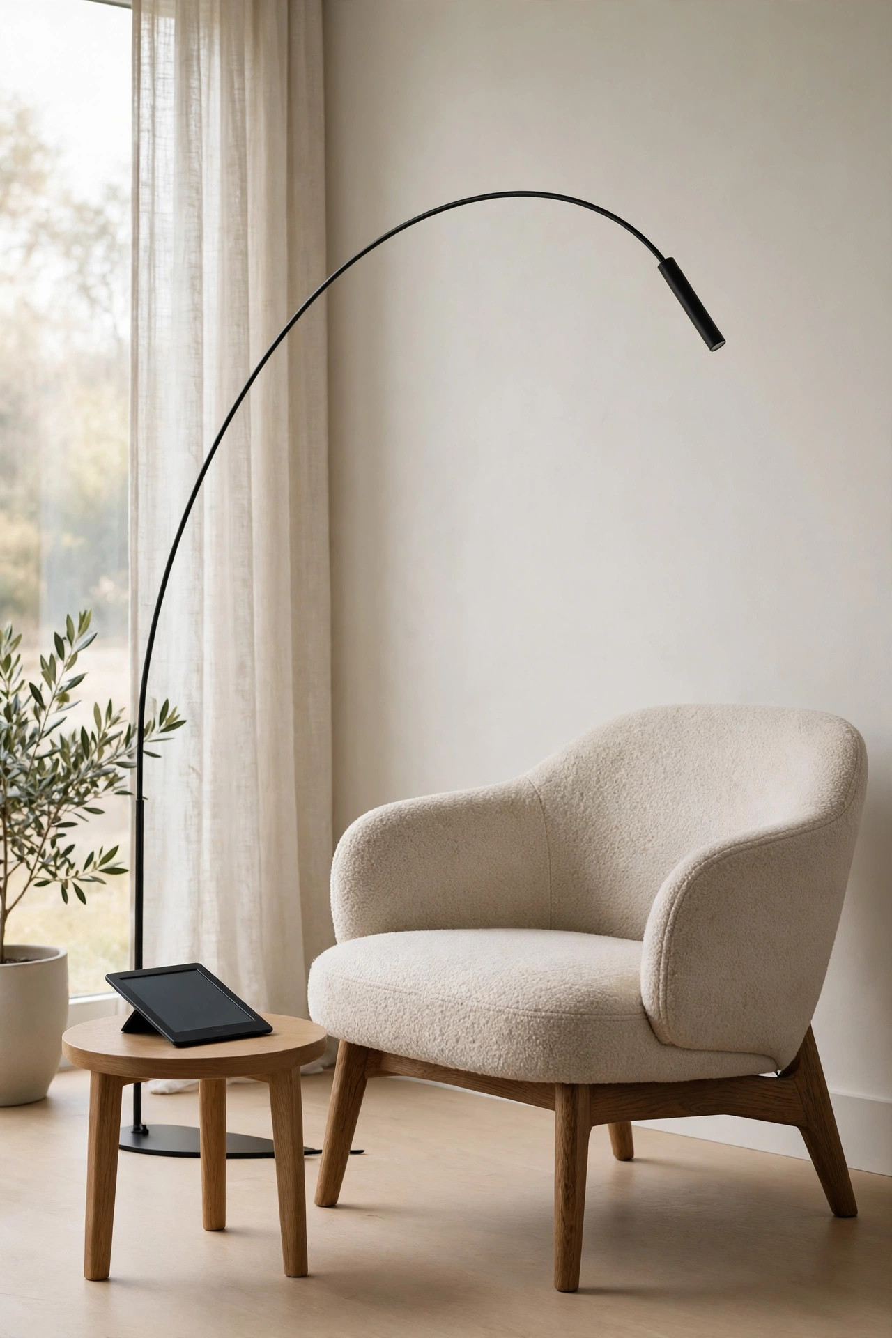
I mocked my husband’s reading setup until I borrowed it during a migraine and discovered he might be onto something. His corner is an egg-shaped pod chair in matte white — yes, the futuristic one, around €600, which I will complain about forever — with a slim LED floor lamp whose colour temperature he adjusts from his phone depending on the time of day. The shelf holds his e-reader dock and a small digital clock, and the cables are routed through a white channel along the wall so there is literally nothing to see. Behind the pod, two acoustic panels in light grey keep the room’s echo down, which makes a bigger difference to comfort than I expected. Everything charges from a hidden hub under the seat. Is it overkill for reading a paperback? Probably. But for evening reading without eye strain, the adjustable light and the complete absence of cable spaghetti are genuinely pleasant, and I have to admit the pod is easier to fall asleep in than any chair I own.
10. Kids’ Minimalist Reading Nook
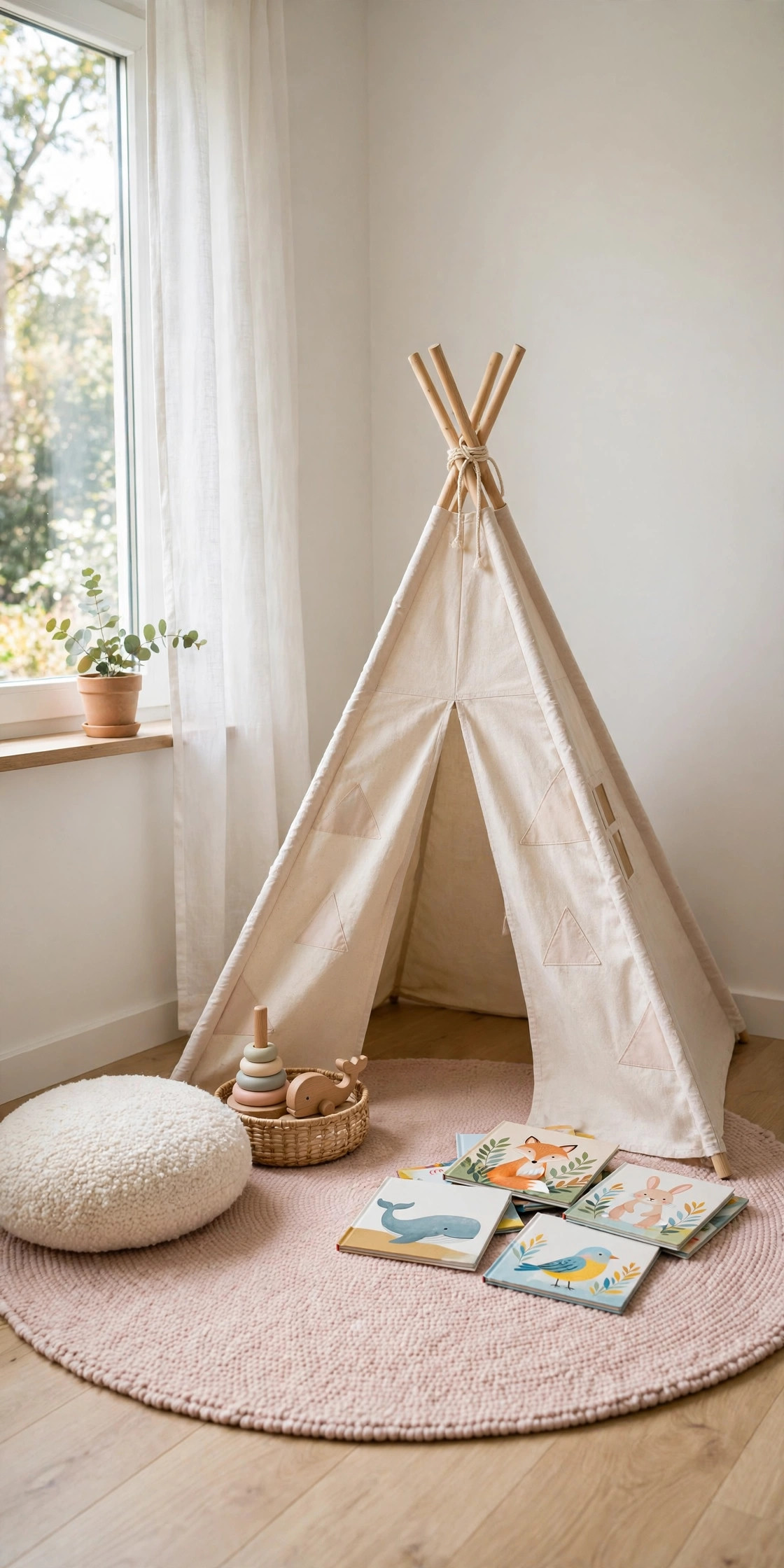
When our daughter was four, her “reading corner” was a chaotic book avalanche, so I rebuilt it with the same discipline I used for mine and it changed her reading habits almost overnight. The rule is simple: one low white shelf — just 60 cm tall so she reaches everything herself — holding twelve books at a time, rotated weekly from a storage box in the closet. Seating is a washable grey beanbag for about €40 and a 50×50 cm floor cushion, both machine-washable because children are weather events. The walls got exactly one cloud-shaped decal and one print of a fox she picked herself; the rest stays empty so her drawings can rotate on a single clip frame. A warm plug-in nightlight at the shelf gives her a glow to read by after lights-out, which I officially disapprove of and unofficially love. She reads in that corner every single day now. Minimalism for kids is not about style, it is about making the books the easiest thing to reach.
Conclusion
I have built or rebuilt a reading corner six times in ten years, and the pattern is always the same: start with what you actually have, keep the light warm and the palette honest, and edit one thing out rather than adding two things in. My window alcove is not the prettiest of the ten — the industrial loft wins that prize — but it is the one where I finish books, and that was the point all along. Pick the corner that fits your flat, not your feed, and give it a week. You will know by page fifty whether it works.