
When I moved into my Munich flat, the rooms were all white boxes with decent light and zero personality, and I made the classic rookie mistake of buying decorative bits before deciding what any room should actually feel like. Three years and many swapped-out cushions later, I’ve landed on a set of ideas that actually hold up over time — not trendy one-season moves, but things I’d do again in a heartbeat. Every one of these went up in my own flat (or my sister’s, where she lets me experiment), and I’ve noted where I messed up so you don’t have to.
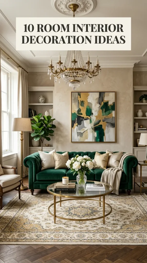
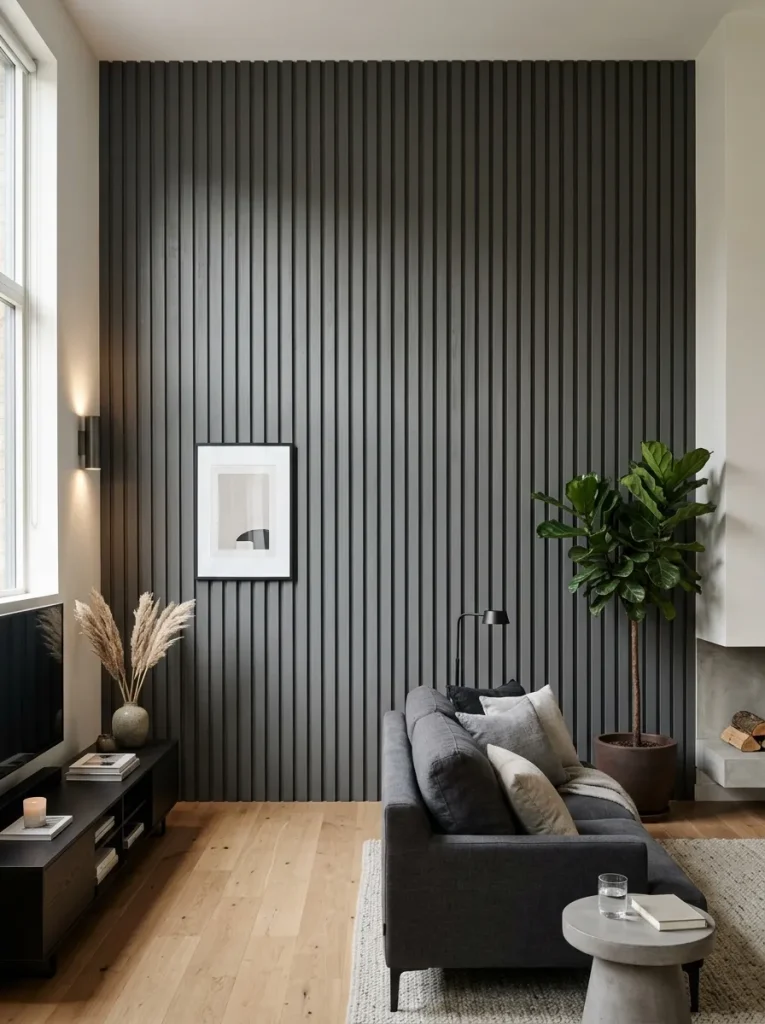
1. Monochromatic Textural Accent Wall
I did this in my bedroom two years ago with soft warm white, and honestly it was the single biggest visual upgrade per euro I’ve ever done. I used thin pine lattice strips from the hardware store — about 18 EUR for the whole wall — and fixed them vertically with construction adhesive plus a few brad nails into the studs. The mistake I made first: I painted the wall and the strips in slightly different sheens, which looked sloppy until I repainted everything in one flat matte coat. Two coats, roller for the wall, small brush around each strip. The light-shadow play across the slats changes through the day, and because it’s all one colour, it never fights the bedding or art. If you’re renting, use lighter battens and removeable adhesive strips rated for their weight — test one spot behind the door first.
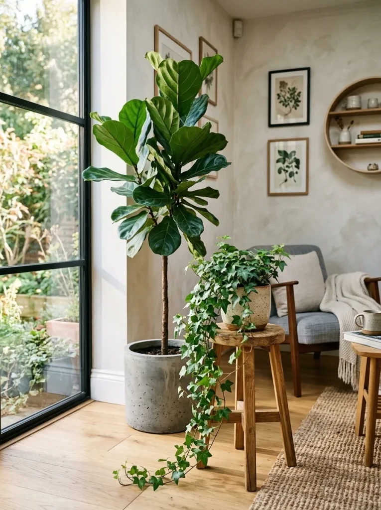
2. Sculptural Biophilic Plant Columns
My living-room corner was a dead zone — router, chargers, cables — until I turned it into a plant column instead. What worked for me: three heights in three different materials, terracotta, a matte concrete pot, and a seagrass basket, so it looks collected rather than matching. Tallest is a dracaena on the floor (I killed two fiddle leaf figs before admitting my flat doesn’t get enough light for them — the dracaena forgives me), a bushy monstera on a low wooden stool, and a trailing pothos up on the floating shelf. Grouping them tight in one corner reads as one sculptural installation instead of random pots scattered around. The hard rule: only group plants with similar water needs, or one of them will always be miserable. I water all three on Sunday mornings, check drainage trays so nothing sits wet, and rotate the pots a quarter turn every few weeks so they grow evenly toward the window.
3. Multi-Layered Natural Fiber Flooring
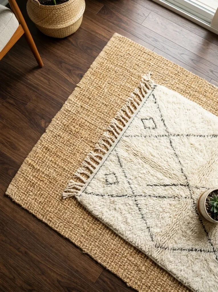
I started layering rugs because my floorboards are beautiful but freezing from October on, and honestly the layered look has stayed. The base is a large flat-weave jute rug — cheap, tough, roughly 60 EUR in a 200×290 — laid on a proper thick anti-slip pad, which is the bit people skip and then complain about corners curling. Over it, slightly off-centre under the coffee table, sits a smaller soft wool rug I found second-hand. The wool defines the seating zone and is where feet actually land. What I learned the hard way: both rugs need to be big enough that the sofa’s front legs sit fully on the layered bit, otherwise it looks like a postage stamp. Vacuum the jute with the plain floor head (no brush roll — it snags fibers) and give the wool a proper beat outside twice a year. It also cut the echo in my high-ceilinged room noticeably.
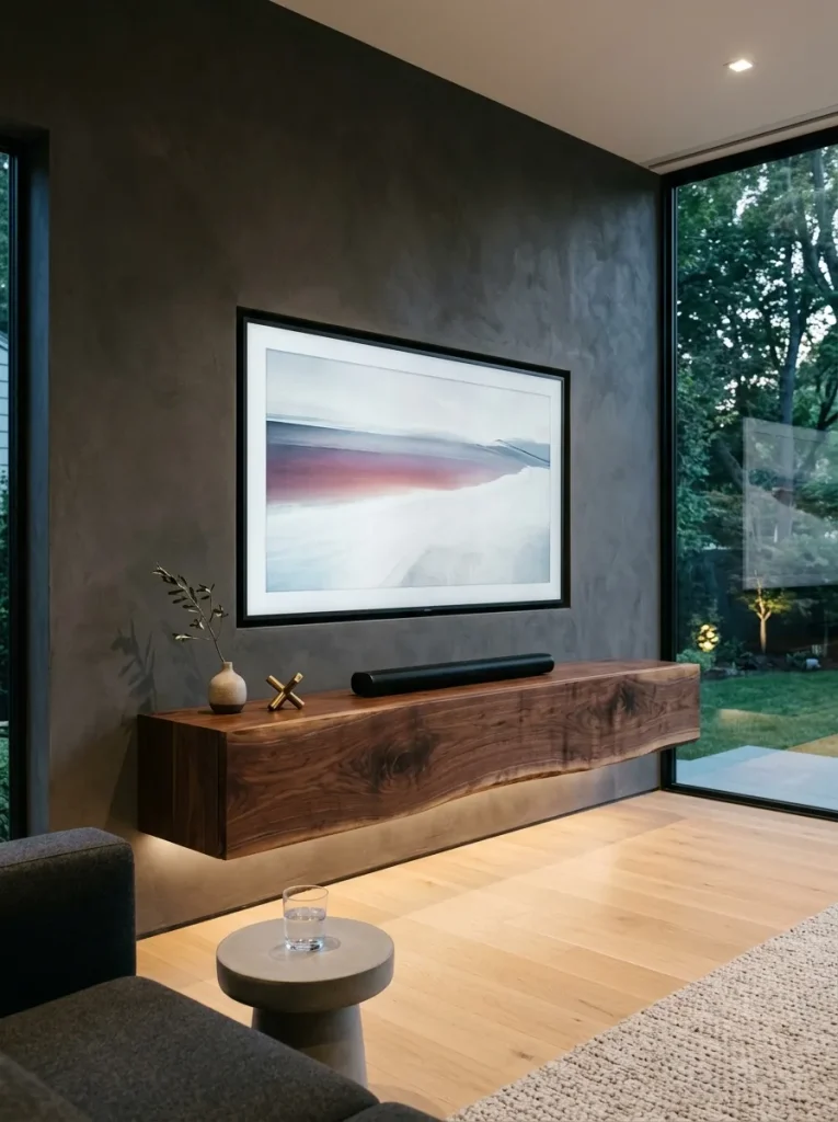
4. Floating Live-Edge Credenza
This one scared me, and I put it off for a year because mounting furniture to the wall felt like a point of no return. I finally did it in my media corner with a live-edge oak slab on a simple plywood cabinet box, hung on concealed steel brackets driven into the studs with lag screws. The floating effect is genuinely dramatic — you can run the robot vacuum straight under it, and the room reads bigger. My mistake: I underestimated the weight and first tried hollow-wall anchors on a stretch with no studs, which was a terrifying sagging week before I redid it properly. Measure twice, find every stud, and don’t mount it higher than about 45 cm off the floor or the TV-on-top ergonomics get weird. Cable management happens through a drilled grommet hole at the back — do it before you hang the box, not after, which is the order I naturally got backwards.
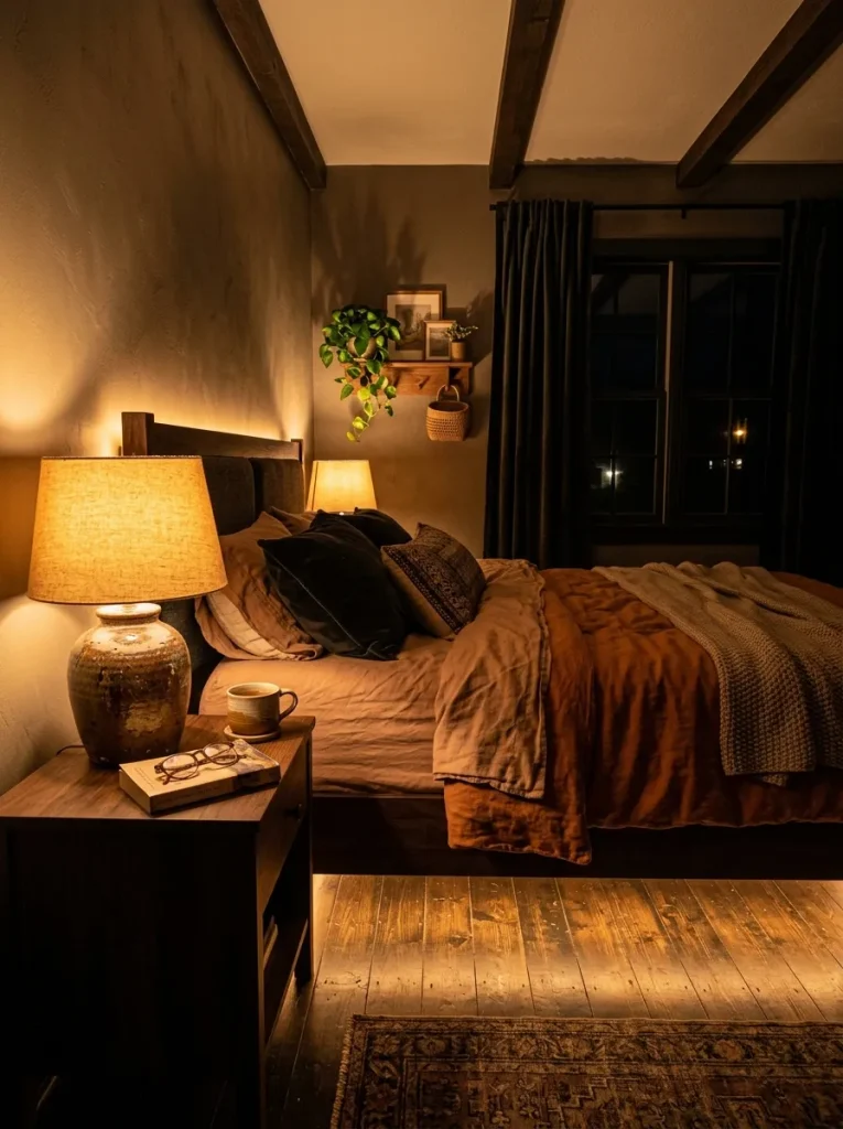
5. Warm Architectural Amber Lighting
I used to have one bright ceiling light per room and wondered why my flat felt like an office after dark. Switching to warm layered lighting — everything 2700K or lower, Edison-style LEDs at 2200K in the living room — changed the evening mood more than any furniture purchase. My setup now: a pair of table lamps on opposite side tables framing the sofa, a tall paper-shade floor lamp in the far corner, and a dimmable LED strip behind the shelf lip. The trick I wish someone had told me earlier: put the lamps on separate cheap plug-in dimmers or smart plugs so you can actually create layers instead of all-on-or-all-off. Amber light flatters wood, linen, and skin alike. One warning — going too warm in the kitchen or bathroom is a mistake; keep the warm scheme to living and sleeping spaces where you actually wind down.
6. Asymmetric Minimalist Art Gallery
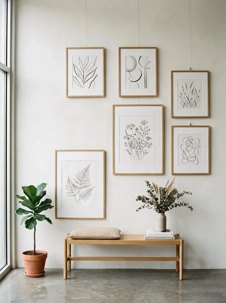
My hallway gallery wall started as five prints I actually liked rather than a curated set, and that ended up being the right move — a unified colour story matters more than matching subjects. I stuck to greens, ochres, and creams across different frames: light oak and matte black mixed, with generous white matting on everything. The matting is the cheat code; it makes wildly different prints look intentional. Layout method that saved me from a wall full of holes: I traced every frame onto kraft paper, taped the templates up with painter’s tape, lived with it for two days, and only then drove the nails through. Largest frame sits slightly off-centre as the anchor, smaller ones around it with roughly 5 cm gaps. Centreline at about 145 cm — eye level — which I ignored the first time and had to redo. Measure from the floor, not from the sofa.
7. Matte Black Architectural Hardware
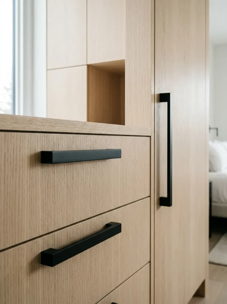
This is the cheapest room refresh I know: swapping out tired shiny brass cabinet knobs and white plastic switch plates for matte black. I did my entire flat’s door handles, cabinet pulls, and switch covers in one Saturday for under 80 EUR. The black lines act like punctuation — they give definition to rooms that are otherwise all soft beiges and wood, and they photograph beautifully. My tip: buy one handle first and check the screw spacing matches your existing holes, because European cabinets come in a few standard bore distances and guessing wrong means new holes. Also, go for powder-coated rather than painted black — painted chips within a year on anything you touch daily. I learned that on a bathroom handle and now it looks like it has dandruff. Powder-coated still looks new after two years of daily use.
8. Double-Layer Texturized Window Drapery
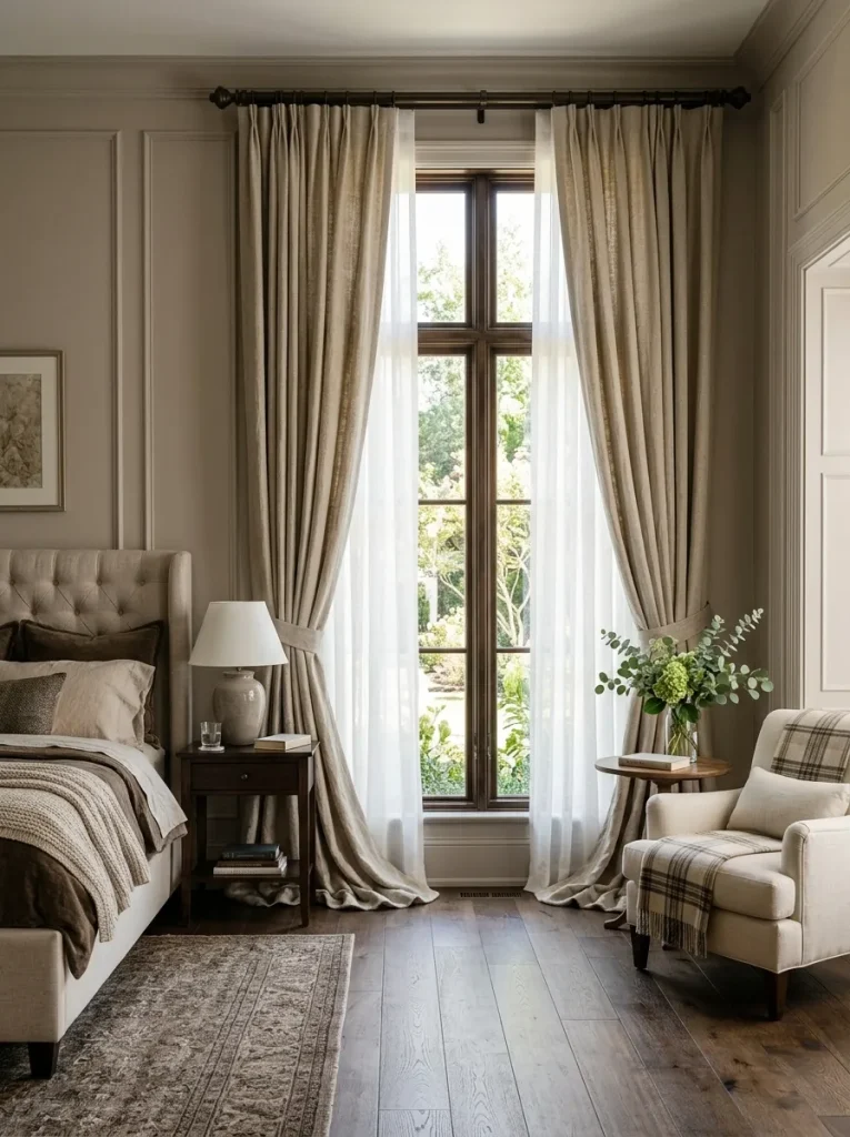
Double curtains sounded fussy until I hung them in my bedroom and immediately slept better. The inner layer is an unbleached cotton sheer on the rod closest to the glass — it softens daylight into something golden and gives daytime privacy — and the outer layer is heavy linen on the room-side rod, which closes for blackout-ish nights and deadens street noise more than I’d expected. Hang the whole thing 15–20 cm above the window frame and at least 10 cm wider each side than the casing; this is the single rule that makes windows look bigger and ceilings taller, and it costs nothing. Invest in a proper double rod with wall brackets into studs, because two layers of linen are genuinely heavy and a cheap tension rod will bow within a month — mine did, on a Sunday night, very dramatically. Hems should just kiss the floor; puddling looks romantic but collects every dust bunny in the flat.
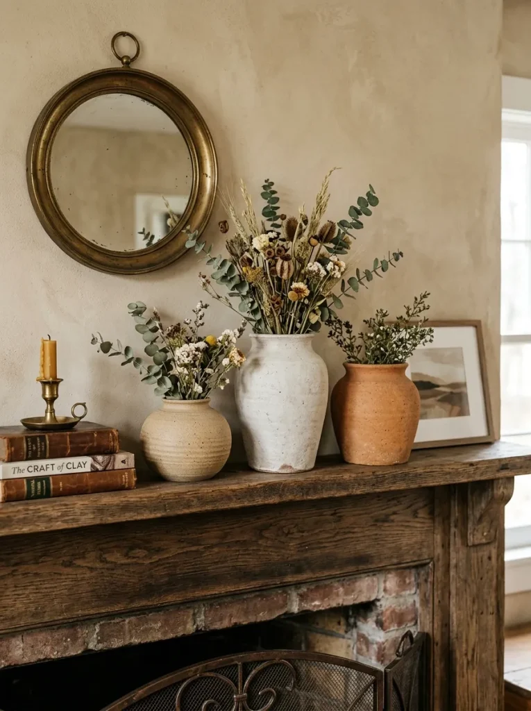
9. Curated Artisan Pottery Grouping
My dresser styling finally clicked when I stopped scattering small objects and grouped three clay pieces instead — a tall hand-thrown jug, a medium vessel, and a low wide bowl in sandy beige, chalky white, and burnt terracotta. Odd numbers, tallest at the back, forming a little triangle. Everything else on the dresser got edited out. I source from flea markets and one local potter at the Viktualienmarkt; imperfect handmade pieces beat identical store-bought sets every time because the slight wobbles catch the light differently. The tallest jug holds dried lavender most of the year (pampas grass sheds everywhere — fair warning) and the whole arrangement takes thirty seconds to dust. Budget-wise this was maybe 35 EUR total, and it’s the thing visitors actually pick up and comment on. One rule: keep the colour family tight, or it reads as clutter instead of a collection.
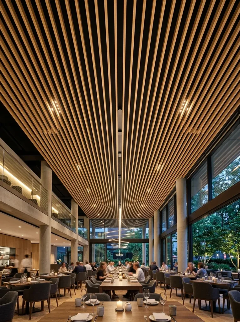
10. Slatted Timber Acoustic Ceiling Panels
I’ll be honest: this was the most ambitious thing on the list and the only one where I hired help for half a day. Prefabricated slatted oak panels on black acoustic felt, mounted across my home office ceiling. The visual effect is striking — the parallel lines pull the eye and the room feels designed rather than decorated — but the real win is acoustic. My echoey rectangle of a room went noticeably quieter on calls, which my colleagues commented on before I even mentioned the panels. If you DIY this, cut your lighting holes with a jigsaw before the panel goes up, use construction adhesive in a zig-zag plus screws into the joists every 30 cm, and check alignment with a long level against the walls. The felt backing is black and unforgiving of gaps, so butt the panels tight. Not cheap — budget around 60–80 EUR per square metre — but it’s the one idea here that genuinely feels like architecture.
Conclusion
None of these required a renovation or a big budget — most of them cost less than a weekend trip. If I had to pick just two to start with, I’d do the warm lighting first and the plant column second, because mood and life change a room faster than any object. And measure the studs before you mount anything. Ask me how I know.